The Quiet Luxury Farmhouse That Proves Restraint Can Be More Powerful Than Color

This post contains affiliate links, and we will be compensated if you buy after clicking on our links. Read our disclaimer.
Read our editorial process
Not every memorable home relies on bold paint, dramatic stone, or statement architecture. Some of the most compelling interiors work in the opposite direction, reducing visual noise until proportion, texture, and craftsmanship become the focal point.
At first glance, this residence appears understated. White millwork, pale flooring, soft gray accents, and carefully selected brass details create a palette that rarely demands attention. Yet moving through each room reveals a sophisticated lesson in balance. Every surface contributes to a larger story of continuity, where architecture and furnishings support one another rather than compete.
What makes this project particularly interesting is that its strongest achievement is not any single material selection. The hero decision behind this home was the commitment to consistency. Instead of treating each room as an independent project, the designers created a language that flows from the pantry to the kitchen, through the dining areas, and into the private spaces beyond.
That decision transformed a collection of rooms into a cohesive experience.
Before Any Decoration, the order became the Foundation
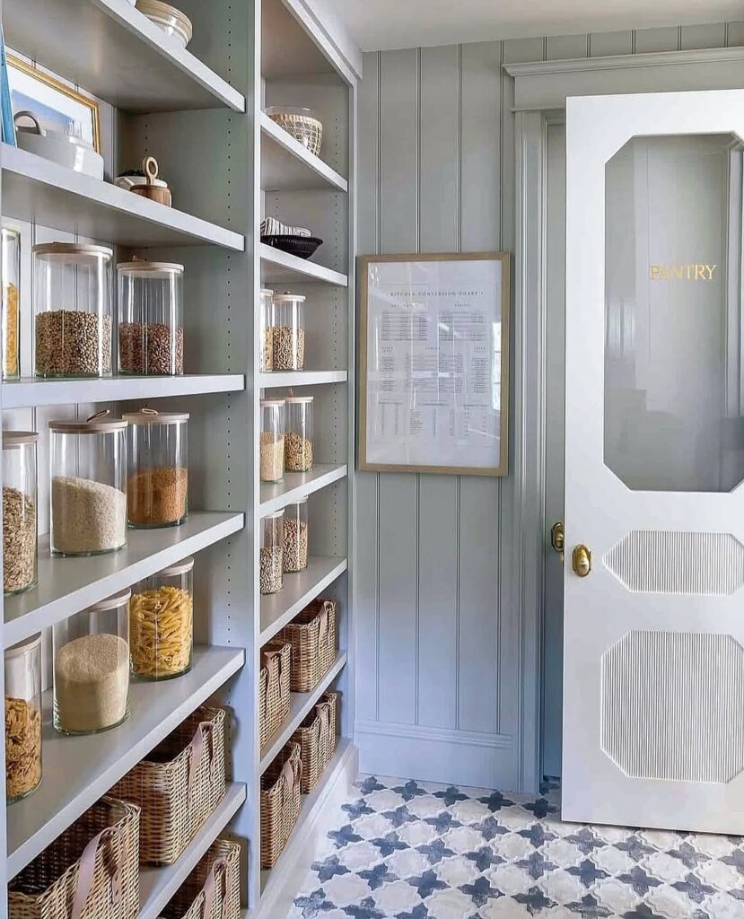
Few areas reveal a home’s priorities more clearly than a pantry. Rather than hiding food storage behind closed doors, this project embraces organization as part of the aesthetic. Open shelving stretches from floor to ceiling, creating vertical rhythm while making everyday ingredients part of the visual composition.
Glass containers introduce repetition without monotony. The eye moves naturally across rows of grains, pasta, and dry goods because similar forms create order. Woven baskets below provide contrast, bringing texture to an otherwise structured arrangement.
Beyond appearance, the shelving demonstrates an important principle of residential design. Spaces become more peaceful when frequently used items are easy to access. Visual clutter often begins with functional frustration. By giving everything a dedicated location, the room supports daily routines while maintaining a composed atmosphere.
Equally notable is the restrained palette. Soft gray millwork and subtle flooring patterns prevent storage from feeling utilitarian. Instead, the pantry reads as an extension of the home’s architecture.
The Kitchen Refused to Chase Trends
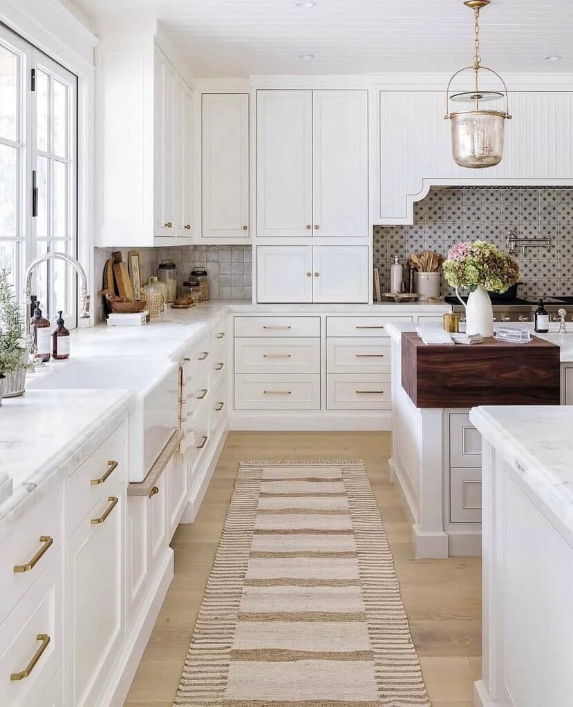
Many contemporary kitchens pursue impact through bold cabinetry or oversized fixtures. This one takes a different route. White panel-front cabinets establish a timeless foundation, allowing details to carry the visual weight.
Attention immediately shifts toward the decorative range wall. The patterned tile introduces movement without overwhelming the composition. Because the motif remains neutral, it contributes personality while preserving longevity.
Natural light plays a critical role in the success of the room. Large windows wash the surfaces evenly, softening transitions between cabinetry, countertops, and flooring. As a result, boundaries become less pronounced, helping the kitchen read as a unified environment rather than a collection of separate components.
Perhaps most impressive is the balance between refinement and practicality. Deep drawers, generous counter space, and integrated storage ensure that functionality remains central to the experience.
Simplicity Often Requires More Discipline
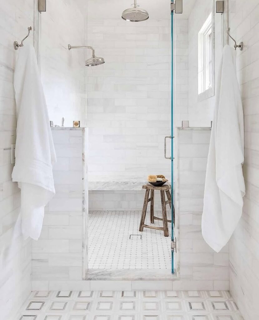
Bathrooms frequently accumulate visual complexity through multiple tile patterns, decorative fixtures, and contrasting finishes. Here, restraint becomes the defining strategy.
Large expanses of pale stone create continuity across walls, floors, and shower surfaces. Because interruptions are minimized, the enclosure appears more generous than its actual dimensions. The eye travels uninterrupted across the surfaces, making the volume feel elongated.
Chrome fixtures provide crisp accents without dominating the composition. Their reflective qualities introduce subtle contrast while maintaining the room’s lightness.
From a psychological perspective, repetition contributes significantly to serenity. When fewer competing elements demand attention, occupants experience less visual fatigue. The result is a bathing environment that feels restorative rather than stimulating.
A Dining Room Built Around Connection
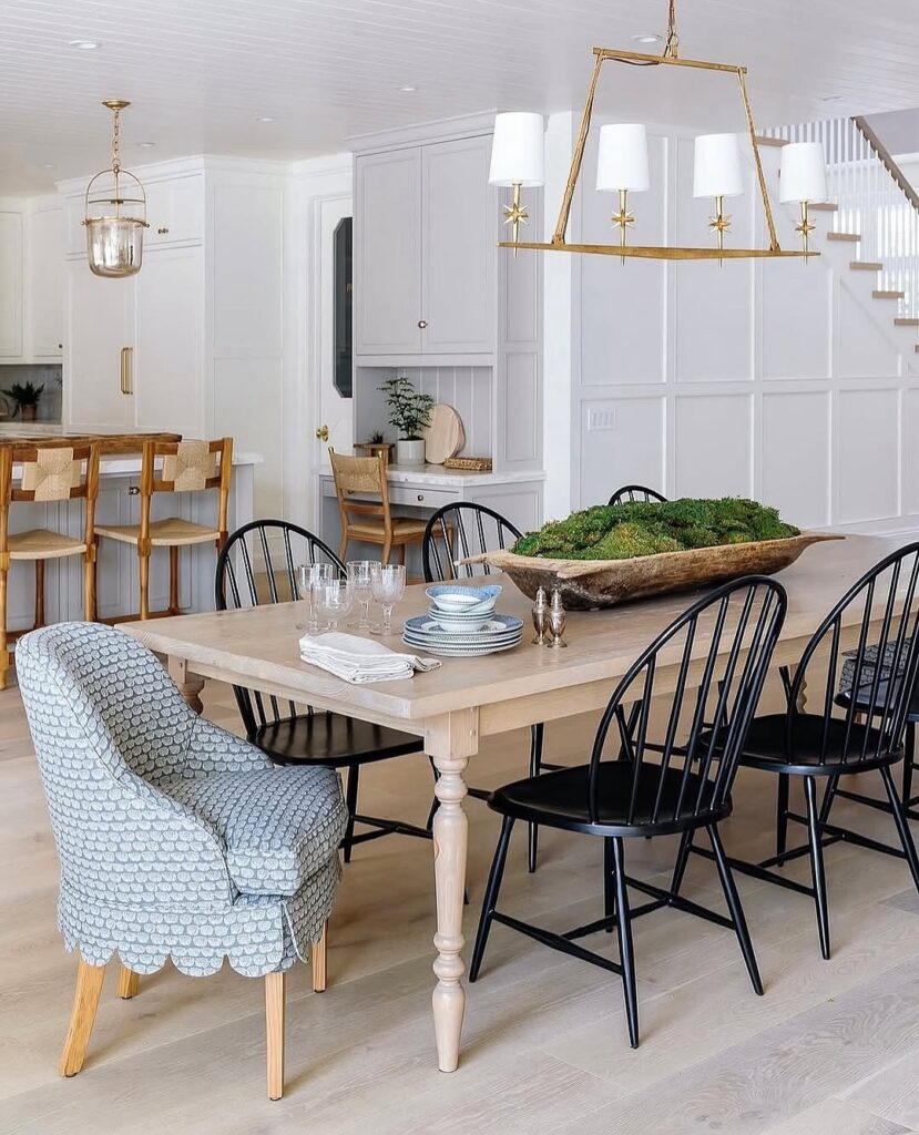
Open-concept homes often struggle with scale. Without careful planning, dining areas can appear disconnected from surrounding spaces. This arrangement solves that challenge through thoughtful furniture selection.
Dark spindle-back chairs anchor the table and introduce contrast against the lighter surroundings. Their repeated silhouettes establish rhythm while helping define the dining zone without walls.
Above, the brass fixture performs a similar function. Its elongated shape mirrors the table below, creating a visual relationship that strengthens the composition. Lighting becomes an architectural tool rather than simply a source of illumination.
A large organic centerpiece prevents the room from feeling overly formal. Natural materials soften geometric lines and reinforce the home’s broader connection to texture and craftsmanship.
The Exterior Introduces the Story Before You Enter
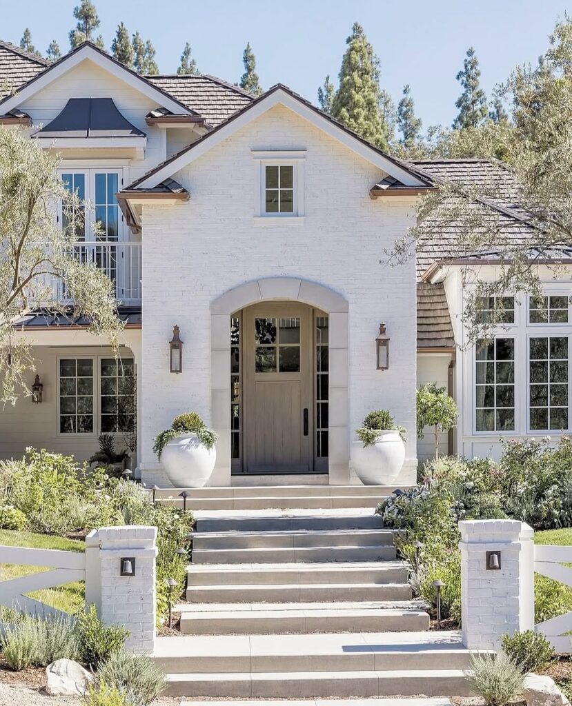
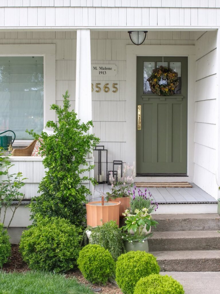
Long before visitors experience the interiors, the facade establishes expectations. Symmetry serves as the organizing principle, lending the residence a sense of permanence and confidence.
White-painted masonry reflects daylight beautifully, emphasizing architectural details without relying on decorative embellishment. Meanwhile, the darker roof introduces depth and prevents the elevation from appearing flat.
Landscape elements play an equally significant role. Structured plantings frame the entry sequence while softening hard architectural lines. The result feels cultivated rather than manufactured.
Viewed as a whole, the exterior communicates the same message present throughout the home: elegance emerges through proportion and restraint rather than excess.
Contrast Becomes Stronger When Used Sparingly
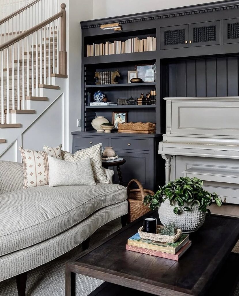
After moving through predominantly pale interiors, the introduction of charcoal cabinetry feels especially impactful. Because darker tones are reserved for strategic moments, they command attention without overwhelming the environment.
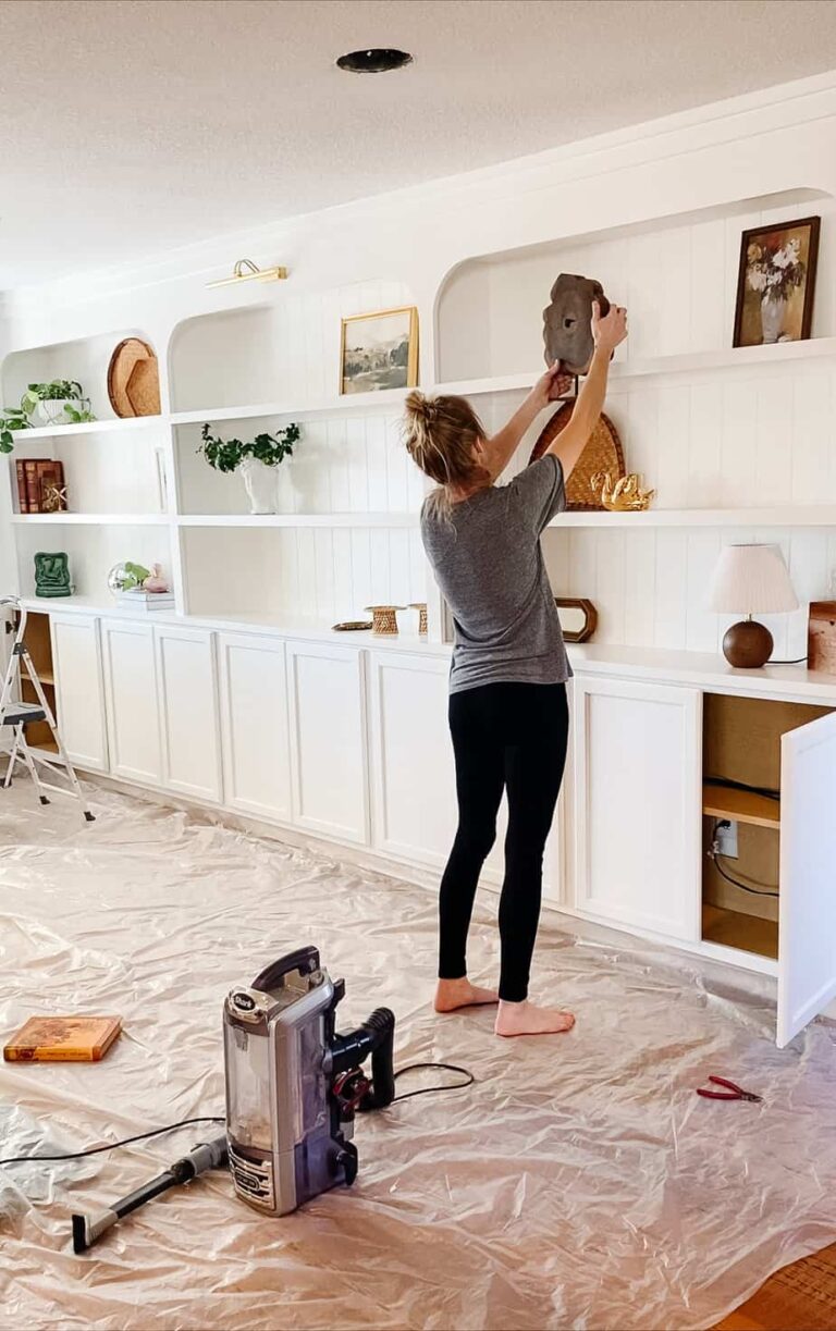
Built-in shelving transforms an ordinary wall into a destination. Books, ceramics, framed objects, and collected pieces create layers of interest that evolve. The installation feels permanent, reinforcing the home’s sense of craftsmanship.
Adjacent architectural elements benefit from the contrast as well. The white piano appears more sculptural against the darker backdrop, while surrounding textures gain additional depth.
Rather than introducing a completely different aesthetic, this room demonstrates how variation can exist within a cohesive framework.
Luxury Often Appears in the Quietest Places
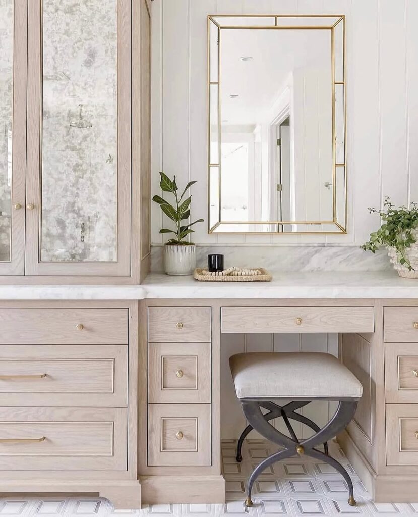
The most successful custom details rarely announce themselves immediately. This dressing area exemplifies that principle through careful proportions and exceptional material continuity.
Light wood cabinetry introduces warmth without disrupting the broader palette. Delicate hardware contributes refinement while maintaining visual lightness. Every line feels measured and deliberate.
A marble countertop enhances the furniture-like quality of the installation. Because the material extends seamlessly across the surface, the vanity reads as a single crafted object rather than a collection of cabinets.
More importantly, the space acknowledges that daily routines deserve thoughtful design. Practical functions become more enjoyable when supported by beauty and organization.
Pattern Can Add Energy Without Creating Chaos
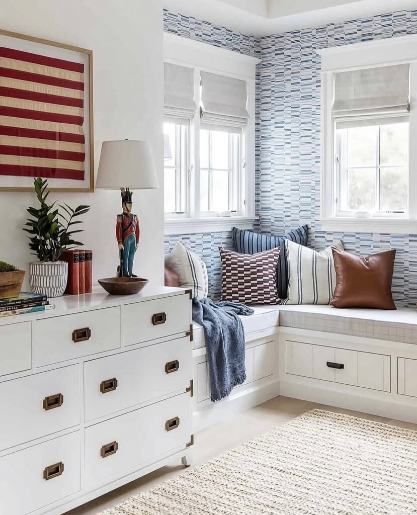
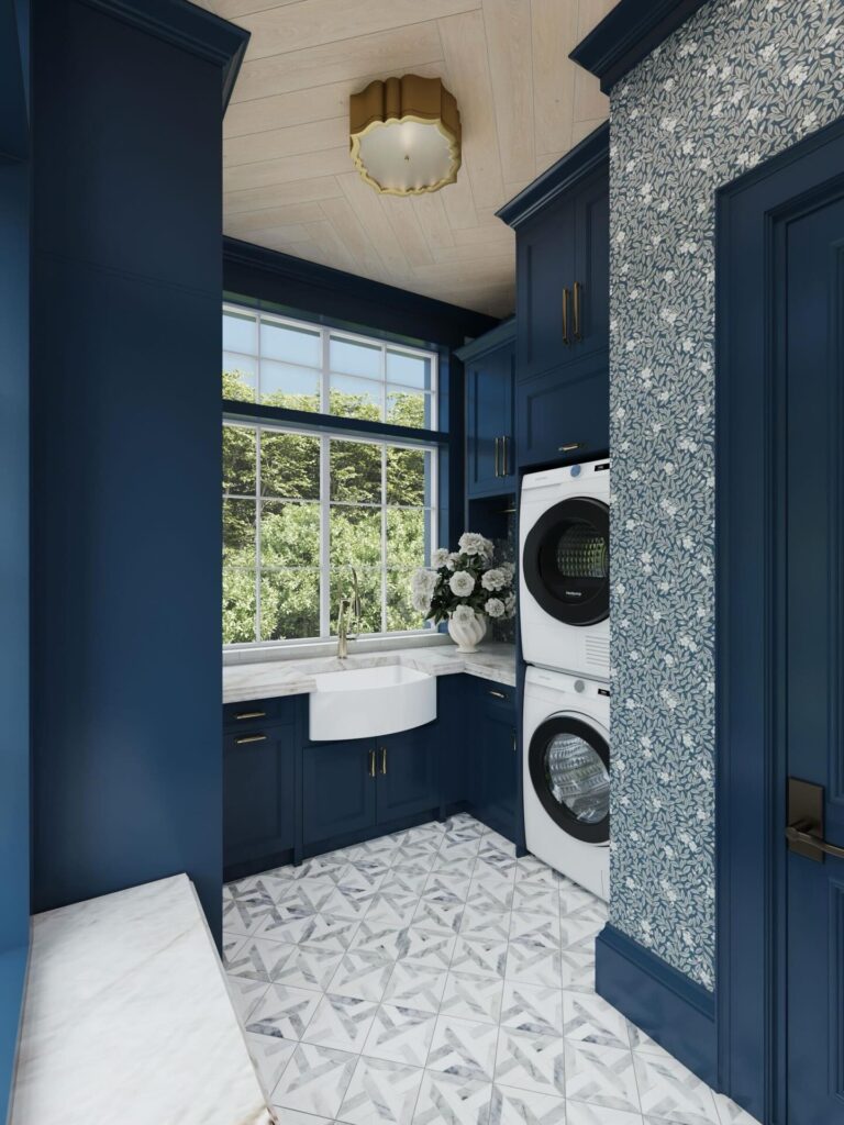
Many homeowners fear patterns because they associate them with visual clutter. This corner demonstrates how strategic application can achieve the opposite effect.
The wallpaper creates movement while remaining subtle enough to support surrounding furnishings. Blue accents within the pattern establish a palette that extends into pillows, throws, and decorative objects.
Built-in seating contributes another layer of functionality. By integrating storage and seating into the architecture, the room gains usefulness without sacrificing openness.
What emerges is a highly livable environment where comfort and character coexist naturally.
Softness Becomes a Design Strategy
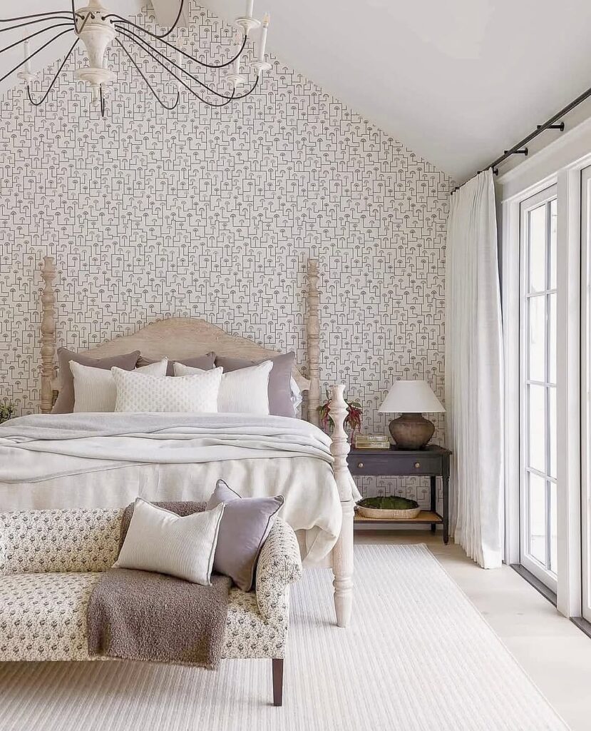
Bedrooms succeed when they encourage rest, and this one achieves that goal through material selection rather than dramatic visual statements.
A patterned wall covering introduces subtle complexity behind the bed, creating interest while remaining quiet enough for a sleeping environment. Neutral textiles build upon that foundation through layers of woven surfaces and varied fabrics.
Floor-to-ceiling curtains enhance verticality, drawing attention upward and emphasizing ceiling height. Their generous folds contribute softness that balances the room’s architectural geometry.
Viewed holistically, the composition demonstrates that richness does not require saturation. Texture alone can provide remarkable depth.
The Final Layer Was Never About Cabinetry
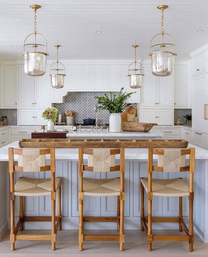
Returning to the kitchen from a different perspective reveals the project’s most important lesson. The cabinetry, countertops, tilework, and lighting are all successful individually. Yet the room’s character comes from how those elements interact.
Woven counter stools introduce an organic quality that offsets the precision of the millwork. Wooden accessories provide additional texture, preventing the kitchen from feeling overly polished.
Pendant fixtures establish rhythm across the ceiling plane while connecting brass accents found throughout the home. Repetition creates familiarity, and familiarity creates cohesion.
More importantly, the kitchen demonstrates the power of the project’s hero decision. Consistency appears in every material transition, every furniture selection, and every architectural detail. Nothing feels disconnected because everything belongs to the same conversation.
What Stayed the Same Matters Most
Perhaps the most surprising aspect of this residence is how little it depends on dramatic interventions. The floor plan remains straightforward. Individual rooms maintain traditional functions. Architectural gestures stay measured.
The difference lies in the commitment to continuity.
Rather than chasing attention through isolated moments, the project focuses on relationships. Materials repeat. Proportions echo one another. Colors transition gradually. Furnishings support architecture instead of competing with it.
That approach creates something increasingly rare in contemporary interiors: a home that feels complete.
The Real Design Lesson
Many renovations begin with the assumption that bigger changes produce better results. This home suggests the opposite.
The strongest spaces often emerge when designers choose a clear direction and follow it consistently. Here, the defining achievement was not a statement kitchen, a dramatic staircase, or a luxurious bathroom. It was the decision to create harmony across every corner of the house.
Good design rarely begins with adding more. More often, it begins with removing distractions until the right elements can finally be appreciated.
Image Credit: All renovation and styling images courtesy of Instagram user @farmhouse__lovers.
Bring Quiet Luxury Into Every Room
• Grey and White Bathroom Ideas
• How to Decorate A Small Bedroom
• How to Decorate Bedroom Walls
• Couples Gaming Room Setup Ideas