How Bold Red Cabinetry Turned a Narrow Galley Kitchen Into an Architectural Statement

This post contains affiliate links, and we will be compensated if you buy after clicking on our links. Read our disclaimer.
Read our editorial process
Many galley kitchens follow a familiar formula of white cabinets and neutral finishes. The goal is often to make the room feel larger and brighter.
This kitchen takes a different approach. Instead of downplaying the narrow layout, it embraces it with warmth, color, and personality.
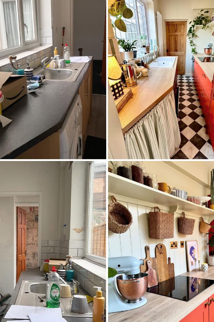
The most impressive part is how little actually changed. The sink stayed beneath the window, and the original footprint remained intact.
Rather than altering the layout, the renovation focused on visual impact. Bold red cabinetry became the defining feature that transformed the entire room.
Oak countertops and checkerboard flooring support that decision without competing for attention. Together, they create a kitchen that feels balanced, memorable, and full of character.
The result proves that a dramatic transformation does not always require moving walls or expanding square footage. Sometimes a single design choice can completely redefine a space.
The Problem With Galley Kitchens
Galley kitchens are among the most efficient layouts in residential design, but efficiency and delight do not always coexist. Narrow proportions can make these spaces feel like corridors rather than destinations, especially when cabinetry crowds both walls.
Many homeowners respond by choosing safe finishes. White cabinets and neutral palettes dominate because they promise openness. Yet safety can sometimes produce spaces that feel anonymous rather than inviting.
This kitchen demonstrates that visual identity matters just as much as function. Good design does not always come from making a room disappear. Sometimes it comes from giving it presence.
The room never gained additional square footage. Instead, the renovation changed how the eye experiences proportion, depth, and rhythm.
Explore More Kitchen Remodel Inspiration
• Luxury Kitchen Design Ideas
• Blue Kitchen Builder Grade To Custom Renovation
• White Oak Kitchen Remodel 1960s Home
• IKEA SEKTION Galley Kitchen Hack
Before the Color, the Kitchen Disappeared Into the Background
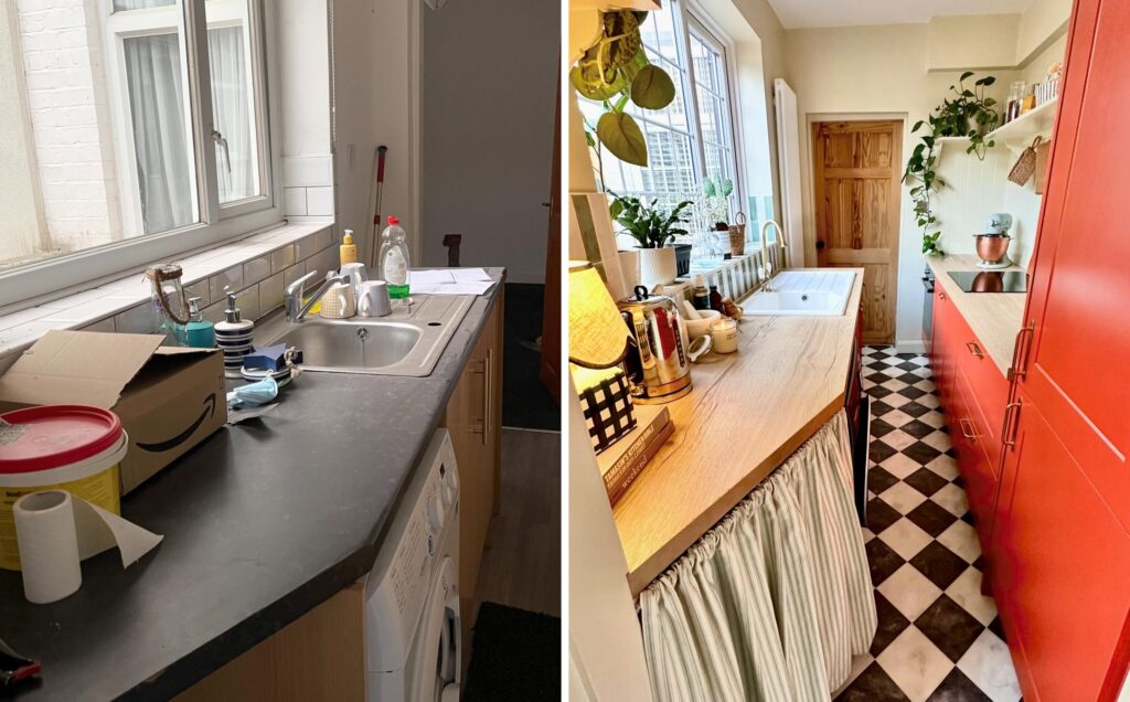
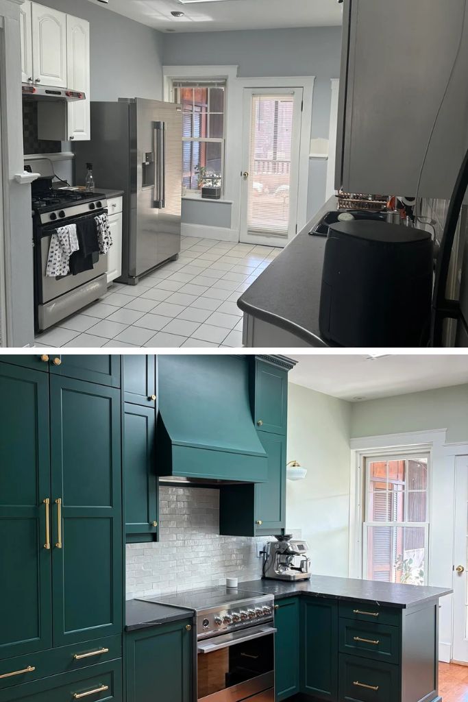
The before-and-after comparison immediately reveals an important truth: the architecture remained largely unchanged. The sink still sits beneath the window, the room maintains its galley form, and the circulation path continues uninterrupted from one end to the other.
What changed was the visual hierarchy. The original kitchen relied on pale wood cabinetry and dark countertops that lacked contrast and identity. In the renovated version, strong cabinetry establishes order while lighter surfaces introduce balance.
Design psychology explains why this works. Continuous blocks of color help the brain organize space more efficiently, making rooms feel more intentional rather than fragmented. The eye now understands where to rest and where to travel.
Layered styling further softens the experience. Plants, textiles, and warm lighting transform a purely functional workspace into a room designed for daily rituals rather than tasks alone.
When Storage Becomes Architecture Instead of Furniture
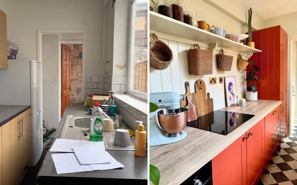
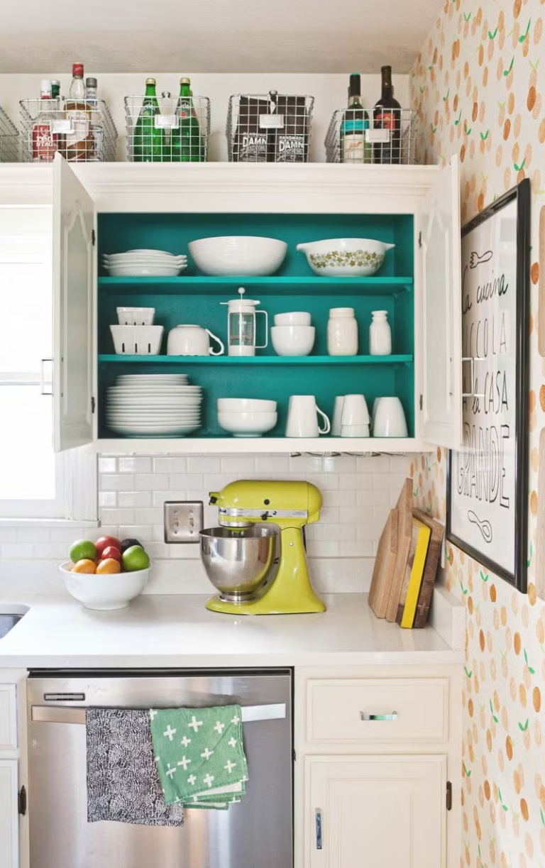
One of the renovation’s quietest successes is the replacement of visual heaviness with openness. Upper cabinets often compress narrow kitchens because they occupy valuable sightlines above eye level.
Open shelving changes that relationship. The wall feels lighter, taller, and more breathable while still accommodating everyday storage needs. Function remains intact, but the experience becomes less restrictive.
The styling choices matter as much as the shelves themselves. Woven baskets, glass containers, ceramics, and cutting boards introduce natural texture that softens hard architectural surfaces.
Organic materials create warmth because they break uniformity. The room no longer feels like a collection of cabinets. It reads instead as a layered interior with depth and personality.
A Narrow Room Learned to Embrace Boldness
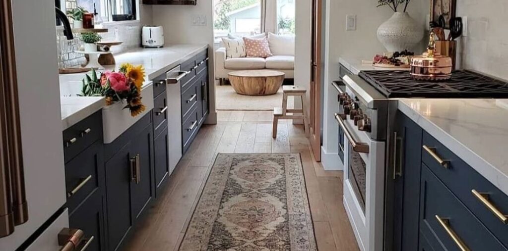
Conventional design advice often warns homeowners against using darker colors in small kitchens. Yet this example illustrates that contrast can create depth when applied thoughtfully.
Long uninterrupted sightlines guide the eye through the space. The runner, cabinetry, and flooring all reinforce movement toward the far end of the room, subtly extending perceived length.
Visual continuity plays an important role in why some spaces feel larger than they actually are. When materials repeat consistently, the brain processes fewer interruptions and perceives greater calm.
The result feels expensive, not because of luxury materials alone, but because every element appears coordinated and deliberate.
Constraints Often Produce the Most Thoughtful Rooms
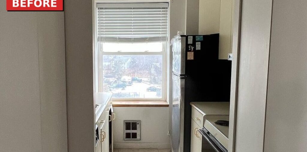
Narrow kitchens leave little room for error. Every appliance, cabinet, and finish occupies valuable visual space, which means even small decisions have outsized effects.
Rather than fighting the galley layout, successful designs work with it. Clear circulation paths and simplified surfaces reduce visual friction, moving to the room feel effortless.
Human perception naturally favors order. Spaces with fewer interruptions often feel calmer because the eye does not need to process competing information.
This principle explains why many smaller kitchens feel more successful than larger ones. Good proportion often matters more than square footage.
Renovation Begins by Revealing Hidden Potential
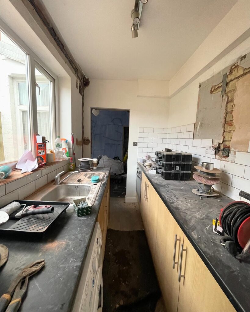
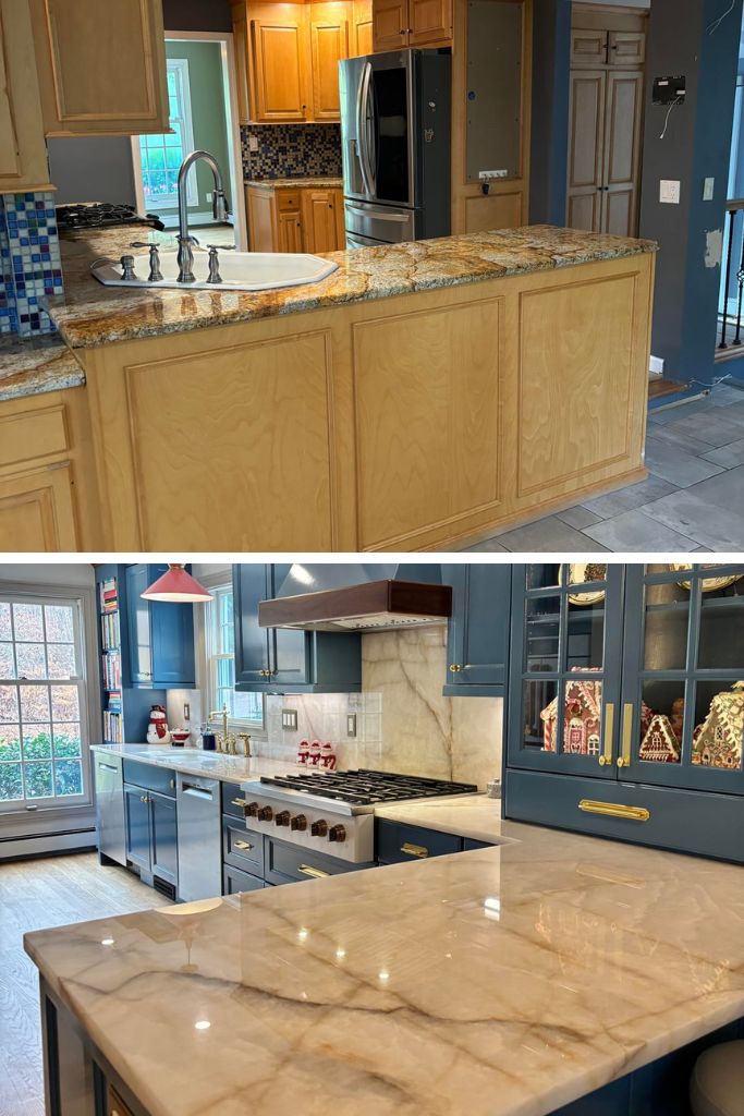
Construction photographs rarely receive attention, yet they often reveal the true story of transformation. Exposed walls and unfinished surfaces make visible the invisible work behind great design.
Even in its stripped-back state, the room’s future becomes easier to imagine. The footprint remained unchanged, but the possibilities within it expanded dramatically.
Subway tile introduces rhythm through repetition. Repeated forms create visual calm because they reduce complexity and allow surfaces to read as unified planes.
Renovation is not always an act of addition. Often it is an exercise in subtraction, removing distractions until the architecture can speak more clearly.
The Final Layer Was Never Cabinetry but Atmosphere
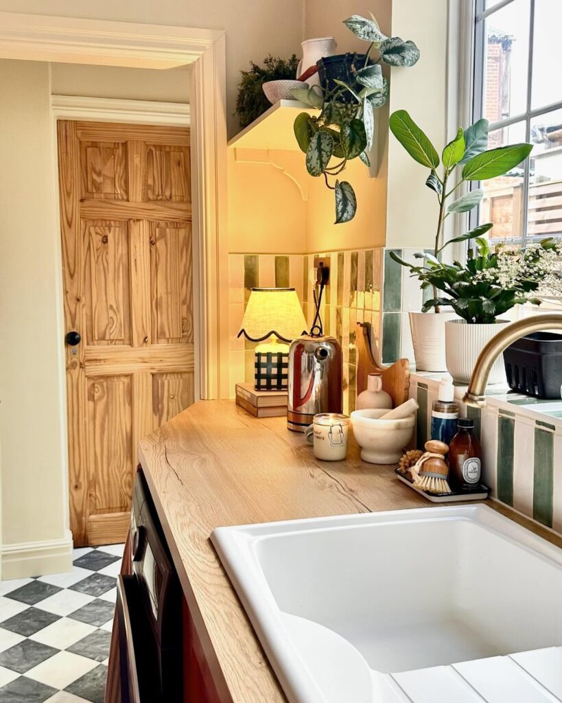
The final reveal succeeds because it extends beyond finishes and fixtures. The small lamp beside the sink, trailing plants, and handcrafted objects create moments of intimacy within an otherwise hardworking room.
Hard surfaces establish structure, but soft layers provide emotional warmth. Textiles, ceramics, and greenery soften architectural edges and encourage slower daily rituals.
Natural materials help explain why the room feels warmer today. Wood grain introduces irregularity, which humans instinctively associate with comfort and authenticity.
Luxury rarely comes from expensive materials alone. More often, it emerges from thoughtful layering that allows a room to feel lived in rather than merely completed.
Why the Kitchen Feels Bigger, Warmer, and More Expensive
The kitchen feels bigger because sightlines remain uninterrupted. The absence of bulky upper cabinets allows the eye to travel farther across the room, increasing perceived depth.
It feels warmer because organic materials dominate the sensory experience. Wood, woven baskets, plants, and soft lighting counteract the hardness typically associated with kitchens.
It feels expensive because the design appears permanent and intentional. Built-in cabinetry, repeated finishes, and restrained materials create visual consistency associated with custom interiors.
Most importantly, it feels calmer because every design decision serves a larger purpose. Nothing appears accidental, and the eye experiences harmony rather than clutter.
Design Lesson
Great renovations rarely begin with more space. More often, they begin with a clearer understanding of what a room could become.
This kitchen never expanded outward. It simply became more certain of its identity. Through color, texture, and restraint, an ordinary galley kitchen was transformed into a space with architectural presence.
The most successful interiors do not always replace what exists. Sometimes they reveal possibilities that were waiting quietly beneath the surface all along.
Image Credit: All renovation and styling images courtesy of Instagram user @fourthhome_.
Finish Every Kitchen Detail
• How to Paint Kitchen Cabinets
• How to Clean Grease Off Cabinets
• How to Decorate Above Cabinets
• How to Organize Kitchen Cabinets Layout