A Moody Blue Kitchen Proves That Bold Color Can Age Better Than White

This post contains affiliate links, and we will be compensated if you buy after clicking on our links. Read our disclaimer.
Read our editorial process
There are kitchen renovations that chase trends, and then there are those rare projects that quietly rewrite what timelessness can look like. At first glance, this home appears to have undergone a complete reconstruction. In reality, the story is far more interesting.
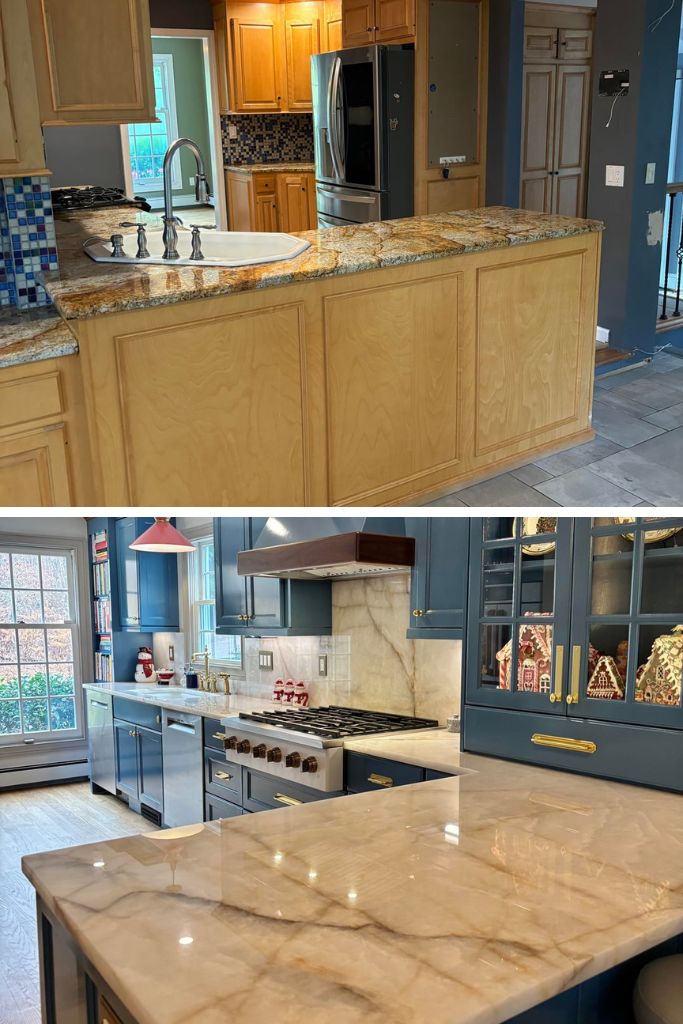
The most surprising detail may be how much remained untouched.
What changed was not the footprint, but perception. Through color, craftsmanship, and carefully layered materials, an ordinary builder-grade kitchen evolved into a richly detailed interior that feels collected over decades rather than installed in months.
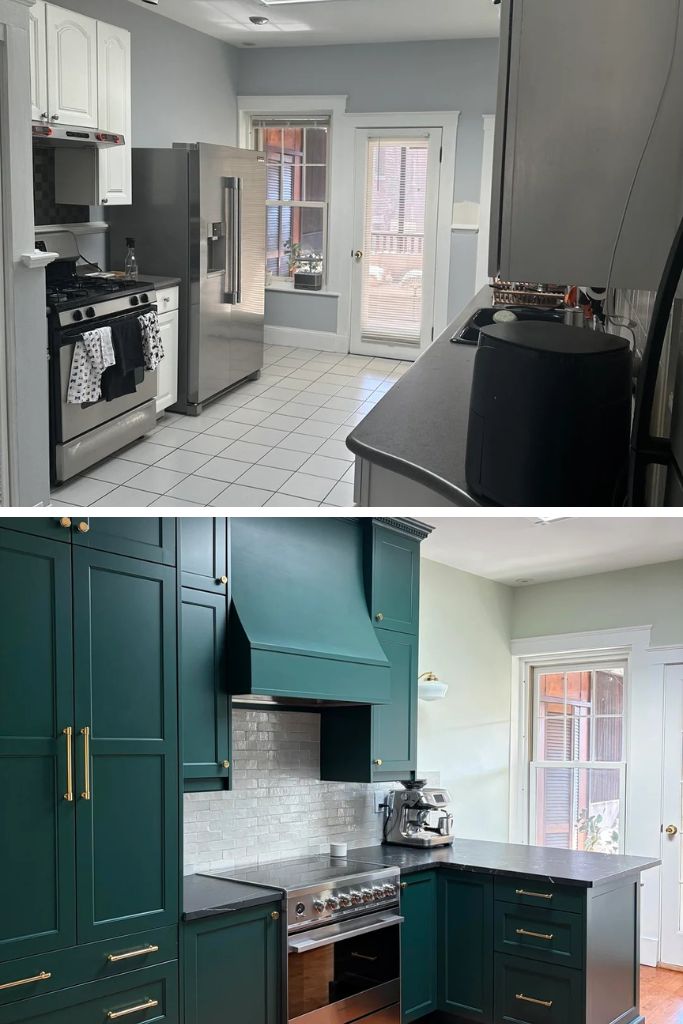
The defining move in this renovation was introducing deep blue cabinetry while preserving the original layout. That single choice transformed a builder-grade kitchen into one that feels tailored and timeless.
Brass accents, rich wood beams, and luminous stone surfaces work together to reinforce its layered character.
Before the Paint, the Kitchen Was Working Hard but Saying Little
Many kitchens built in the early 2000s share the same challenge: they function perfectly well but rarely possess a distinct identity.
The original maple cabinetry, granite countertops, and efficient work zones offered durability, yet the overall impression lacked cohesion.
Rather than demolishing the kitchen, the renovation team recognized an important truth. A successful redesign often begins with editing rather than erasing.
The bones were strong. What the kitchen needed was character, contrast, and a clearer sense of permanence.
Viewed another way, this project demonstrates that renovation is not always about expansion. Sometimes it is about helping a house finally become itself.
Discover Stunning Kitchen Transformations
• Luxury Kitchen Design Ideas
• White Oak Kitchen Remodel 1960s Home
• Bold Red Galley Kitchen Transformation
• Copper Kitchen Ideas
Beneath the New Finishes, the Original Layout Quietly Survived
The room never changed its footprint, yet the experience feels entirely different today.
Windows remained where they were. Major work zones continued serving the same purpose. The island retained its central role in circulation.
By preserving infrastructure while changing materials and visual hierarchy, the renovation avoided unnecessary disruption while achieving remarkable impact.
Good design often rewards restraint.
Instead of spending resources moving plumbing or rebuilding walls, attention shifted toward surface, proportion, and atmosphere. Those choices ultimately transformed how every square foot is perceived.
A Builder Kitchen Waiting for Its Second Life
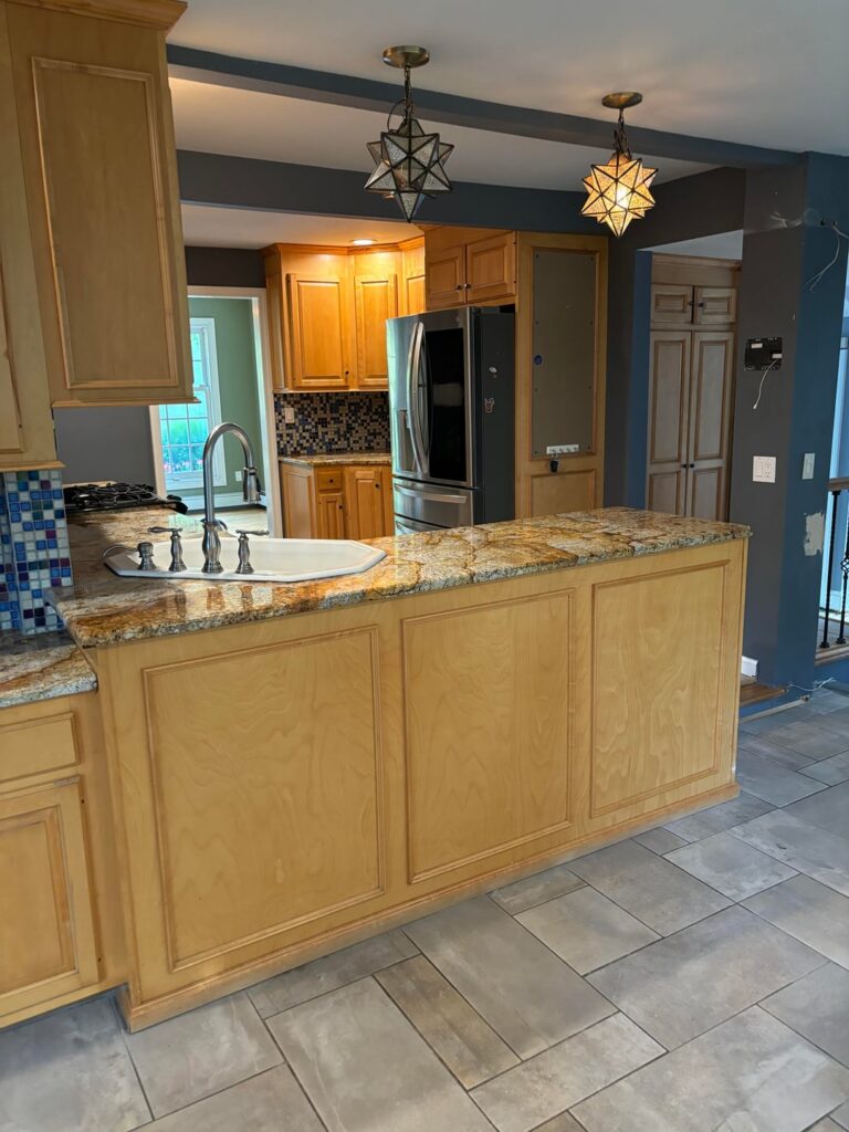
Before any paint or millwork arrived, the kitchen reflected a familiar suburban vocabulary: honey-toned cabinets, patterned granite, and mosaic tile. None of these materials was inherently problematic. Their challenge lay in competition. Multiple textures and colors demanded attention simultaneously, leaving little visual hierarchy.
The island already served as an important anchor, separating preparation areas from adjoining spaces. Yet its visual weight remained low because the finishes blended into one another rather than establishing contrast. The eye wandered without finding a focal point.
Large-format floor tile, interestingly, had already begun solving one problem. Fewer grout lines create longer visual pathways, which naturally make interiors appear more expansive. Even before renovation began, the floor hinted at the home’s untapped potential.
A Practical Layout That Deserved Better Finishes
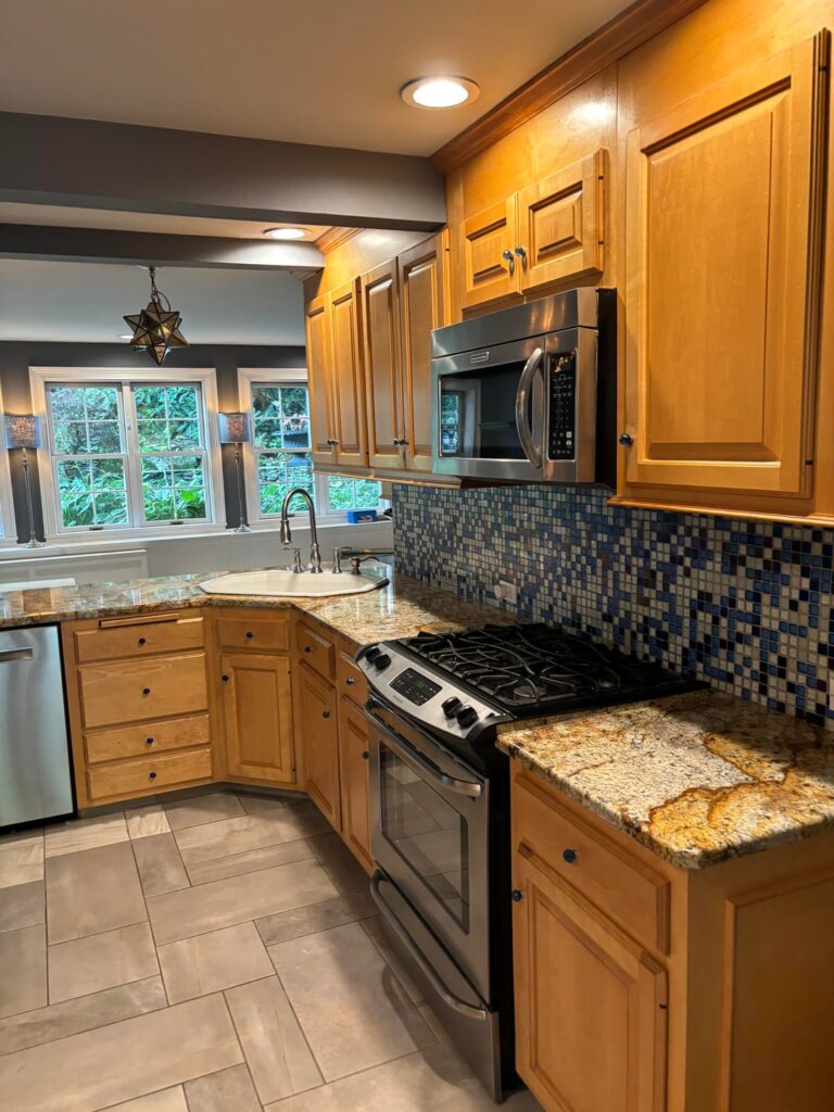
From this angle, the existing workflow becomes especially clear. Refrigerator, sink, and range formed an efficient triangle long before cosmetic upgrades entered the conversation. Many expensive renovations fail because they prioritize appearance over function. This kitchen already possessed functional intelligence.
The mosaic backsplash introduced movement but also fragmentation. Small repeating tiles create visual activity, which can energize some interiors while overwhelming others. In compact cooking zones, too much pattern often reduces perceived openness.
What ultimately elevates later images is not a new arrangement but the reduction of visual noise. Design psychology teaches us that repetition creates harmony because the brain processes fewer interruptions.
Sometimes the Best Renovations Begin with Restraint
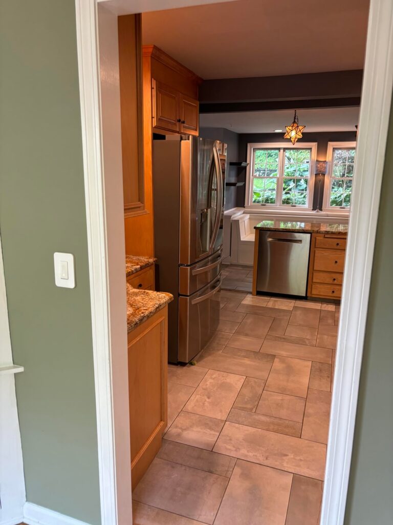
Viewed from the doorway, the kitchen already benefited from generous natural light and a comfortable footprint. The challenge was never size. Instead, it was identity. Many homeowners underestimate how profoundly color influences spatial experience.
The original cabinetry enclosed the room visually despite its light finish. Because surfaces shared similar values and textures, architectural details faded into the background. Distinction creates clarity, and clarity creates elegance.
Beneath the surface lies an important lesson: preserving infrastructure often frees budgets for craftsmanship. The most successful projects frequently invest where people see and touch every day.
Color Became Architecture Rather Than Decoration
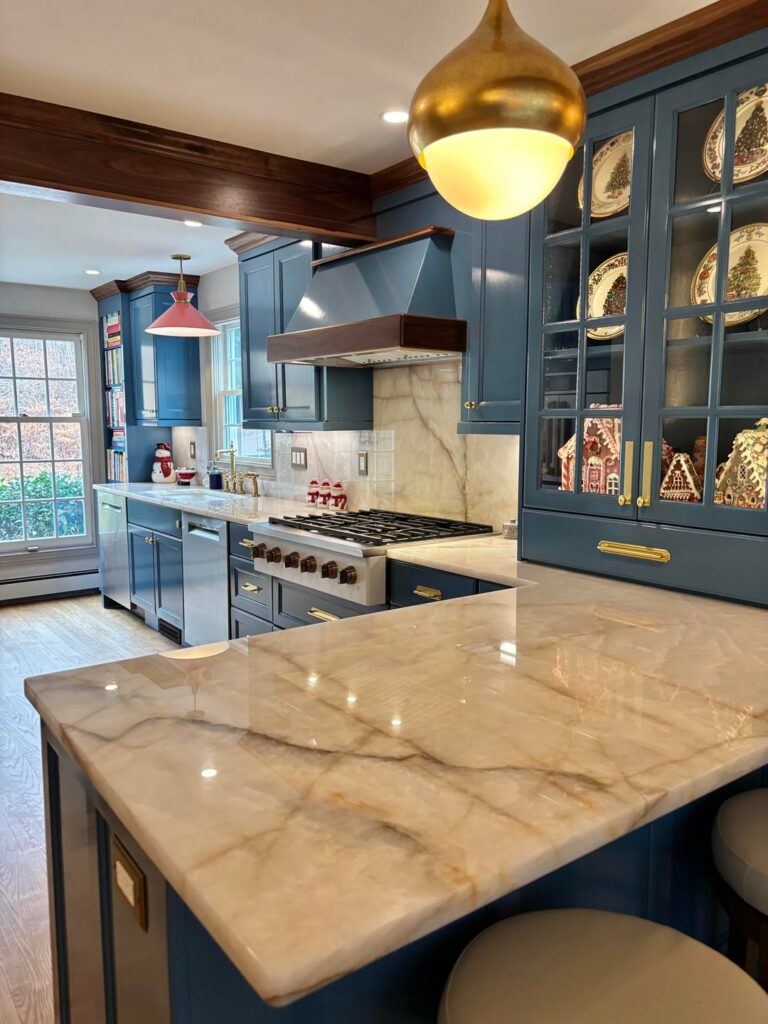
The completed kitchen immediately reveals why blue became the defining gesture. Rich cabinet fronts establish depth while allowing surrounding materials to breathe. Instead of overwhelming the room, the saturated hue acts almost like architecture, framing windows and appliances with remarkable precision.
Equally significant, creamy stone surfaces soften the intensity of the cabinetry. Natural veining introduces movement without competing for attention. The result feels layered rather than busy, sophisticated rather than formal.
Dark wood beams across the ceiling perform another subtle task. By repeating throughout adjoining areas, they create continuity that visually stitches the entire level together. Repetition often creates cohesion more effectively than complexity.
The Kitchen Began Speaking to the Rest of the House
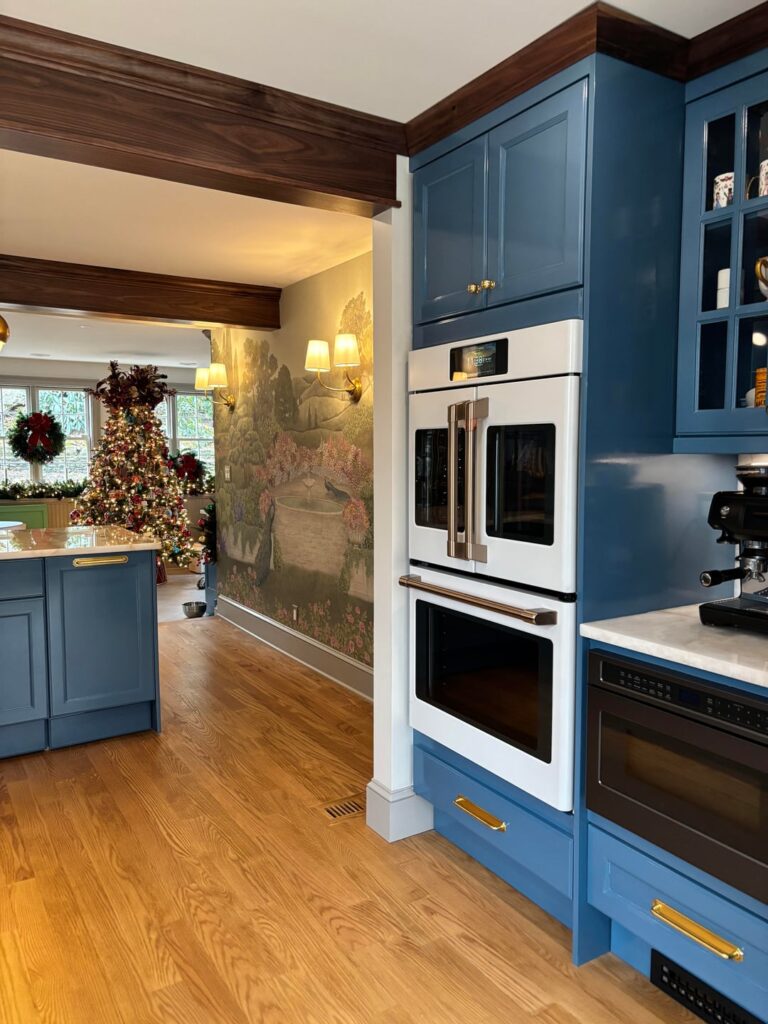
Perhaps most surprising is how seamlessly the renovated kitchen now relates to neighboring spaces. The blue cabinetry no longer reads as an isolated design decision. Instead, it participates in a broader narrative of rich wood tones, brass lighting, and traditional detailing.
The mural visible beyond the kitchen introduces softness through imagery rather than additional materials. Landscapes have long been used in interiors because they create psychological depth, encouraging the eye to travel beyond physical boundaries.
White appliances often struggle within darker palettes, yet here they become sculptural elements. Framed by blue millwork, the ovens read as an intentional composition rather than a necessity.
Light Matters More When Surfaces Become Deeper
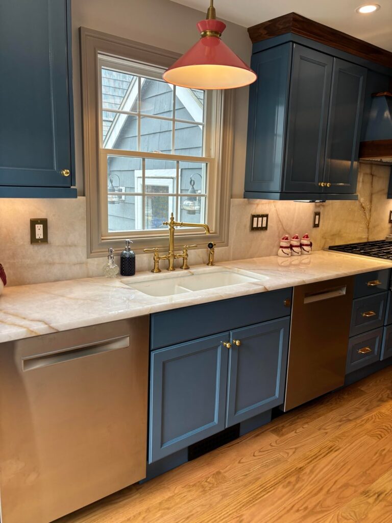
Dark cabinetry succeeds only when balanced by thoughtful illumination. The brass faucet, reflective appliances, and pale counters work together to bounce light throughout the room, preventing the blue from feeling heavy.
Natural daylight from the window becomes especially important. Designers frequently describe windows as the most valuable decorative element in any interior because they change constantly throughout the day. Materials appear richer when they interact with shifting light.
From a functional perspective, integrated stone backsplashes simplify maintenance while reinforcing continuity. Fewer material transitions create cleaner visual lines and quieter compositions.
Books Turn Storage Into Personality
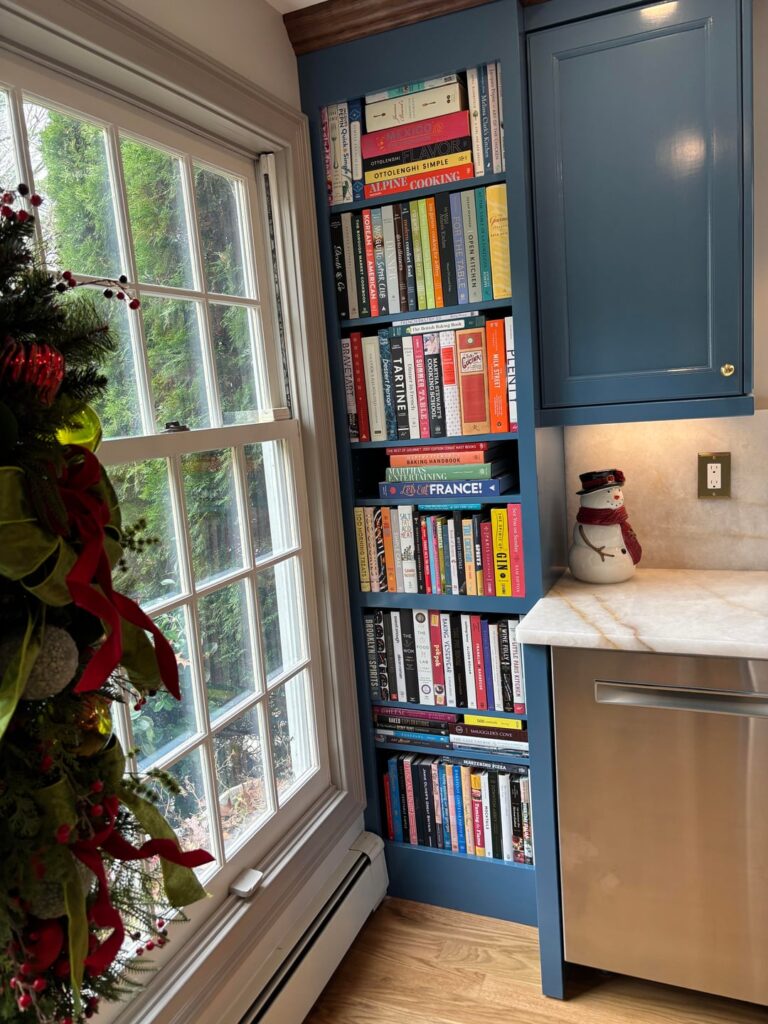
Few additions humanize a kitchen more effectively than books. This built-in shelf does more than provide storage. It reveals habits, interests, and routines. Cookbooks suggest use rather than display, reminding visitors that kitchens are living environments rather than showrooms.
Hard surfaces establish order, but personal objects create emotional connection. A collection accumulated over time introduces authenticity that cannot be purchased in a single shopping trip.
The surrounding millwork also deserves attention. By integrating shelving directly into cabinetry, the design achieves permanence. Built-ins often feel luxurious because they appear inseparable from the house itself.
Even Transitional Spaces Deserve Ceremony
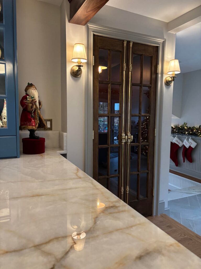
French doors framed by sconces introduce an unexpectedly formal moment. Passageways are often overlooked during renovation, yet they shape daily experience more frequently than statement pieces.
Wall lighting positioned at eye level creates intimacy because it illuminates people rather than surfaces. Unlike overhead fixtures, sconces produce softer shadows and a more residential atmosphere.
The dark wood doors echo ceiling beams elsewhere in the home, creating rhythm through repetition. Consistent materials quietly guide movement and establish visual order.
Hospitality Found a Permanent Home
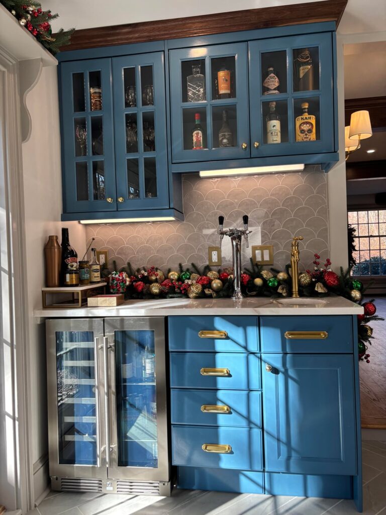
A dedicated beverage area acknowledges an evolving reality of modern kitchens: they are no longer solely for meal preparation. Increasingly, they serve as gathering spaces where conversation happens as often as cooking.
Glass-front cabinetry prevents the blue from becoming visually dense while displaying barware with restraint. Transparency creates lightness, an important principle whenever darker finishes dominate.
Under-cabinet illumination adds another layer of depth. Lighting hidden from view often produces the most luxurious effect because the source disappears while the glow remains.
The Final Reveal Feels Collected Rather Than New
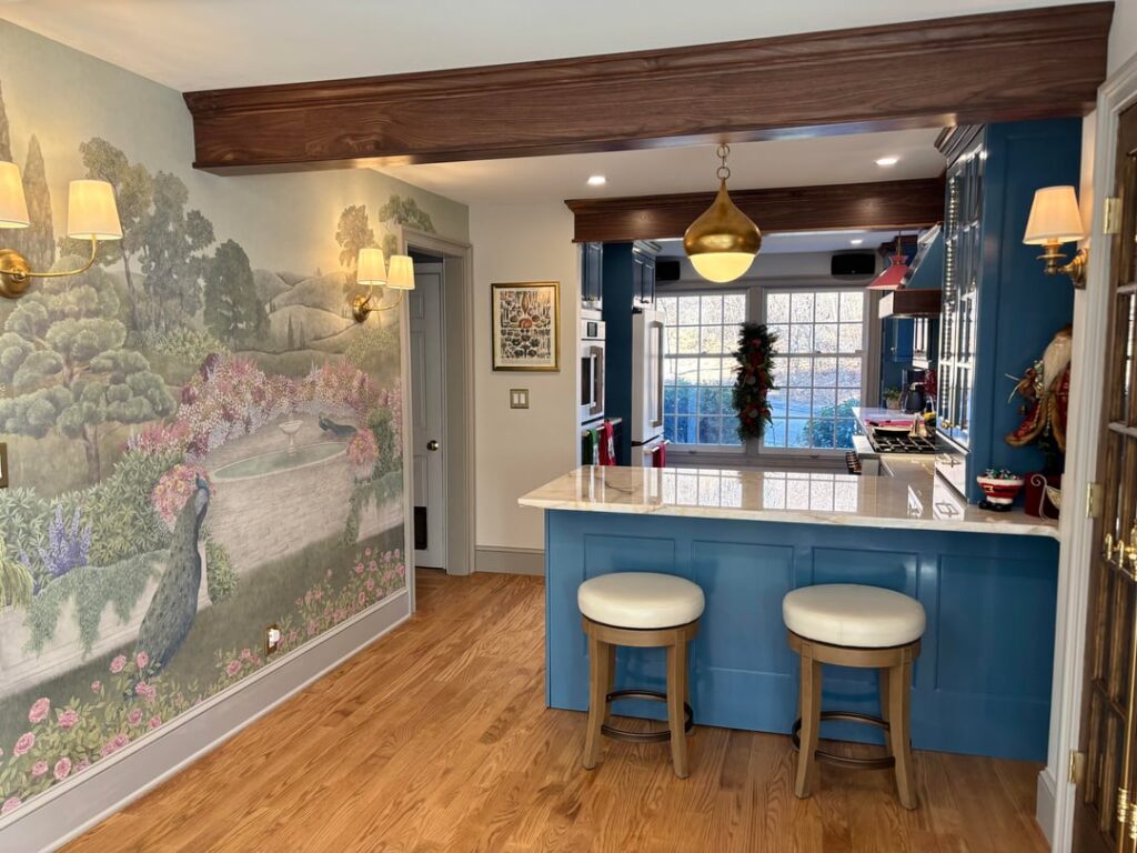
Stepping back reveals the renovation’s greatest achievement. Nothing appears overly coordinated. Instead, brass, wood, stone, blue cabinetry, and artwork coexist with the ease of a home that has evolved naturally over time.
The mural softens strong architectural lines while upholstered stools introduce comfort near hardworking surfaces. Every element balances another: dark against light, polished against textured, traditional against contemporary.
Good interiors rarely rely on a single beautiful object. Their success comes from relationships between materials, scale, and light. This kitchen understands that principle exceptionally well.
The Lesson Hidden Inside This Renovation
Many homeowners assume timeless kitchens must be white. This project argues otherwise. Timelessness is less about color and more about proportion, craftsmanship, and consistency.
By preserving the original layout while embracing bold cabinetry, the renovation achieved something increasingly rare: a kitchen with personality that still feels enduring.
Good design rarely begins with more space. More often, it begins with seeing existing spaces differently.
Image Credit: All renovation and styling images courtesy of Instagram user @AgentMulder2023
Take the Next Step in Your Remodel
• How to Paint Kitchen Cabinets
• How to Organize Kitchen Cabinets
• How to Decorate Top Of Cabinets
• How to Clean Grease Off Cabinets