From Frozen Dinners to Custom Millwork: The Story of an IKEA Kitchen Reinvention

This post contains affiliate links, and we will be compensated if you buy after clicking on our links. Read our disclaimer.
Read our editorial process
A fresh coat of paint can completely change the look of a bedroom.
Scuffed walls, faded colors, and everyday wear can make a space feel outdated, even when the furniture and decor still work well.
Many painting problems, such as streaks, roller marks, and uneven coverage, come from poor preparation rather than the paint itself. Taking the right steps before you begin makes a big difference.
With the proper tools and techniques, you can achieve a smooth, professional-looking finish without hiring a painter.
Below, you’ll learn how to paint bedroom walls step by step, from preparing the room to applying clean, even coats that refresh the entire space.
Before the Renovation, the Kitchen Had Light but Lacked Presence
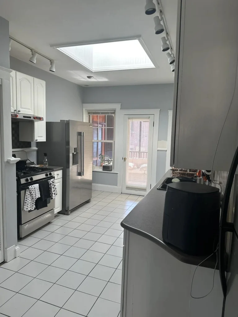
The original kitchen already had several strengths. Natural light poured in through the windows and skylight, while the galley layout provided an efficient flow for everyday use.
Despite those advantages, the space felt unfinished. Upper cabinets stopped short of the ceiling, leaving large blank areas that disrupted the overall balance of the room.
The issue was not a lack of space but a lack of visual continuity. White finishes kept the kitchen bright, yet there was little to guide the eye or create a strong focal point.
From a design perspective, the solution centered on proportion. Extending cabinetry to the ceiling helped create a more cohesive look, making the kitchen feel taller, more refined, and intentionally designed.
Empty Space Above the Cabinets Became the Greatest Opportunity
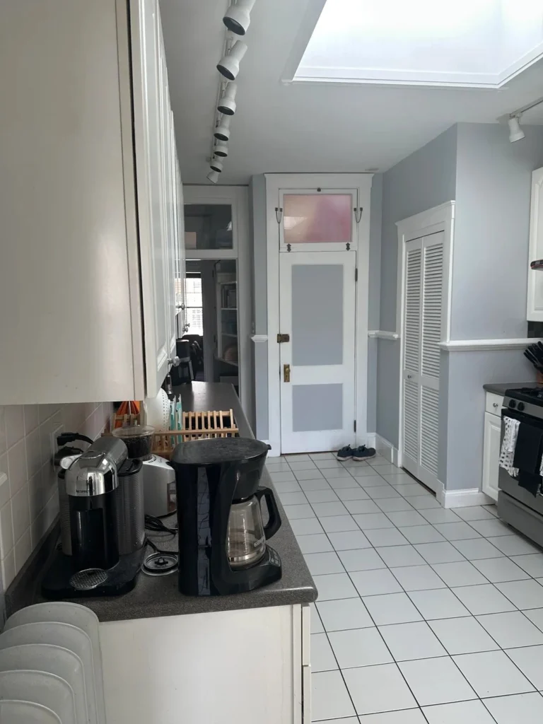
From another angle, the kitchen reveals its greatest hidden asset: height. Many historic homes possess generous ceilings but fail to capitalize on them, leaving valuable storage and visual continuity unused.
Luxury interiors often rely on architectural repetition. Extending cabinetry upward creates uninterrupted lines that guide the eye from floor to ceiling, making the entire interior read as a unified composition rather than a collection of individual objects.
Beneath the visual upgrade lies an important practical benefit. Full-height storage dramatically increases capacity without expanding the footprint. In compact urban homes, vertical square footage often matters more than horizontal expansion.
Color Succeeded Where Square Footage Never Could
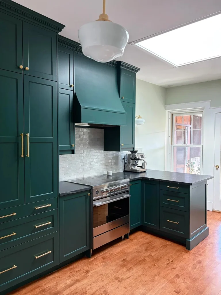
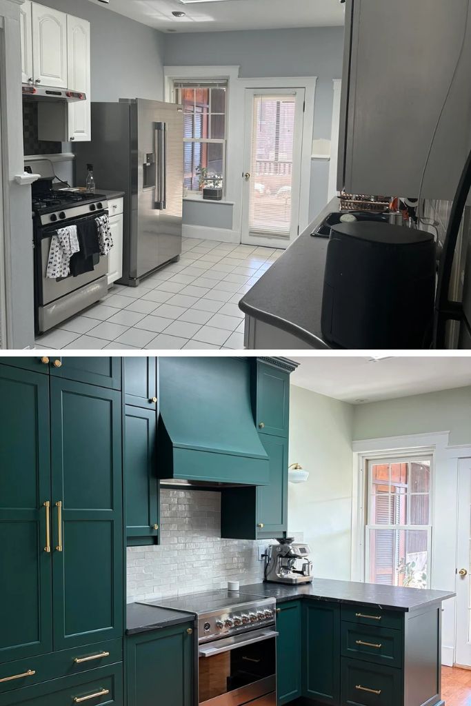
The finished kitchen immediately shifts expectations. Rich green cabinetry replaces the previous pale palette, transforming the room from functional to deeply atmospheric. Dark finishes in smaller kitchens are frequently discouraged, yet this project demonstrates why blanket design rules rarely hold.
Abundant daylight changes everything. Natural light pouring through the skylight softens the cabinetry’s depth, allowing color to create dimension rather than heaviness. Instead of shrinking the room, the darker palette creates visual depth, making the galley feel more layered.
The cabinetry itself tells an even more compelling story. IKEA SEKTION cabinet frames and inserts formed the foundation, while custom fronts and panels from Scherr’s elevated the system into something far more tailored. Because the panels were pre-drilled to IKEA specifications, the final installation achieved the appearance of custom millwork without fully custom pricing.
Altogether, the cabinet system cost roughly $15,000, including painting, a remarkable figure considering the finished result resembles a far more expensive installation.
Materials Quietly Carry the Luxury of the Entire Space
Seen from this perspective, material selection becomes the true story. The cabinetry is anchored by Negresco leathered granite countertops sourced through a family friend’s stone shop. Unlike polished stone, the leathered finish introduces subtle texture while minimizing glare.
Texture matters because interiors are experienced with more than the eyes. Leathered surfaces absorb and diffuse light differently throughout the day, adding complexity without visual noise. The stone’s understated movement complements the cabinetry rather than competing with it.
Behind the induction range sits Zellige bejmat tile from Zia Tile. Handmade tile carries slight irregularities that machine-produced surfaces cannot replicate. Those imperfections catch light differently across each piece, creating movement and depth that become more apparent the longer one spends in the kitchen.
At the same time, brass hardware and lighting from Rejuvenation introduce warmth against the saturated cabinetry. The metal accents quietly bridge historic architecture and contemporary function.
Some of the Most Important Decisions Were Invisible
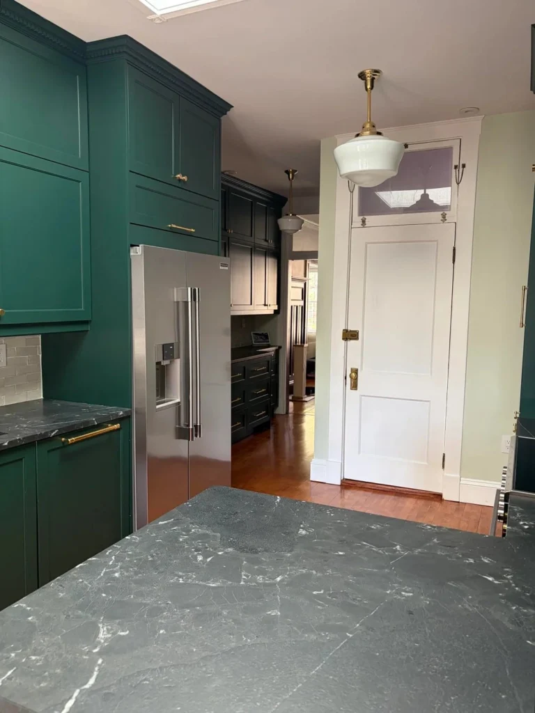
Good renovations know what not to change. The existing windows remained untouched. Door locations stayed the same. Most importantly, the skylight continued delivering daylight deep into the kitchen.
Natural light arriving from above behaves differently from light entering from the side. It reduces shadowing across vertical surfaces, allowing darker colors to appear nuanced rather than heavy. That subtle distinction explains why the cabinetry reads as refined instead of overwhelming.
The custom range hood further strengthens the architectural quality of the kitchen. Built by Hoodsly and paired with a Vent-A-Hood insert, it functions less like an appliance and more like integrated millwork. Its presence anchors the cooking zone while reinforcing symmetry throughout the room.
Even the appliance selections favor restraint over spectacle. A Fisher & Paykel induction range, Bosch dishwasher, Frigidaire refrigerator, Kraus sink, and Kohler faucet quietly support everyday function without competing for attention.
The Laundry Wall Proves Utility Can Be Beautiful
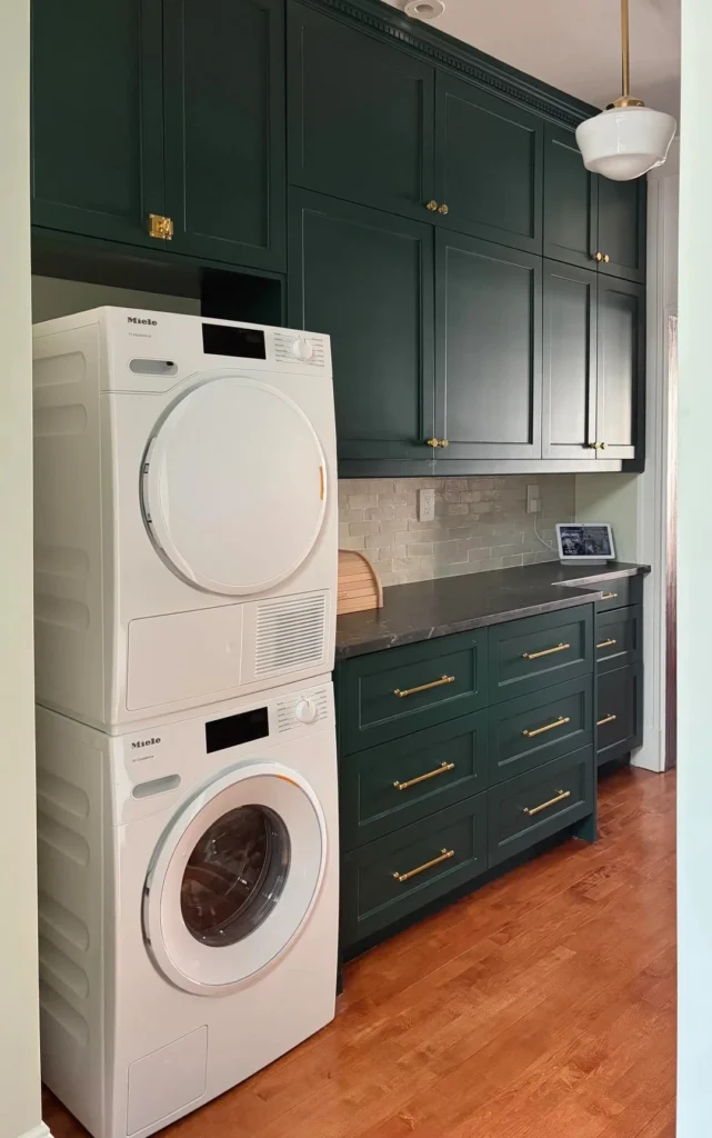
Perhaps the most overlooked achievement lies beyond cooking entirely. Stacked Miele laundry appliances occupy valuable real estate, yet careful millwork transforms them into an intentional extension of the kitchen.
Many homes treat utility areas as interruptions. This renovation does the opposite. Matching cabinetry wraps the laundry zone, creating continuity that allows everyday tasks to disappear into the larger composition.
The ventless Miele dryer exceeded expectations, proving that practical decisions can be as transformative as aesthetic ones. More importantly, integrating these functions into the cabinetry allows the home to operate more efficiently without sacrificing elegance.
Design psychology repeatedly shows that concealed storage reduces visual stress. When fewer objects compete for attention, interiors naturally feel more orderly and restorative.
The Final Layer Lives Underfoot
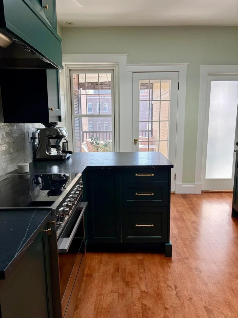
Flooring rarely receives the attention cabinetry commands, yet it often determines how an interior is experienced emotionally. New maple floors finished with gel stain introduce warmth beneath the rich green millwork, preventing the palette from feeling too heavy.
Wood serves an important balancing function in interiors filled with painted surfaces and stone. Its organic variation softens hard edges and brings tactile richness to the composition. That subtle contrast allows the kitchen to feel lived in rather than overly formal.
Pendant lighting overhead reinforces this balance. Traditional forms paired with tailored cabinetry create a dialogue between old and new, allowing the renovation to respect the home’s historic character while embracing contemporary performance.
Viewed as a whole, the project succeeds not because it feels trendy but because it feels rooted. The kitchen belongs to the architecture around it.
A Custom Kitchen Is Not Always About Custom Construction
What makes this renovation memorable is not simply its appearance but its approach. The project proves that luxury often comes from continuity, proportion, and restraint rather than excess.
The budget reflects that philosophy. Roughly $74,000 covered labor and materials in a high-cost-of-living area, while appliances added another $12,000. IKEA cabinet frames accounted for about $4,000, and Scherr’s custom fronts and panels added approximately $6,800 before painting.
Those numbers reveal an important truth about modern renovation: thoughtful customization can achieve extraordinary results without requiring every element to be built from scratch.
Good design rarely begins with more square footage. More often, it begins with seeing existing rooms differently. This galley kitchen never changed its footprint, yet the experience of living within it changed entirely. Perhaps that is the clearest definition of successful design: not creating something new, but revealing potential that was there all along.
Image Credit: Renovation and styling images courtesy of Reddit user u/After_Canary7347.
Browse More IKEA Kitchen Remodels
• Bold Red Galley Kitchen Transformation
• White Oak Kitchen Remodel 1960s Home
• Blue Kitchen Builder Grade To Custom Renovation
• Luxury Kitchen Design Ideas