Warm White Oak Replaced a Remodel Nightmare With Quiet Luxury

This post contains affiliate links, and we will be compensated if you buy after clicking on our links. Read our disclaimer.
Read our editorial process
Some renovations begin with a clear vision. Others begin with survival. What makes this home remarkable is not simply the finished kitchen, but the fact that it emerged from months of setbacks that would have stopped many projects entirely.
Burst pipes, flooding, contractor bankruptcy, a break-in, and three months without power could have turned this house into a cautionary tale. Instead, the result is a deeply personal renovation that proves patience often leaves the strongest mark on a home.
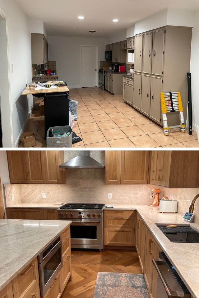
The house itself dates back to the 1960s, carrying decades of layered updates. An addition created extra square footage years later, yet left behind an awkward relationship between the kitchen and the living areas. Solving that disconnect became the project’s defining challenge.
The hero decision behind this renovation was opening the wall between the kitchen and the living area. Every other element, from white oak cabinetry to herringbone flooring, works because circulation and connection came first.
Perhaps most surprising is how much remained untouched. The home kept its original footprint. Plumbing zones largely stayed where they belonged. Rather than expanding outward, the renovation reimagined how existing spaces communicate with one another.
Before Beauty, the Kitchen Carried Decades of Compromise
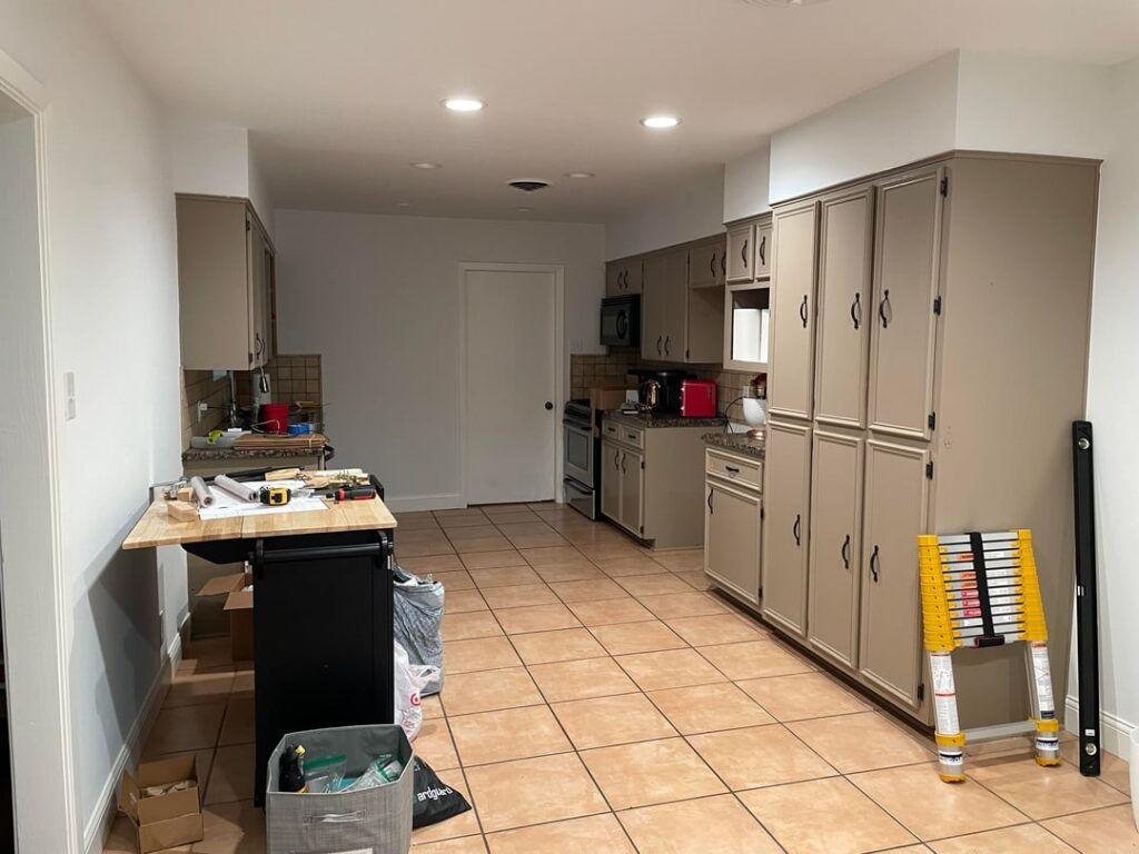
Before construction began, the kitchen reflected many homes built in the mid-century era: generous storage paired with limited interaction. Tall cabinetry lined one side of the room, while an enclosed layout separated cooking from everyday living. The added living area introduced years later increased square footage but never fully resolved circulation.
What stands out in the original condition is not a lack of size, but a lack of connection. Wide tile floors, bulky cabinet banks, and visual interruptions prevented the eye from traveling naturally through the home. Even larger interiors can feel constrained when boundaries accumulate over time.
Design psychology often comes down to continuity. Human perception reads uninterrupted sightlines as openness, regardless of actual dimensions. By removing barriers instead of adding square footage, the renovation addressed experience rather than area, a distinction many successful projects share.
A Single Opening Changed the Entire Experience of the House
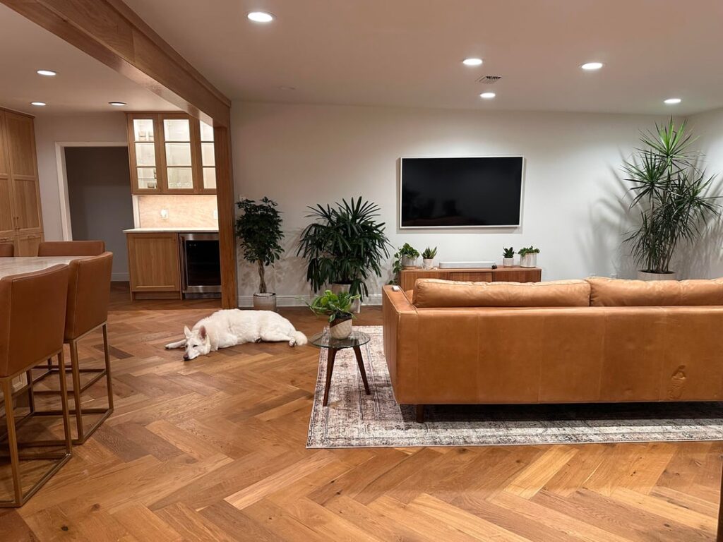
Viewed from the living area, the relationship between kitchen, dining, and lounge spaces now feels remarkably effortless. Structural beams frame transitions without closing them off, creating subtle boundaries while preserving openness. The home finally behaves like one unified environment rather than several disconnected zones.
The herringbone white oak flooring deserves particular attention. Because the pattern flows uninterrupted across spaces, it acts almost like visual stitching, connecting functions while maintaining consistency. Repetition of material often creates harmony because the brain processes fewer changes along its path.
Soft furnishings contribute just as much as hard surfaces. A caramel leather sofa echoes the warmth of surrounding wood tones, while indoor plants introduce organic shapes that soften strong linear elements. Even the family dog resting peacefully on the floor communicates something important: the home feels lived in rather than staged.
Natural Materials Often Succeed Where Trends Quickly Fade
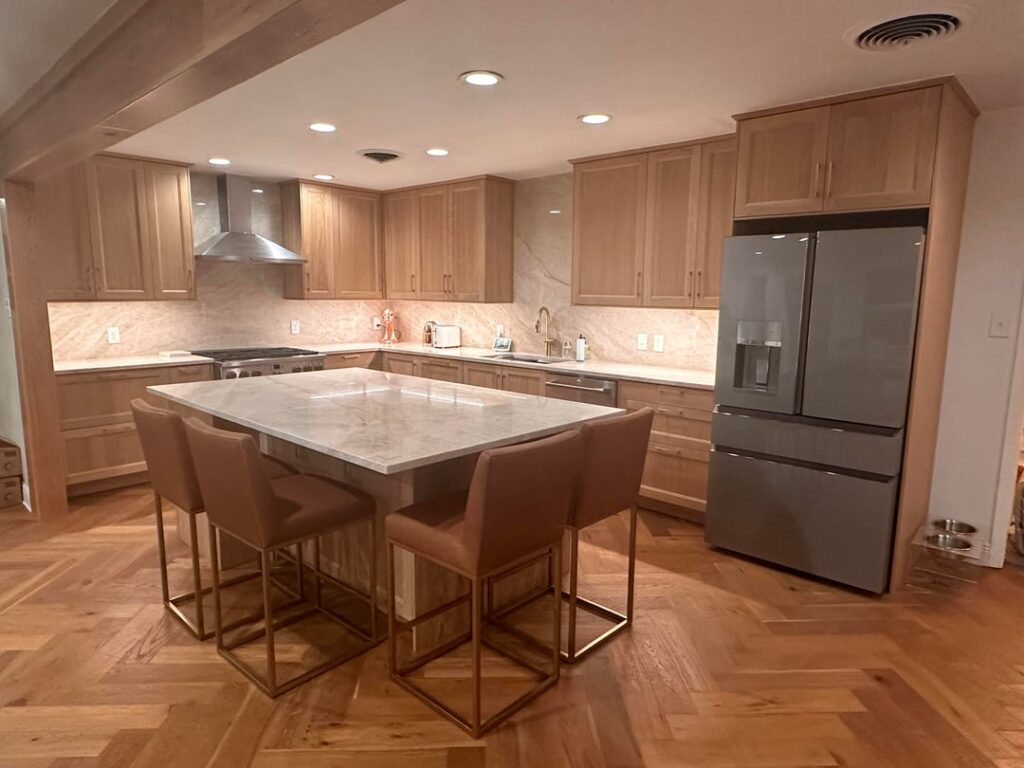
The completed kitchen immediately distinguishes itself through restraint. White oak veneer cabinetry from IKEA delivers custom millwork character without visual heaviness, while Taj Mahal quartzite introduces movement through subtle veining rather than dramatic contrast.
Material pairings succeed when they balance one another. The cabinetry carries visible grain and tactile richness, while the stone surfaces provide quiet elegance. Neither competes for attention. Instead, each surface allows the other to breathe, creating a layered composition that feels collected over time.
Equally significant is the choice to avoid upper cabinets on every wall. Visual density often makes kitchens feel compressed. By introducing moments of openness and glass-front storage, the eye receives places to rest, increasing perceived spaciousness without changing the footprint.
The Island Became Furniture Rather Than Pure Utility
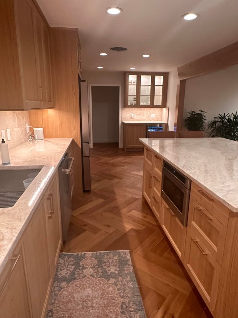
Large islands often dominate kitchens visually. Here, the proportions remain generous while still feeling balanced because the island reads more like furniture than infrastructure. Its waterfall-inspired mass is softened by pale stone and surrounding wood textures.
Seating transforms the island into a social anchor. Rather than isolating the cook, guests can gather naturally without disrupting work zones. Good kitchen planning rarely depends on square footage alone. It depends on whether movement feels intuitive.
Lighting plays a subtle but important role. Recessed fixtures distribute illumination evenly, preventing harsh shadows across work surfaces. Consistent lighting reduces visual fragmentation, which often contributes to interiors feeling more composed and easier to navigate.
The Details Quietly Suggest Custom Craftsmanship
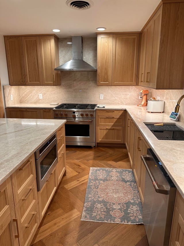
At first glance, many visitors would likely assume this kitchen was built entirely by custom cabinetmakers. Yet much of its success comes from proportion, alignment, and finish selection rather than extravagant spending.
Panel-front white oak cabinetry introduces depth through shadow lines and texture. Hardware remains understated, allowing natural materials to carry the visual weight. The stainless range hood introduces an industrial counterpoint, preventing the palette from becoming overly rustic.
Beneath the surface lies one of the renovation’s strongest achievements: efficiency. The work triangle remains compact and functional, while expanded storage keeps counters largely free of clutter. A composed kitchen often feels luxurious not because of cost, but because everyday tasks require less effort.
Small Supporting Spaces Matter More Than Most People Realize
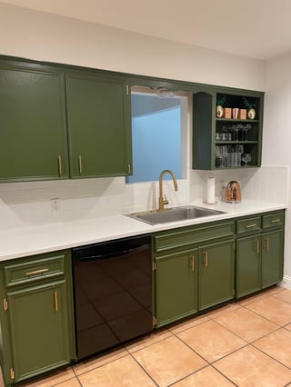
Beyond the primary work area sits a dedicated beverage and storage zone that quietly improves daily life. Glass-front cabinetry introduces reflection and depth while displaying objects without overwhelming the eye.
Supporting spaces like this often determine whether a kitchen stays organized months after renovation. By assigning specific functions to smaller areas, the main counters remain calmer and more usable. Good planning is often invisible precisely because it works so well.
The transition toward the living area feels especially important. There are no abrupt material changes or competing finishes. Instead, continuity carries the eye naturally outward, reinforcing the sense that the home was always intended to function this way.
Even the Color Story Speaks a Different Language Now
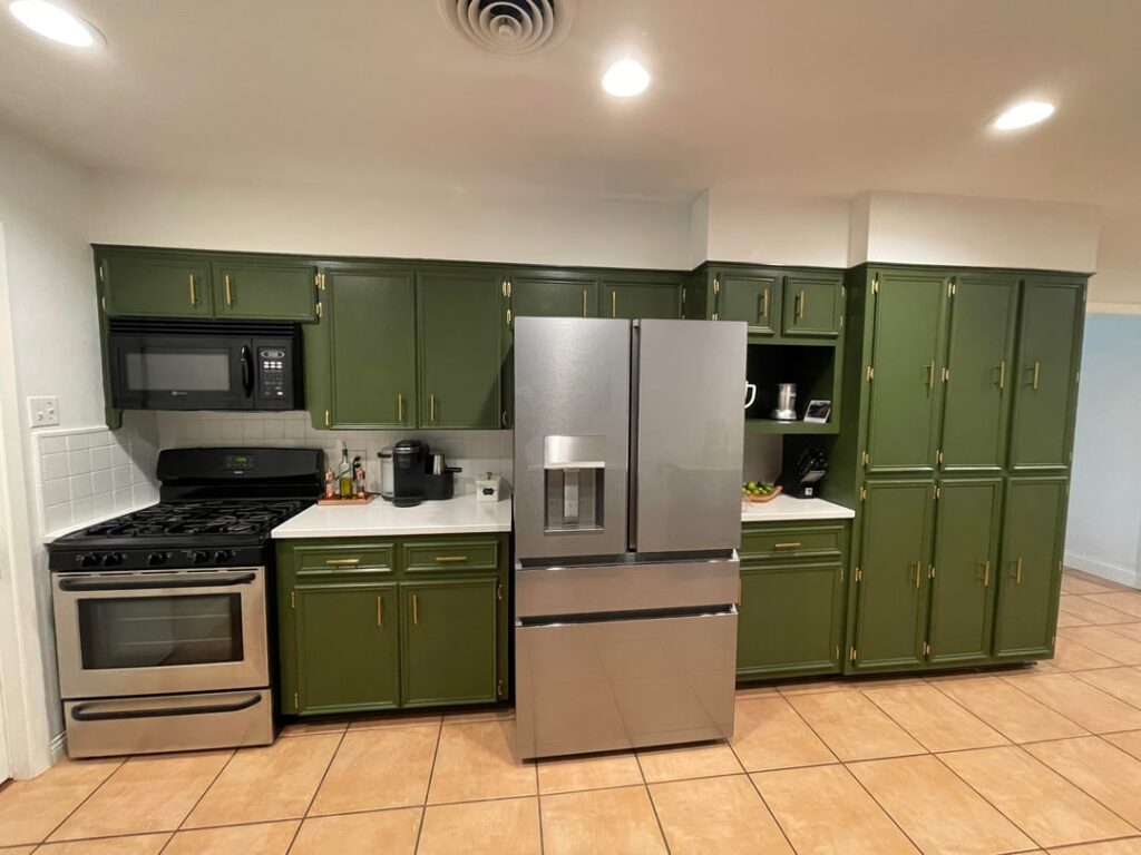
Looking back at an earlier stage of the home reveals how dramatically perception can shift. Deep green cabinetry brought personality, yet the enclosed arrangement still limited interaction with surrounding spaces. Color alone cannot solve circulation problems.
The previous tile flooring introduced numerous grout lines that visually fragmented the interior. Large-scale herringbone planks now create longer sightlines, making the floor read as a continuous surface rather than a grid of smaller sections.
Design psychology repeatedly shows that continuity creates comfort. When surfaces, tones, and textures work together, environments feel easier to understand. The result is not merely aesthetic improvement but a deeper sense of ease during everyday life.
When Renovations Become Personal Histories
Some projects are measured by budgets and timelines. Others become markers of endurance. Living through flooding, power loss, contractor failures, and unexpected setbacks changes the meaning of a renovation. The finished kitchen becomes more than cabinetry and stone. It becomes proof of persistence.
The most successful homes rarely begin with perfect conditions. They emerge through careful choices, restraint, and the willingness to keep moving forward when projects become difficult. Good design rarely begins with more space. More often, it begins with seeing existing spaces differently.
Image Credit: All renovation and styling images courtesy of Instagram user @wetheliving.
Learn From Real Kitchen Remodels
• Open Kitchen Shelves Kitchen Remodel
• Tiny Kitchen Remodel With Breakfast Nook
• Copper Kitchen Ideas
• Coffee Station Ideas