This Tiny Kitchen Kept Its Footprint but Gained an Entirely New Way of Living

This post contains affiliate links, and we will be compensated if you buy after clicking on our links. Read our disclaimer.
Read our editorial process
Some kitchen renovations focus on expanding square footage. Others transform the way a space functions without changing the footprint at all.
This kitchen falls firmly into the second category. At first glance, the changes feel substantial, yet much of the original layout remains intact.
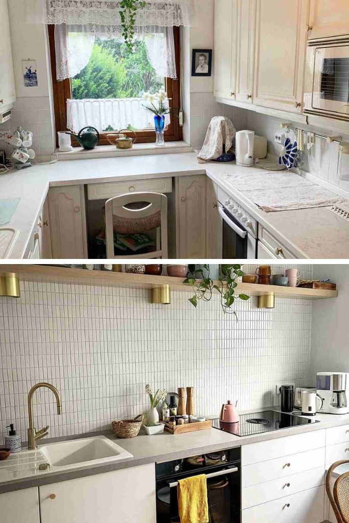
The window stayed in place, plumbing locations were largely untouched, and the room occupies the same footprint it always did. Despite that, the kitchen feels noticeably different today.
The transformation centers around one smart design decision. A built in breakfast nook introduced additional seating, storage, and a stronger sense of purpose within the room.
That single feature changed how the kitchen is used every day. It created a more inviting atmosphere while making better use of available space.
The result proves that meaningful renovations are not always about moving walls. Sometimes the biggest impact comes from rethinking how the existing space can work harder and feel more connected.
The Problem: A Functional Kitchen That No Longer Fits Modern Life
Older kitchens often carry a particular contradiction. They provide plenty of storage and durable materials, yet struggle to support how people actually use their homes today.
The original kitchen had many qualities worth preserving. Cream cabinetry, generous upper storage, and natural light from the window created a bright environment. But visually, the room felt compartmentalized. Ornamental cabinet profiles, traditional glass fronts, and heavy upper storage pulled attention upward and compressed the space.
In smaller rooms, visual complexity matters as much as physical size. A kitchen can be perfectly functional and still feel crowded. The eye works harder when surfaces compete for attention, making spaces feel smaller than they truly are.
This renovation recognized that challenge early. Rather than expanding outward, it focused on creating calm.
What Stayed the Same
The most surprising detail may be how much remained untouched. The renovation never expanded the kitchen’s footprint, nor did it introduce dramatic structural changes.
The window remains in the same location, continuing to anchor the room with natural light. Plumbing appears largely unchanged, preserving the efficiency of the existing layout. The kitchen still functions as a compact workspace organized around the perimeter.
Retaining these elements matters because successful renovations are not always about replacement. Often, they begin by identifying what already works and allowing those strengths to become more visible.
Good design rarely starts from zero. It starts with careful editing.
Before and After Overview
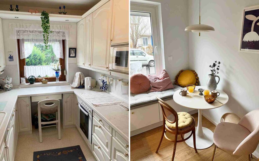
The side-by-side comparison immediately reveals the project’s central achievement. The original kitchen leaned heavily into traditional detailing, while the renovated version embraces restraint. The difference is not simply aesthetic. It alters how the entire room is perceived.
Notice how the new space feels visually lighter despite adding a built-in seating area. This may seem counterintuitive. Adding furniture usually consumes space, yet integrated millwork often creates greater efficiency by consolidating functions into one architectural element.
Design psychology plays a major role here. Continuous surfaces, fewer visual interruptions, and simplified cabinetry allow the eye to travel more freely across the room. Spaces often feel larger, not because they are bigger, but because they are easier to read.
The Original Kitchen
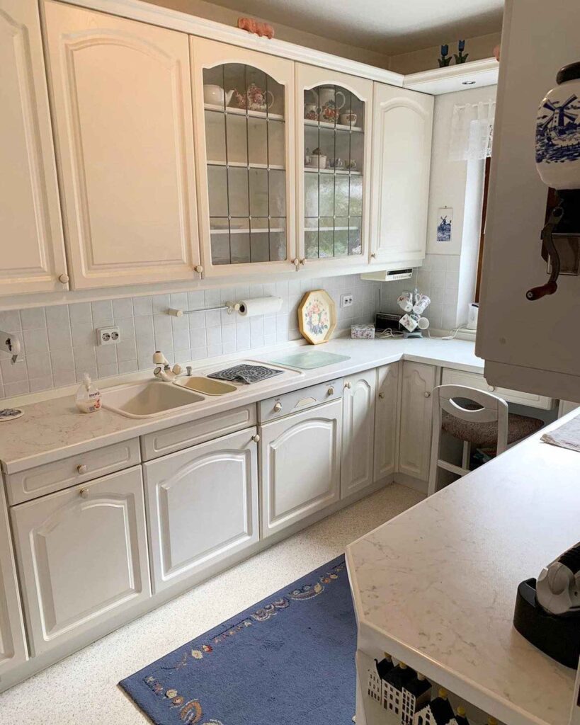
The original kitchen was undeniably practical. Cream-colored cabinetry extended nearly to the ceiling, maximizing storage in a compact footprint. Decorative paneling and glass-front cabinets introduced character, while the window provided valuable daylight.
Yet visual density can sometimes work against spatial comfort. Ornamental cabinet profiles create shadows and movement across surfaces, causing small rooms to feel busier. The large volume of upper cabinets also concentrated visual weight at eye level.
Light colors kept the room bright, but brightness alone does not create spaciousness. Visual simplicity matters just as much. This kitchen had strong bones, yet its potential remained partially hidden beneath layers of detail.
The Demolition Phase
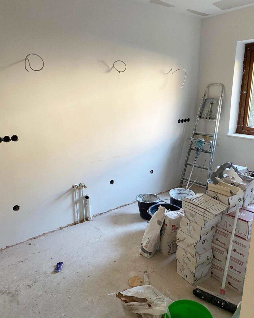
Demolition images often appear chaotic, but they reveal something important about renovation: every finished room begins as uncertainty. Exposed wiring, unfinished walls, and construction materials tell the story of transformation in progress.
At this stage, the future layout becomes easier to understand. Removing cabinetry exposes the true proportions of the room and clarifies how light enters the space. Without visual clutter, the architecture begins speaking more clearly.
Many successful renovations rely less on adding elements and more on subtraction. By removing layers accumulated over time, designers often uncover opportunities that were already present but difficult to see.
Early Construction Progress
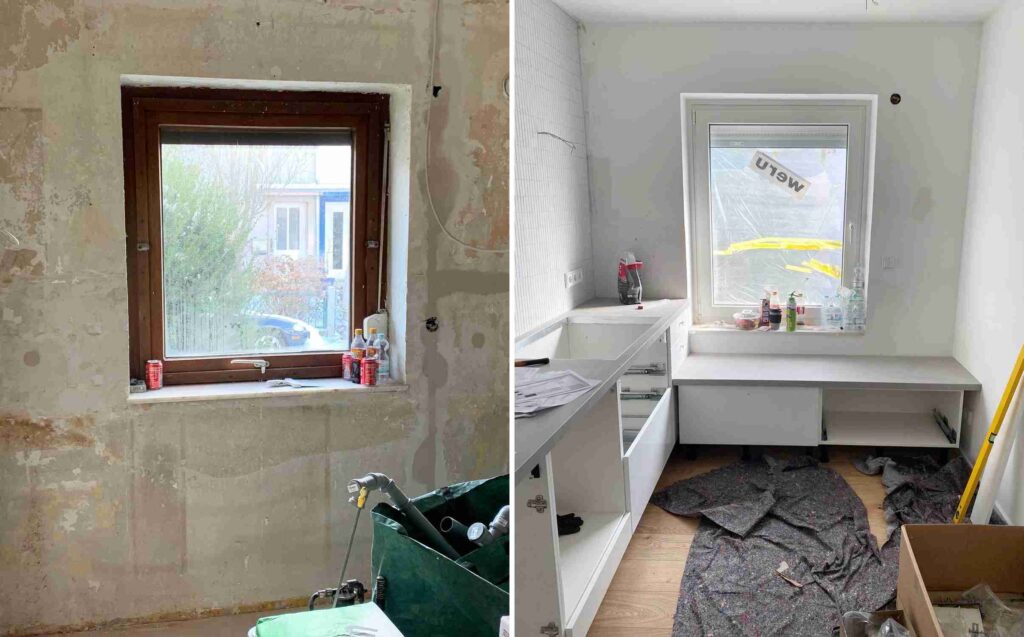
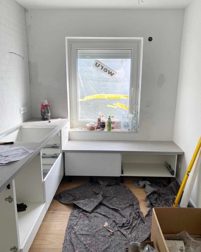
The installation phase reveals the renovation’s defining strategy. Low cabinetry stretches cleanly beneath the window, introducing a built-in bench that immediately changes how the room functions.
This move does more than add seating. It creates a destination within the kitchen. Spaces feel more valuable when they support multiple activities, and the addition of a breakfast nook transforms the room from a workspace into a place for lingering.
Built-ins frequently feel expensive because they suggest permanence. Freestanding furniture can be moved, but integrated millwork appears tailored specifically to the architecture itself.
The New Breakfast Nook
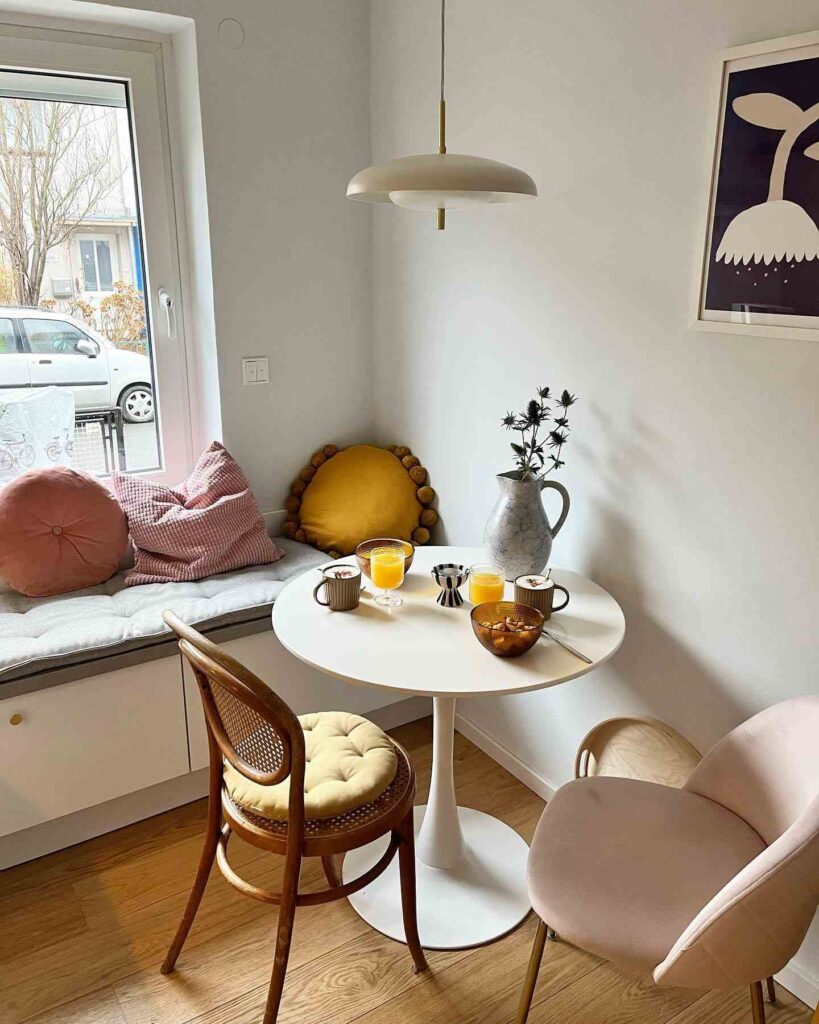
The completed breakfast area may be the renovation’s most transformative feature. A round pedestal table encourages conversation, while the upholstered bench softens the room’s harder surfaces.
Round tables work especially well in compact interiors because they improve circulation. Without corners interrupting movement, the room feels easier to navigate. This subtle design decision increases comfort without requiring additional square footage.
The layered textiles introduce warmth and tactility. Cushions, soft upholstery, and natural wood help balance the kitchen’s clean lines, ensuring the minimalist palette never feels cold.
The New Cabinetry Installation
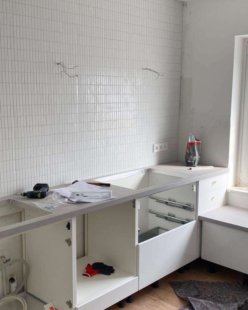
The new cabinetry embraces flat surfaces and restrained detailing. Compared with the original kitchen, the visual language feels considerably quieter. This shift allows other materials, such as wood flooring and tile, to become more prominent.
Uniform cabinet fronts reduce visual noise because uninterrupted surfaces read as larger planes. The result is a kitchen that feels calmer and more expansive despite occupying identical dimensions.
Hardware also plays an important role here. Small brass knobs add warmth and refinement without overwhelming the design. These details operate quietly, yet contribute significantly to the room’s finished character.
Material Palette and Texture
One of the renovation’s most effective material choices is the vertically stacked tile backsplash. The slim format introduces texture without visual heaviness, allowing the wall to remain active yet restrained.
Tile orientation influences perception more than many people realize. Vertical lines subtly draw the eye upward, making ceilings appear taller. Repetition creates rhythm, while minimal contrast preserves calm.
The countertop’s soft gray tone bridges warm wood flooring and white cabinetry. This layered neutrality creates depth, proving that minimalist interiors often rely on subtle variation rather than stark contrast.
Open Shelving and Styling
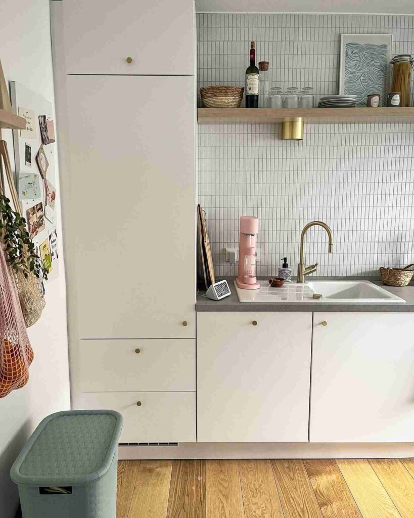
Open shelving introduces a degree of softness often missing from highly efficient kitchens. Ceramics, glassware, framed art, and plants provide variation in shape and material without overwhelming the room.
Styling succeeds when it feels collected rather than decorated. Here, objects appear useful as much as beautiful. Everyday items remain accessible, turning ordinary routines into small rituals.
Plants deserve special attention. Organic forms soften straight architectural lines, while trailing greenery introduces movement that prevents the kitchen from feeling overly structured.
The Completed Cooking Zone
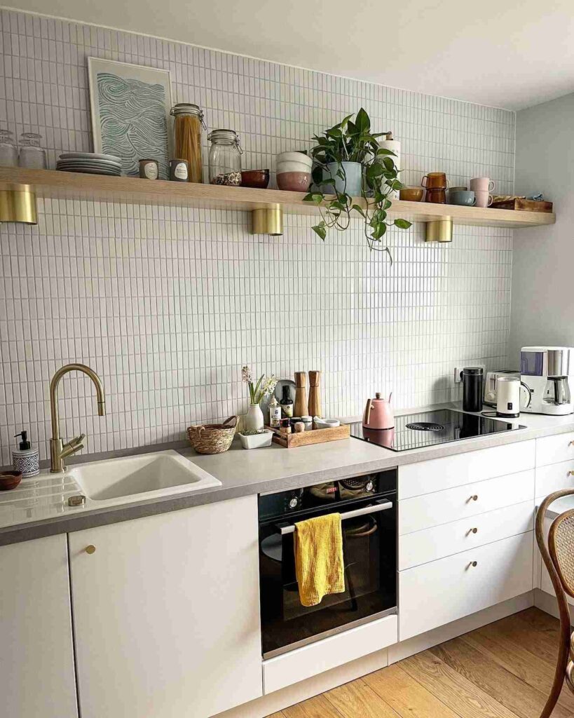
The finished cooking area demonstrates how restraint can create luxury. Brass fixtures add warmth, wood shelving introduces natural texture, and neutral cabinetry allows materials to speak for themselves.
Large uninterrupted cabinet surfaces contribute to visual calm. Meanwhile, the continuous backsplash establishes cohesion across the entire wall. These choices create a stronger sense of order, which people often interpret as sophistication.
Expensive spaces rarely depend on expensive materials alone. They rely on consistency, proportion, and careful editing. This kitchen succeeds because every element appears to belong to the same conversation.
Final Before and After
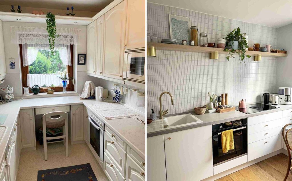
Placed side by side, the before-and-after images reveal a renovation built on precision rather than excess. The room did not become larger, but it became more useful, more inviting, and significantly more intentional.
The integrated dining nook changed how the kitchen functions throughout the day. It is no longer only a place for cooking. It supports morning coffee, quiet reading, conversation, and shared meals.
That may be the renovation’s greatest lesson. Design is rarely about adding more. Often, it is about understanding what a room could become and permitting it to do so.
Design Lesson
Good design rarely begins with more space. More often, it begins with seeing existing spaces differently. The most successful renovations do not always rebuild a room. They simply reveal the potential that was already there.
Image Credit: All renovation and styling images courtesy of Instagram user @casafabelhaft.
Browse More Small Kitchen Inspiration
• Open Kitchen Shelves Kitchen Remodel
• Luxury Kitchen Design Ideas
• White Oak Kitchen Remodel 1960s Home
• IKEA SEKTION Galley Kitchen Hack