What Colors Are Used in Boho Decor? My Beginner-Friendly, No-Pressure Guide to Getting the Vibe Right
If you have ever wondered what colors are used in boho decor and why some spaces feel effortlessly cozy while others feel a little off, you are not alone. This is a real-life, no-pressure look at how warm neutrals, earthy tones, and softened color choices actually work together in homes people live in.
Before We Talk Color, Let’s Calm the Whole Thing Down
I want to start by saying this quietly, like we are leaning across the table while our coffee gets cold.
Boho decor is not about picking the “right” colors. It is about choosing colors that feel lived in, collected, and a little emotionally attached.
If you have ever Googled boho color palettes and immediately felt overwhelmed by words like palette, balance, and cohesion, same. I have been there. Sitting on the floor at 9:42 pm surrounded by paint swatches, wondering why everything I picked suddenly looked like a sad rental.
This guide is me walking you through how I actually think about boho color. Real mess. No design school energy. Boho color is flexible, forgiving, and human. Once you understand that, it gets way easier to trust yourself.
Boho Colors at a Glance
The Quick Answer So You Do Not Overthink It
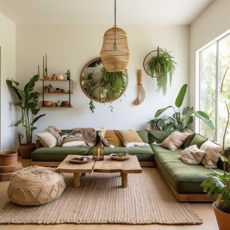
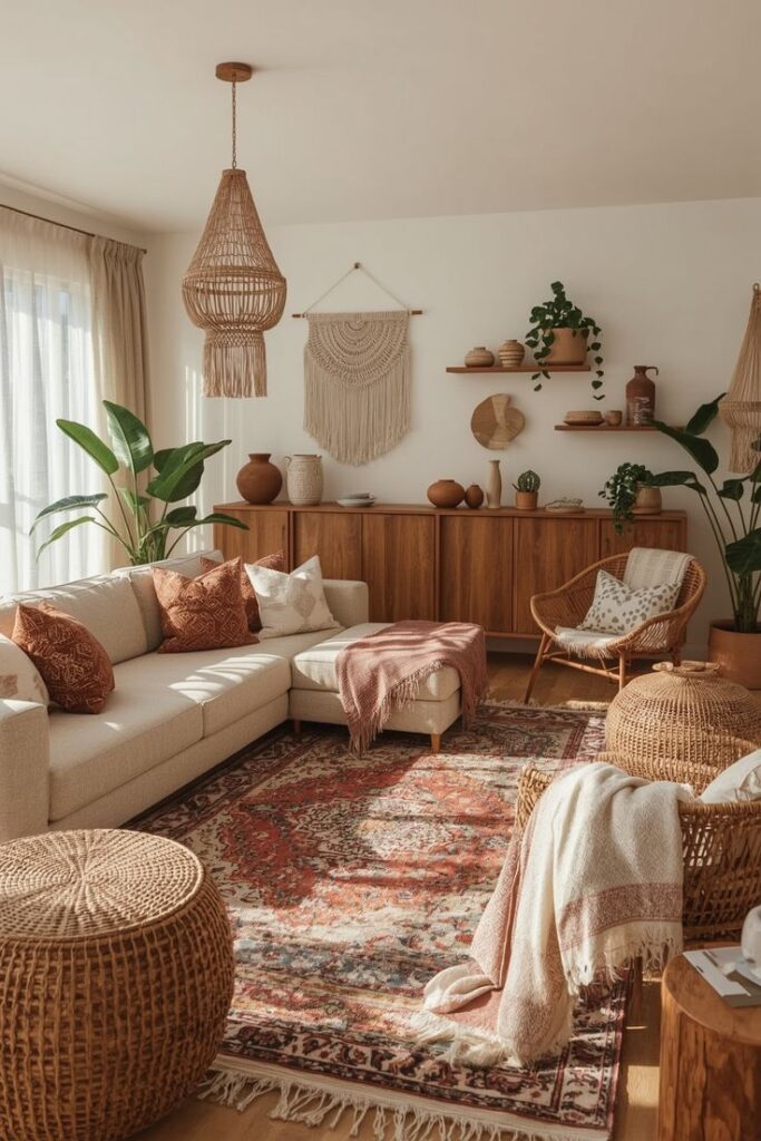
Boho color is warm, earthy, and slightly sun-faded, like it has been loved for a while. It is less about perfect matching and more about colors that feel calm together, even when there are a lot of them.
Think in color families, not exact shades.
Warm Neutrals
Warm white, cream, oatmeal, sand, warm beige
Earth Tones
Terracotta, clay, caramel, cinnamon, tobacco brown
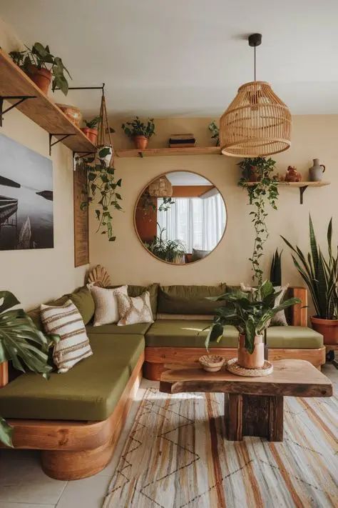
Greens

Sage, olive, eucalyptus, forest
Muted Blues
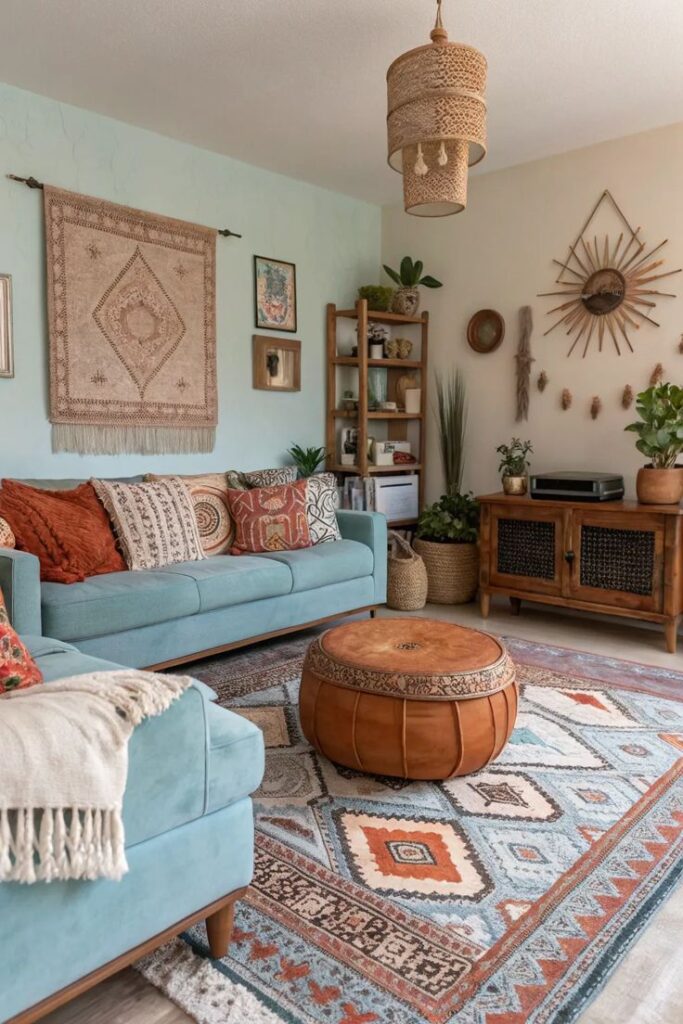
Dusty denim, indigo, slate blue
Soft Warm Accents
Rust, mustard, dusty blush
Deep Accents (Use Sparingly)
Charcoal, matte black, burgundy, deep teal
The Tiny Boho Rule That Saves You
Boho equals a warm neutral base plus two or three sun-faded colors plus wood plus texture.
If a color feels icy, shiny, neon, or super crisp, it usually fights the vibe.
Quick Pick Your Boho Mood Palettes
Light and Airy Boho
Warm white, sand, sage, tiny touches of brass
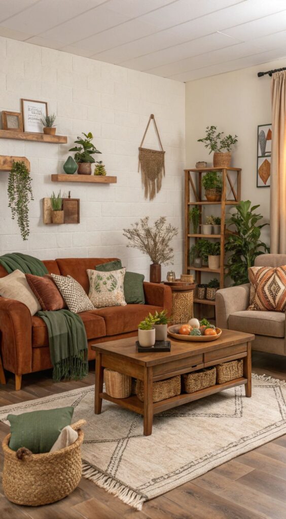
Cozy Earthy Boho
Cream, terracotta, olive, walnut wood
Moody Boho
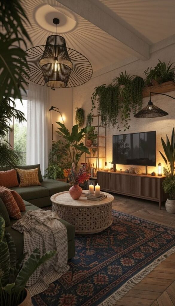
Warm beige, indigo, rust, charcoal with small black accents
Undertone Sanity Check
Boho colors usually look a little dusty or softened, not glossy or sharp. Always test fabric and paint in daylight and at night with lamps on, because boho lives in that warm, glowy in-between.
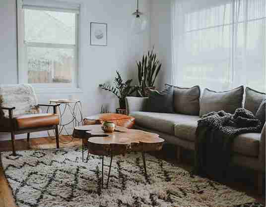
Earth Tones and Neutrals Are the Backbone
Even When the Room Looks Colorful
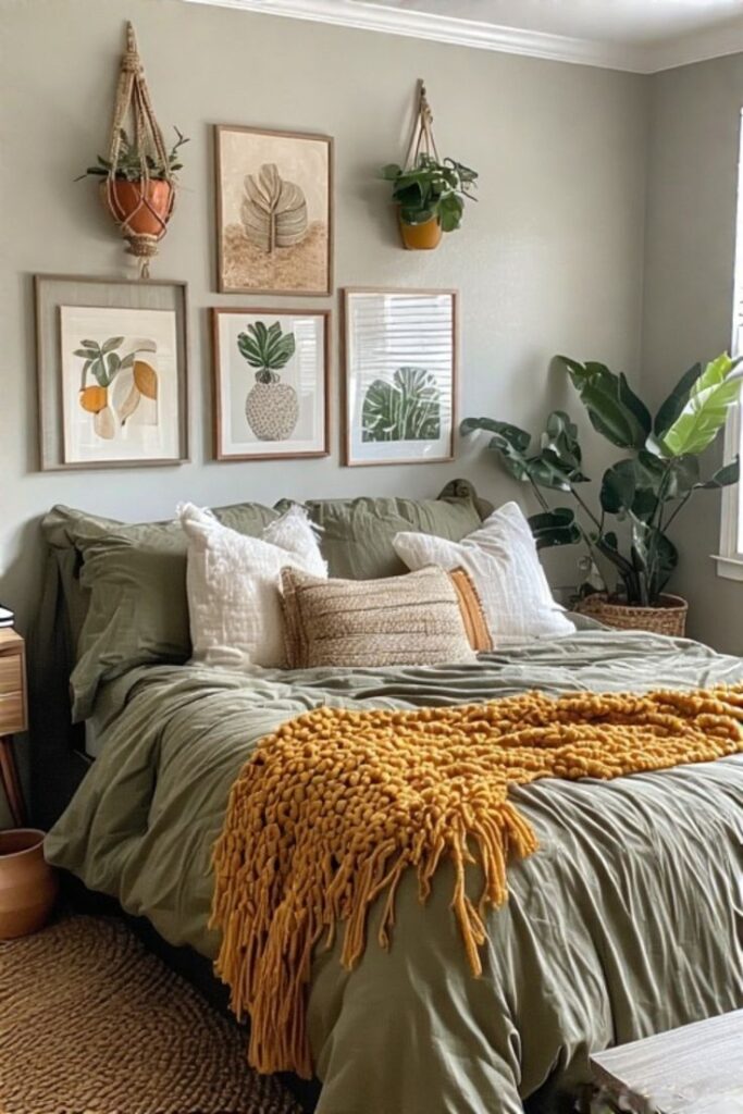
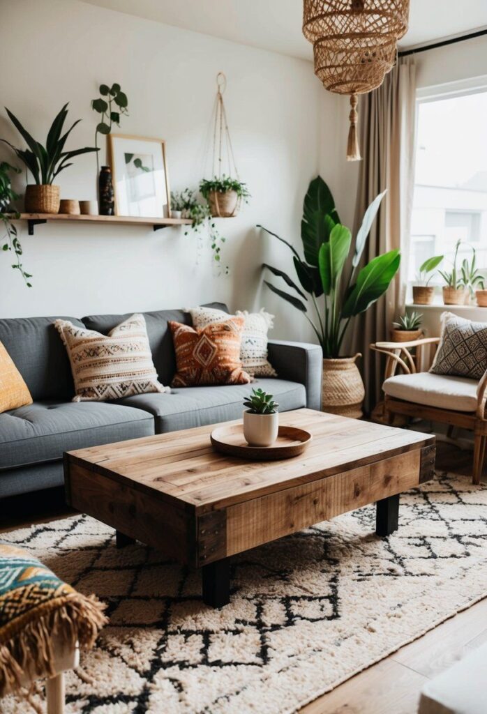
Boho spaces almost always start with earthy colors and warm neutrals, even if you do not notice it at first. That is what gives them that grounded exhale feeling.
When I say earth tones, I mean the colors you see outside without trying. Clay, sand, faded grass, warm soil, sunbaked terracotta. Warm beige that leans creamy, not gray.
These tones usually show up in the big stuff: walls, rugs, sofas, larger furniture pieces. They hold everything together quietly while the fun layers do their thing.
Warm neutrals do a shocking amount of heavy lifting in boho style. They make bold colors feel softer and patterns feel intentional instead of chaotic. A soft white wall with a yellow undertone. A tan linen sofa that wrinkles if you breathe near it. A jute rug that sheds and makes you vacuum more than you want to admit. That unglamorous base layer matters.
Boho Color Palette Recipes
Copy These Today Without the 10 PM Panic
Think of these like loose recipes, not rules. You are allowed to tweak based on what you already own, what your light looks like, and whether a dog lives there and claims the sofa.
Warm Neutral, Terracotta, and Olive
- Walls: Warm white or light warm beige
- Sofa or big upholstery: Camel, caramel, or soft tan
- Rug: Cream base with subtle terracotta or brown pattern
- Accents: Terracotta pottery, olive pillows, a little rust
- Wood and metals: Medium to warm wood, aged brass or bronze
Common mistake: Going full desert theme with too much orange
Easy swap: If you already have a gray sofa, warm it up with camel throws and olive pillows so it stops feeling chilly
Cream, Rust, and Indigo
- Walls: Cream with a soft undertone, not stark white
- Sofa or big upholstery: Warm neutral, linen-y if possible
- Rug: Vintage style rug with indigo and faded reds
- Accents: Rust pillows, indigo art, one deep blue throw
- Wood and metals: Walnut or darker wood, blackened or aged metal
Common mistake: Using bright navy so it turns nautical
Easy swap: If you rent and cannot paint, bring cream in through curtains and bedding instead
Sand, Sage, and Mustard
- Walls: Sand or warm beige
- Sofa or big upholstery: Oatmeal neutral
- Rug: Natural fiber or low contrast patterned rug
- Accents: Sage pillows, muted mustard throw, earthy art
- Wood and metals: Light to medium wood, brushed brass
Common mistake: Mustard goes too lemon or sage goes too cool
Easy swap: If you hate rugs, layer the color through pillows and wall art instead
Warm White, Camel, and Deep Teal
- Walls: Warm white
- Sofa or big upholstery: Camel leather or fabric
- Rug: Neutral base with subtle pattern
- Accents: Deep teal pillows, art, ceramics
- Wood and metals: Warm wood, matte black or brass
Common mistake: Shiny teal or too much of it
Easy swap: If kids or pets run your house, bring teal in through washable pillows only
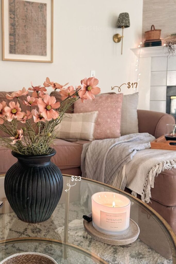
Cream, Dusty Blush, Walnut, and Brass
- Walls: Cream
- Sofa or big upholstery: Soft neutral
- Rug: Cream or lightly patterned rug
- Accents: Dusty blush textiles, warm art tones
- Wood and metals: Walnut whenever you can, brass frames or lighting
Common mistake: Blush goes sugary and starts feeling too pink
Easy swap: Start with one blush throw or one art print and live with it for a week
Warm Beige, Soft Emerald, and Vintage Reds
- Walls: Warm beige
- Sofa or big upholstery: Neutral or lightly textured
- Rug: Vintage rug with faded reds and greens
- Accents: Soft emerald pillows, burgundy or rust details
- Wood and metals: Medium wood, antique brass
Common mistake: Bright emerald without warmth around it so it looks glam
Easy swap: If you already own a bold rug, let it lead and keep everything else quieter
Off White, Charcoal, and Earthy Browns
- Walls: Off white, never stark
- Sofa or big upholstery: Earthy brown or warm neutral
- Rug: Brown toned or vintage style rug
- Accents: Small hits of charcoal in art or pillows
- Wood and metals: Warm wood, matte black in tiny doses
Common mistake: Too much black everywhere so it feels harsh
Easy swap: If your fixtures are black, soften the rest with warm textiles and wood
Rental Friendly No Paint Palette
- Walls: Whatever you have got
- Sofa or big upholstery: Neutral or warm toned
- Rug: Do the heavy lifting with earthy pattern
- Accents: Pillows, throws, art in warm neutrals and muted color
- Wood and metals: Lean hard into wood furniture and warm metals
Common mistake: Trying to fix everything with small colorful decor only
Easy swap: Change scale, bigger textiles, bigger art, more wood
The Tiny Rule I Actually Follow
- Pick one dominant neutral.
- Pick two supporting colors.
- Repeat each supporting color two to three times.
- Let wood and metal finishes count as part of the palette.
That is it. That is the whole system.
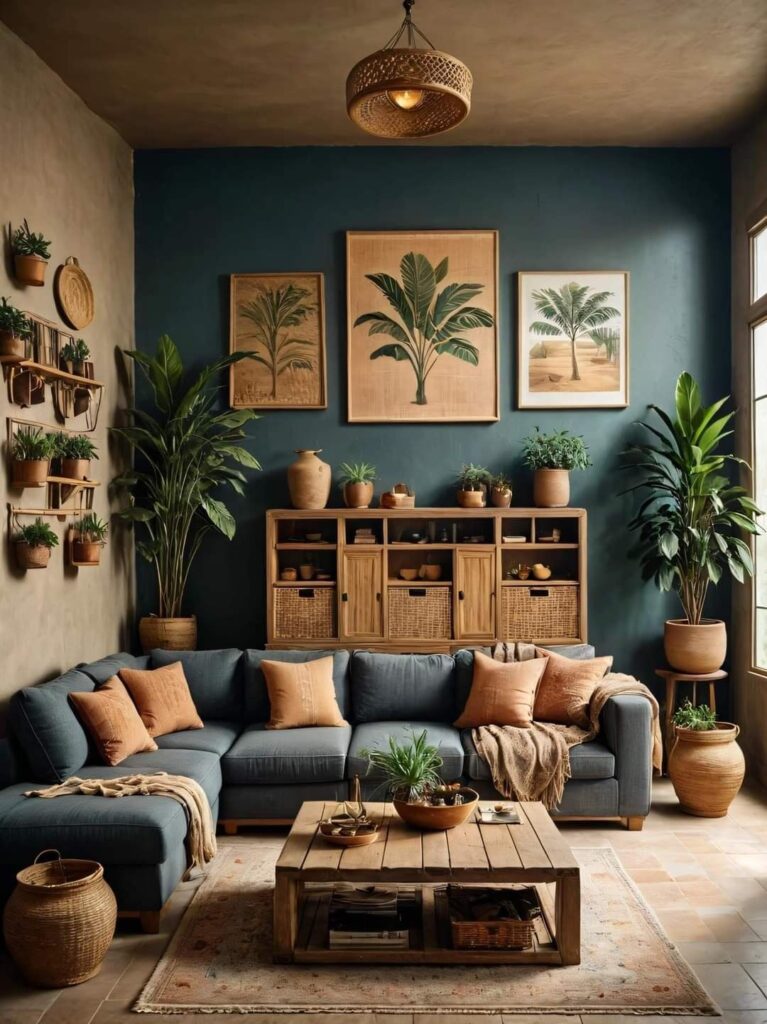
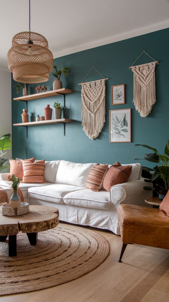
Jewel Accents and Muted Warmth
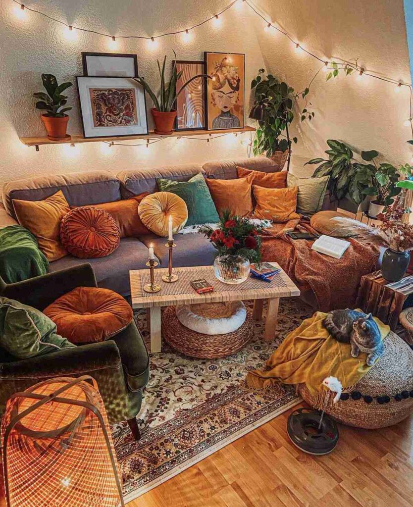
Boho can absolutely include jewel tones, but usually not the glossy, sharp versions. Think emerald that looks slightly dusty. Indigo that feels moody instead of crisp. Burgundy that reads warm, not formal.
These colors show up best in smaller doses: pillows, throws, art, pottery, maybe that one chair you impulsively bought because it felt like a good idea in the moment.
Muted warmth is the secret ingredient. Rust instead of bright orange. Mustard instead of lemon yellow. Blush that feels earthy, not sugary.
I once bought a bright teal pillow thinking it would be the moment. It was not. It looked like it belonged in a kid’s playroom. I swapped it for a deeper, embroidered blue and suddenly it worked. Same family, totally different feeling.
How to Combine Colors Without Making It Weird
Boho color is not meant to be perfectly balanced or symmetrical. It is meant to feel collected, even if you bought everything in one weekend.
Start with one dominant neutral, usually your walls, sofa, or rug. Then layer two to three supporting colors that feel naturally connected.
Nature colors almost always play nicely together. Browns, greens, warm whites, muted blues, clay tones. They rarely fight.
Instead of exact matching, think families. A rust pillow, a terracotta pot, and a faded blush throw can live together because they share warmth. A sage blanket, an olive pillow, and a deep green plant leaf feel cohesive even if they are different shades.
This is slow, intuitive, and a little trial and error. No color wheel required.
Why Boho Colors Feel Cozy
Boho spaces feel cozy because the colors are warm and softened. Even when they look bold at first glance, there is almost always a calm base doing quiet work in the background.
Boho whites are creamy and forgiving. They look better at night with lamps on than they do at noon. Cream, soft beige, and warm off white give your accent colors somewhere to land.
Warm colors are easier in boho because they naturally support that layered, lived-in feeling. Cool colors can still work, they just need backup: warm wood, warm neutrals, and warm lighting.
My personal test is simple. Would I want to be in this room at night with only lamps on and nowhere to rush off to. If the answer is no, something needs to soften, warm up, or calm down.
Quick Fixes If the Vibe Is Off
Feels cold: Add one warm element like wood, brass, rust, or a cream textile
Feels busy: Add one solid neutral exhale like curtains, a throw, or bedding
Feels muddy: Pick one accent color and repeat it two to three times
Patterns and Prints
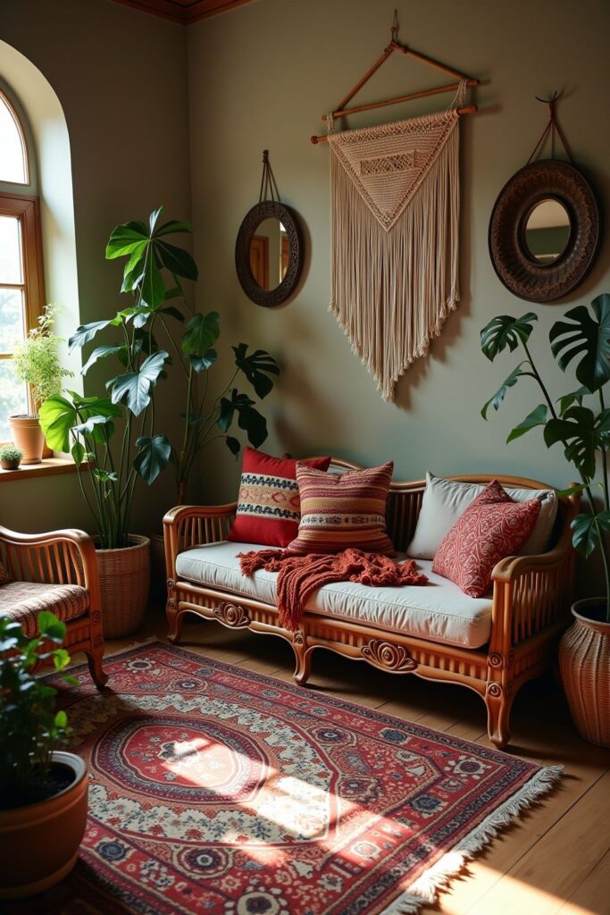
A lot of boho color shows up through patterns, not solid blocks. Rugs, pillows, tapestries, and art carry the color story. That is why boho patterns work so well. They let multiple colors live together without feeling forced.
A rug with rust, blue, cream, and green can connect all of those colors across the room. This is especially helpful if you are layering pieces you already own.
Boho also likes imperfection. Patterns that do not line up perfectly. Colors that repeat casually. Nothing too polished.
Boho Color in Different Rooms
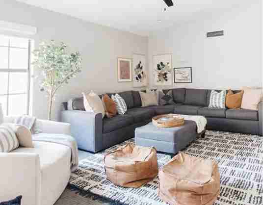
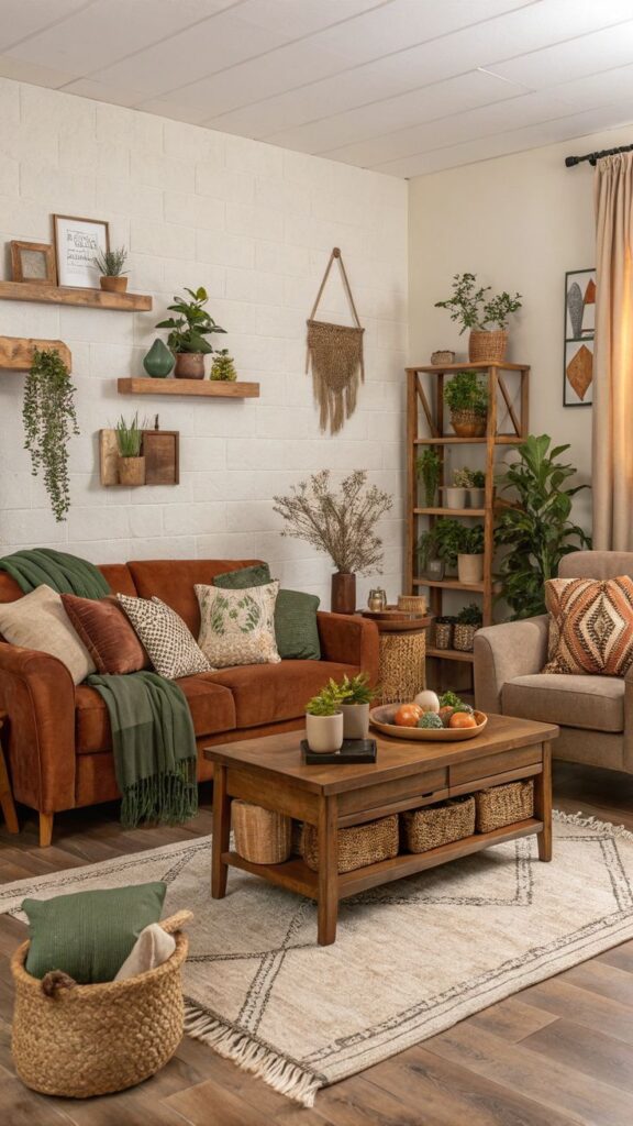
Living room boho can handle deeper tones. Warm browns, moody blues, earthy greens, layered neutrals. It is a room meant for lingering.
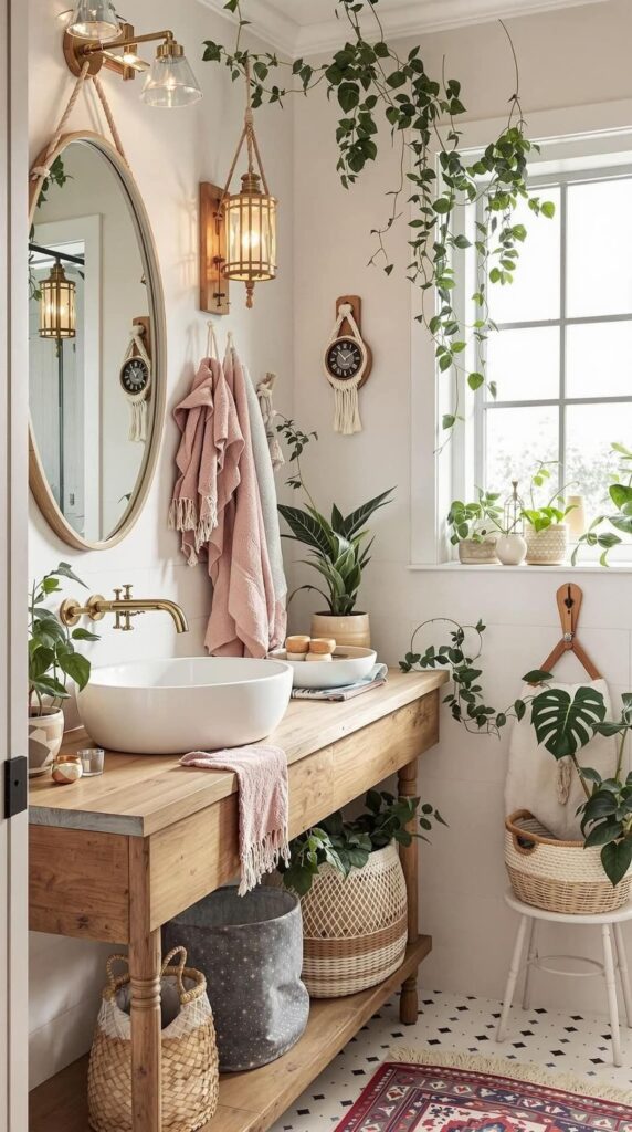
Bedroom boho tends to lean softer. Blush, clay, warm white, muted sage, gentle blues. More cocoon, less drama.
Outdoor boho is its own vibe. Terracotta, olive, sand, charcoal, warm white. Bright color can work outside, but it usually looks best in small accents like tile or planters.
Common Color Mistakes in Boho Decor
The biggest mistake is trying to follow rules too closely. Boho does not like strict rules. It likes intuition.
Another common issue is choosing colors that are too saturated or too shiny. Boho leans matte, dusty, and softened. Glossy finishes and neon hues usually fight the vibe.
Also, people overdo accent colors without enough neutral support. If everything is colorful, nothing stands out. The room needs quiet moments.
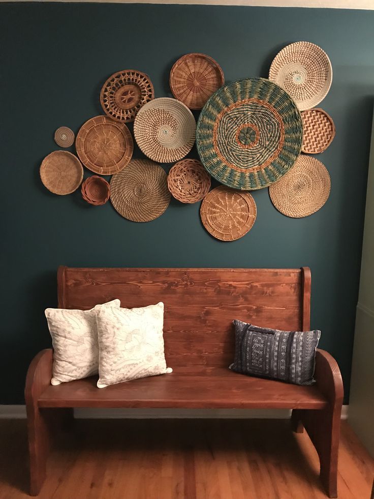
And skipping texture is a big one. Color alone will not do the job. Boho needs layering: textiles, wood, woven pieces, ceramic, natural fibers.
FAQs
What Are the Colors for Boho Decorating
Boho decorating usually starts with warm neutrals like cream, oatmeal, sand, and warm beige, then layers in earthy tones like terracotta, rust, caramel, olive, and muted blues like indigo or dusty denim. The key is that most shades look softened and sun-faded instead of bright or glossy, so the room feels relaxed and lived-in.
Are Cool or Warm Colors Better for Boho
Warm colors are easier because they naturally create that cozy, collected feeling boho is known for. Cool colors can still work, but they need warm backup: wood furniture, warm neutrals, textured textiles, and warm lighting. If a boho room ever feels cold, it is usually missing warmth in materials or light, not missing more color.
What Are Common Mistakes in Boho Decor
Going too bright, skipping neutrals, and relying on small decor to do all the work are the big ones. Another common mistake is choosing shiny versions of colors, like glossy teal or crisp navy, which can feel off. And the quiet mistake is ignoring texture, because boho needs layers of fabric, wood, and natural materials to make the palette feel real.
Is There a Specific Boho Color Trend Right Now
Right now the vibe is earthy and grounded. Clay and terracotta are everywhere, olive and sage keep showing up, and warm whites are replacing stark whites. Softened jewel tones like dusty teal, muted emerald, and deep indigo are also popular, but usually in smaller accents like pillows, art, or rugs instead of huge furniture pieces.
Final Thoughts From My Very Real Couch
Boho color is not about getting it right on the first try. It is about creating a space that feels layered, collected, and comfortable to exist in.
If your room feels good to you, you are doing it right.
And if something feels off, it is usually not everything. It is one small thing asking to be warmer, softer, or repeated one more time. A pillow. A lamp. A rug that is doing too much.
Trust that instinct. It knows more than you think.