How to Use Wallpaper in a Small Bathroom Without Overwhelming the Space (29 Ideas)
A small bathroom can feel limited when it comes to design choices.
Wallpaper often gets overlooked in these spaces because there is a concern it might make the room feel even tighter or visually crowded.
The challenge is finding a balance between adding pattern and keeping the space open and comfortable to use.
With the right approach, wallpaper can actually enhance a small bathroom instead of overwhelming it. Thoughtful placement, scale, and color choices can create depth, highlight key areas, and bring personality without closing the space in.
There are many ways to work with wallpaper in a smaller layout, from subtle accents to more defined focal points.
Here are 29 ideas to help you use wallpaper in a small bathroom without overwhelming the space.
Subtle Stripes for an Elegant Touch
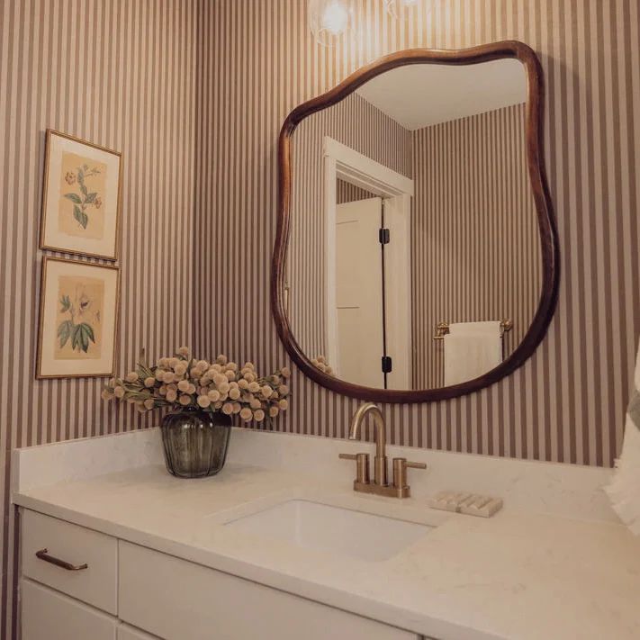
Sometimes a bathroom feels more balanced without adding bold features. Soft striped wallpaper introduces quiet structure while keeping the space calm and easy to look at.
In a small bathroom with low ceilings, vertical stripes can shift how height is perceived. A muted pink and white palette with a matte finish pairs well with round mirrors and white fixtures, helping light move evenly across the walls. The result feels taller and less confined.
One thing I noticed after trying this setup is that high contrast stripes can feel busy in tight layouts. Keeping the lines soft allows the pattern to guide the eye without making the space feel crowded.
Minimalist Monochrome for a Sleek Look
Small bathrooms tend to collect clutter quickly, so black and white wallpaper helps bring visual order without adding complexity. The contrast creates a clear structure that makes the everyday mess feel less noticeable.
In a tight layout with limited counter space, a simple graphic pattern with clean lines works best alongside modern fixtures and minimal decor.
Adding small black elements like hooks or a bin ties everything together, making the space feel intentional. The overall effect feels sharper and more controlled.
One thing that stands out over time is how busy patterns can feel overwhelming in compact spaces. Keeping the design restrained allows the wallpaper to add interest without making the room feel crowded.
Luxe Marble Effect for a Glamorous Upgrade
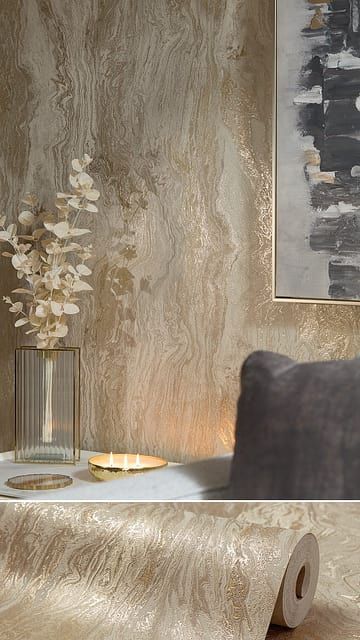
Not every upgrade needs tile work to feel refined. Marble effect wallpaper introduces depth through soft veining, giving the walls a layered look that feels more finished.
This works especially well in a small bathroom with artificial lighting, where a gray veined pattern with a slight satin sheen reflects light gently. Pairing it with warm metallic accents like gold fixtures adds contrast without overpowering the space. The result feels more open and visually detailed.
A small detail I noticed is that marble patterns tend to hide minor marks better than flat colors. That makes them easier to maintain, especially in high-use bathrooms where walls see frequent contact.
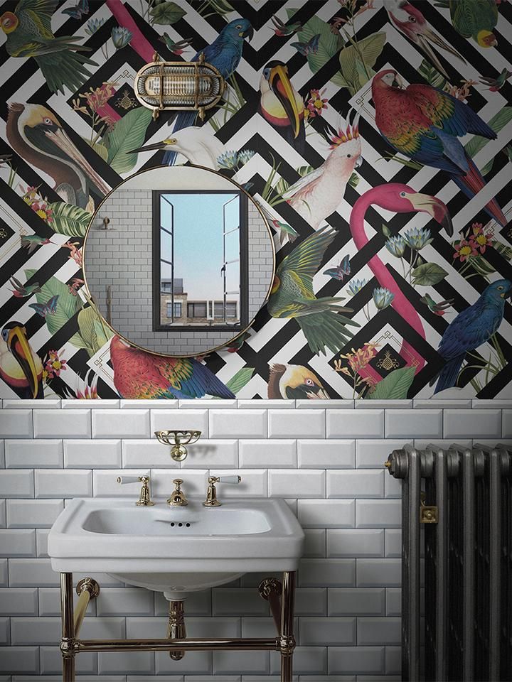
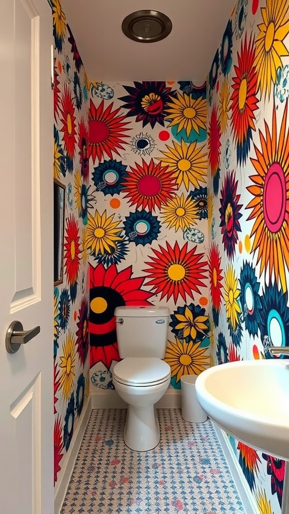
Playful Animal Motifs to Spark Joy
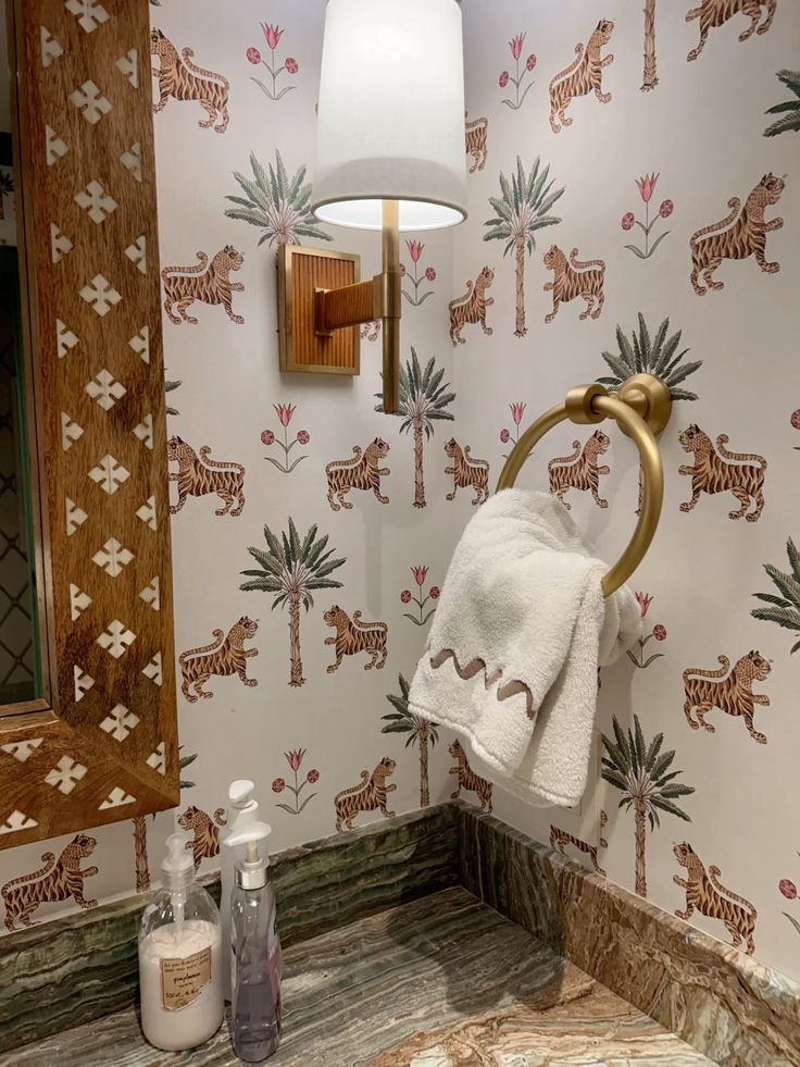
Some bathrooms benefit from a bit of personality, especially when the space feels purely functional. Animal motif wallpaper adds movement and character, turning the walls into a focal point.
In a shared or guest bathroom, a colorful illustrated pattern on a light background keeps the space lively without feeling heavy.
Pairing it with simple white fixtures allows the design to stand out while keeping everything balanced. The space ends up feeling more engaging and less plain.
What often gets overlooked is how too many competing colors can feel chaotic in a small room. Picking one shade from the wallpaper and repeating it in a towel or accessory helps bring everything back into alignment.
Botanical Prints for a Nature-Inspired Retreat
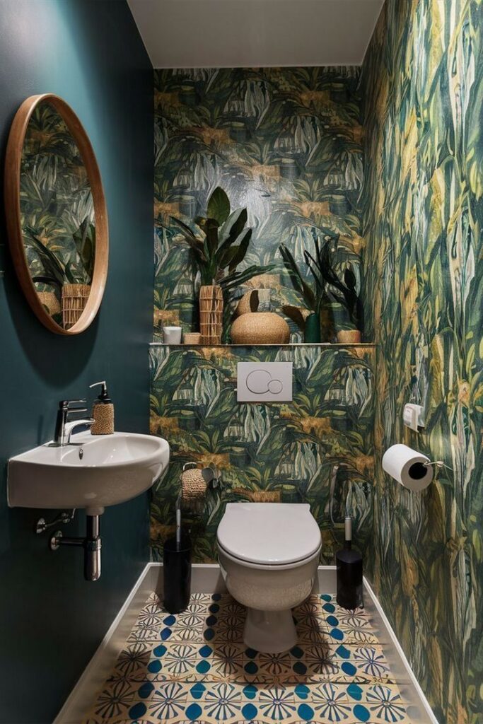
Some bathrooms feel closed in, especially without windows. Botanical wallpaper with soft green leaves can shift that feeling by adding a natural visual layer that feels calm and grounded.
In a compact bathroom with harsh overhead lighting, a light background with detailed leaf patterns helps soften the brightness while still reflecting enough light.
Pairing it with wood tones or woven textures keeps the look balanced. The space starts to feel more open and less sterile.
A small thing that often gets missed is how dense, dark foliage can make tight walls feel heavier. Choosing lighter greens with spaced patterns keeps the room fresh instead of enclosed.
Ocean Waves for a Calming Effect
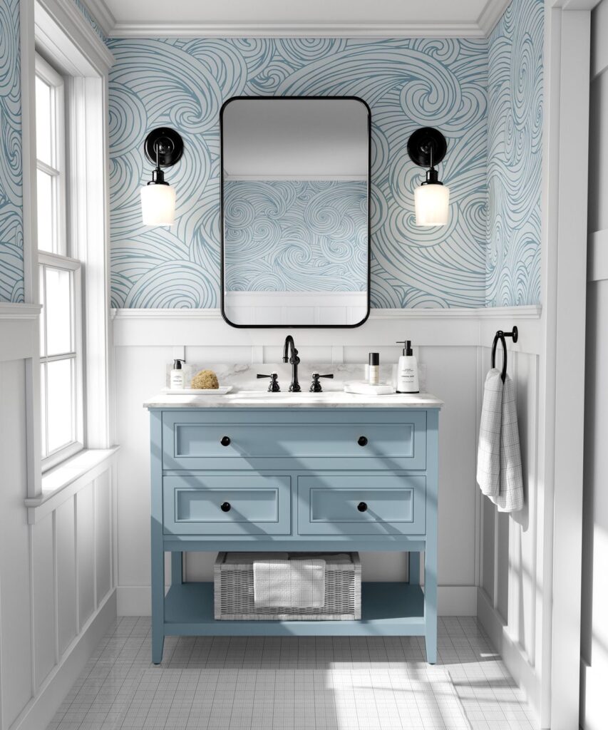
Bathrooms used at night often feel stark or overly bright. Wave pattern wallpaper in soft blue tones introduces movement that feels steady and easy on the eyes.
This works well in a small bathroom with mixed lighting, where a gentle blue and white pattern with a smooth finish reflects light without glare.
Keeping accessories light allows the pattern to stay the focus. The result feels airy and more relaxed.
One detail that makes a difference is how overly saturated blues can darken the room quickly. Softer shades maintain that calm tone without reducing brightness.
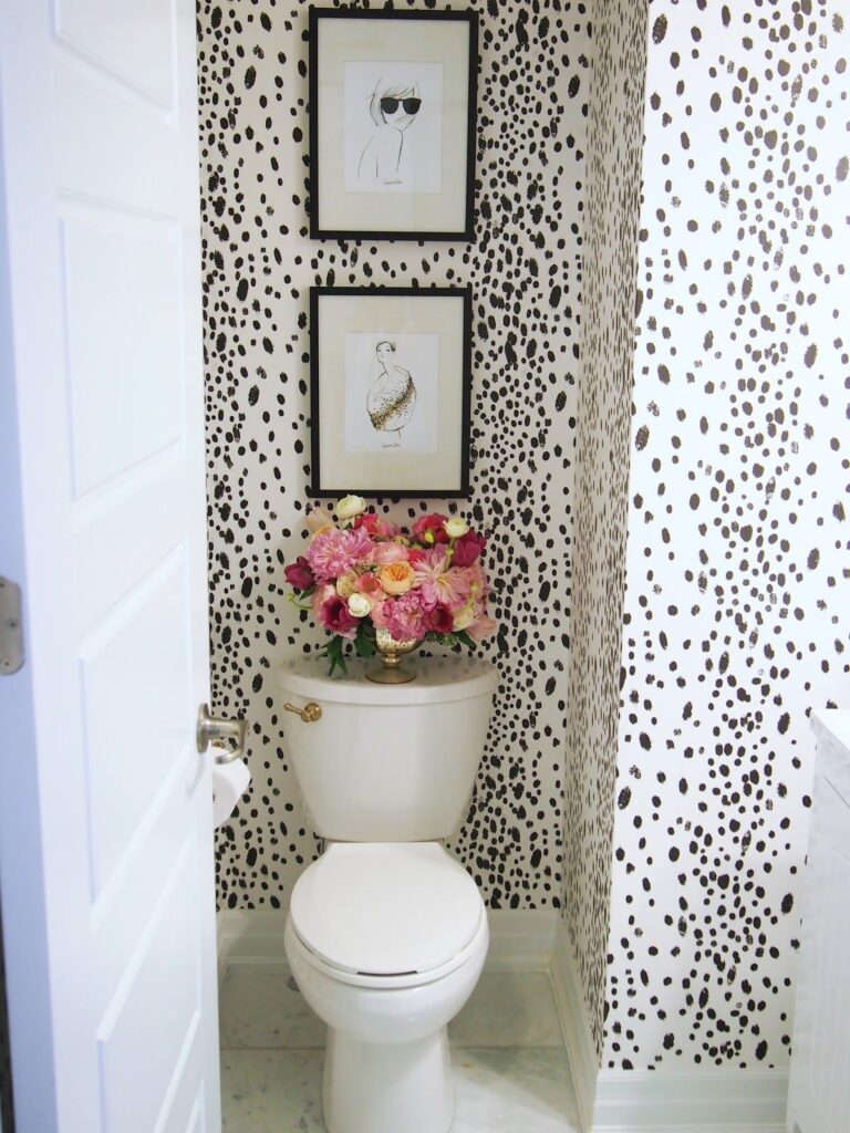
Bold Geometric Patterns to Make a Statement
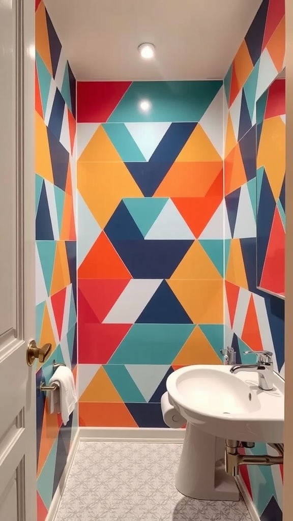
Some spaces benefit from contrast rather than subtlety. Geometric wallpaper with defined shapes adds energy and structure, especially when the layout feels plain.
In a small bathroom with no natural light, a pattern with clear lines and controlled color placement can prevent the room from feeling flat.
Keeping fixtures simple balances the intensity. The space ends up feeling more dynamic and less confined.
A useful observation is that too many colors in a tight area can feel scattered. Limiting the palette within the pattern keeps the design strong without overwhelming the eye.
Whimsical Patterns for a Fun Atmosphere
Bathrooms that feel purely functional can lack personality. Whimsical wallpaper with playful icons introduces variation that makes the space feel more engaging.
In a shared or guest bathroom, a light base with scattered colorful details works best alongside simple fixtures. This keeps the design from becoming too busy while still adding interest. The room feels more inviting and less routine.
One thing that helps is noticing how too many competing elements can make small spaces feel chaotic. Keeping everything else minimal allows the pattern to stand out clearly.
Rustic Wood Paneling for a Cozy Feel
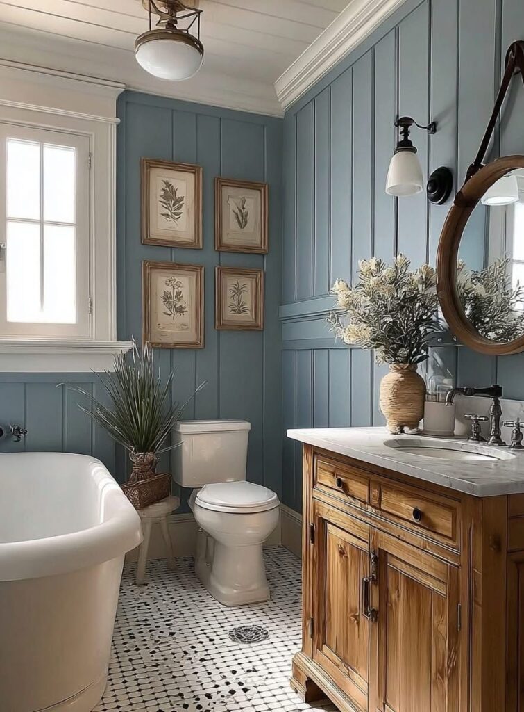
Some bathrooms feel disconnected from the rest of the home. Wood look wallpaper adds warmth and texture, helping the space feel more grounded.
In a small bathroom with cooler lighting, a wood grain pattern with subtle gray undertones pairs well with white fixtures to balance warmth and clarity.
This combination keeps the room from feeling dull. The space feels more cohesive and lived in.
A practical detail to consider is how warmer orange-toned wood prints can highlight stains or watermarks more easily. Choosing a muted tone helps maintain a cleaner look over time.
Abstract Art for Creative Expression
Some bathrooms feel forgettable, especially when everything is neutral. Abstract wallpaper with bold strokes adds a focal point that brings energy without changing the layout.
In a small powder room with limited wall space, a multi-color pattern with large brush shapes works best when paired with simple mirrors and clean fixtures.
This keeps the design focused rather than scattered. The space feels more expressive and less plain.
A detail that becomes obvious over time is how overly dense patterns can feel chaotic up close. Choosing designs with breathing space helps the colors stand out without overwhelming the room.
Chic Brick Wall for Urban Appeal
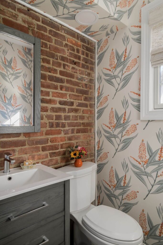
Flat walls can make small bathrooms feel lifeless. Brick-style wallpaper introduces texture that gives the room more depth and structure.
In a compact bathroom with warm lighting, a soft red or muted brown brick print with slight shadow detailing adds dimension without feeling harsh.
Pairing it with modern fixtures keeps the look balanced. The result feels textured but still clean.
One thing to watch is how strong contrast in brick patterns can look too heavy in tight spaces. Softer tones keep the wall interesting without closing the room in.
Bright Tropical Prints for a Vibrant Retreat
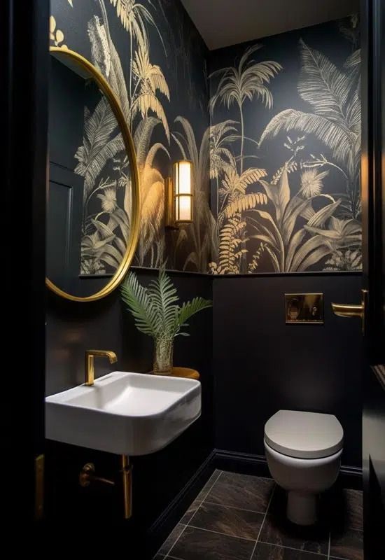
Some bathrooms benefit from a quick burst of energy. Tropical wallpaper with bold leaves and colors brings movement that breaks up plain surfaces.
In a small bathroom with limited natural light, a pattern with bright greens on a lighter base helps reflect light while still feeling lively.
Keeping fixtures simple prevents the space from feeling crowded. The room feels more open and dynamic.
A small adjustment that helps is noticing how too many contrasting colors can feel overwhelming in close quarters. Pulling one color into accessories keeps everything visually connected.
Art Deco Inspiration for a Sophisticated Style
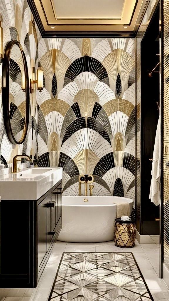
Certain patterns add structure without adding clutter. Art Deco wallpaper with geometric symmetry brings a refined look through repetition and contrast.
In a small bathroom with artificial lighting, a black base with subtle gold detailing in a smooth finish reflects light in a controlled way.
Pairing it with warm metal accents keeps the design cohesive. The space feels more polished and intentional.
One detail that stands out is how excessive shine can create glare in tight spaces. A softer finish keeps the pattern visible without becoming distracting.
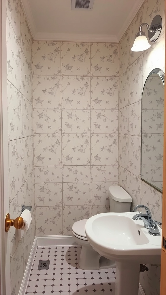
Soft Pastels for a Serene Space
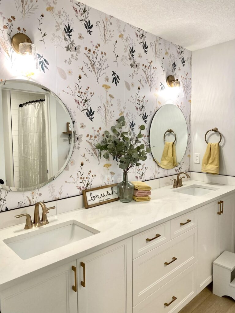
Busy routines can make a bathroom feel overwhelming. Pastel wallpaper with light floral detail softens the space without adding visual weight.
In a small bathroom with bright lighting, a pale pink or soft blue base with fine patterns helps diffuse the light and keep the room feeling open.
White textiles and simple decor maintain clarity. The result feels calm and easy to use.
A useful observation is that overly muted pastels can fade under strong lighting. Choosing slightly defined tones keeps the pattern visible while still maintaining a gentle look.
Classic Damask Patterns for Traditional Elegance
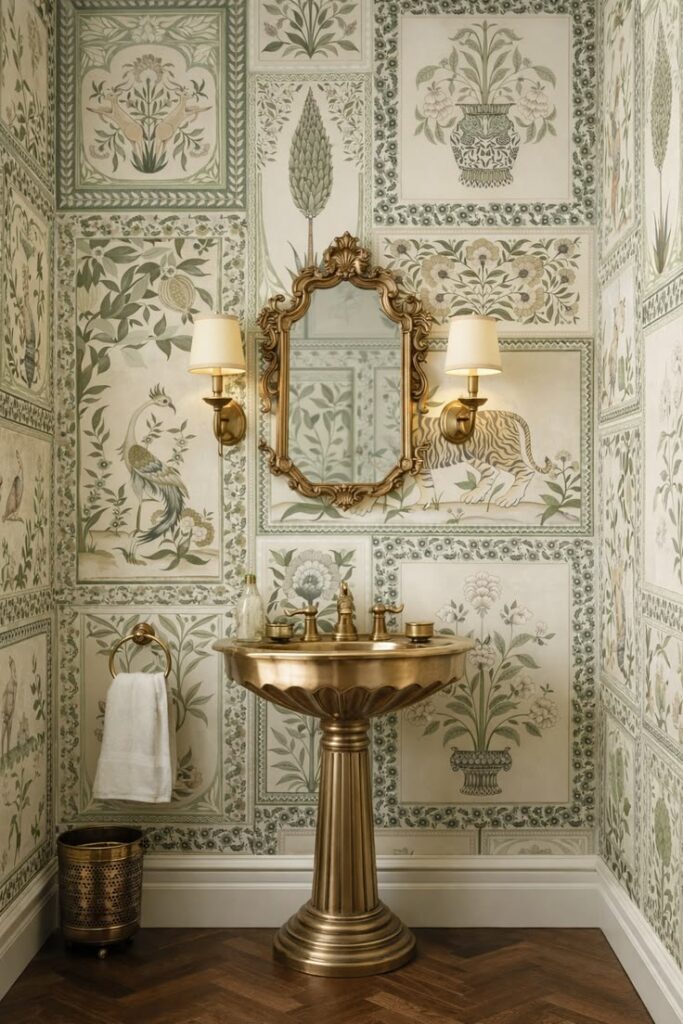
Some bathrooms feel flat when they lack detail. Damask wallpaper with rich tones introduces structure and depth that gives the space a more refined look.
In a small bathroom with limited natural light, a red and gold pattern with a slightly muted finish works best when paired with white fixtures and simple trim.
This balance keeps the design from feeling too dense. The space ends up feeling classic without becoming heavy.
A detail that often gets overlooked is how high-contrast damask can dominate tight walls. Softer versions of the pattern keep the elegance while maintaining visual comfort.
Funky Retro Designs for Nostalgic Flair
Some spaces benefit from a bit of personality instead of staying neutral. Retro wallpaper with bold florals and bright tones adds energy that shifts the mood instantly.
In a windowless small bathroom, a high contrast pattern with rounded shapes and warm colors helps break the flatness caused by artificial lighting.
Keeping fixtures simple allows the design to stand out. The room feels more lively and less enclosed.
One thing that becomes clear with use is how many added accessories can compete with the pattern. Letting the wallpaper carry most of the visual weight keeps the space balanced.
Geometric Tile Effect for a Modern Twist
Plain walls can make a bathroom feel unfinished. Tile effect wallpaper with structured patterns brings a clean, organized look without the need for actual tile work.
In a small bathroom with uneven walls, a blue and white geometric layout with sharp edges helps disguise minor imperfections while maintaining a crisp appearance.
Pairing it with minimal decor keeps the focus clear. The result feels more structured and polished.
A practical observation is how overly intricate tile patterns can feel busy up close. Choosing simpler geometry keeps the look sharp without overwhelming the space.
Charming Plaid Patterns for a Cozy Vibe
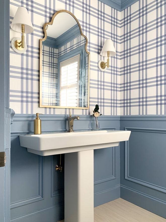
Bathrooms can sometimes feel too sterile. Plaid wallpaper with warm tones introduces a softer, more lived-in feeling without adding clutter.
In a compact bathroom with warm lighting, a subtle plaid pattern with balanced spacing pairs well with white tile and simple fixtures.
This keeps the design grounded while adding texture. The space feels more inviting and less rigid.
A small detail to notice is how tight plaid patterns can look crowded in small areas. Wider spacing in the design helps maintain clarity and comfort.
Metallic Accents for Subtle Glamour
Some bathrooms feel dull under artificial light. Wallpaper with metallic detailing reflects light in a way that adds dimension without changing the layout.
In a small bathroom with darker walls, a deep base color with soft gold accents in a low sheen finish helps bounce light gently across the surface. Pairing it with lighter, lower walls creates balance. The room feels brighter without losing depth.
One thing that becomes noticeable is how high-gloss metallics can create glare in tight spaces. A softer sheen keeps the effect refined and easier on the eyes.
Nature-Inspired Textures for a Rustic Touch
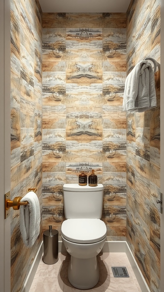
Some bathrooms feel flat when everything is smooth and uniform. Textured wallpaper that mimics wood or stone adds depth without changing the structure of the space.
In a small bathroom with basic fixtures, a muted blend of wood grain and stone tones with a matte finish helps create variation while keeping the look calm.
Pairing it with neutral towels and minimal decor keeps the texture from feeling heavy. The space feels more grounded and less plain.
A subtle detail that matters is how overly dark textures can make tight spaces feel enclosed. Lighter, weathered tones keep the room open while still adding character.
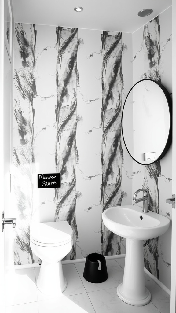
Black and White Photography for a Bold Impact
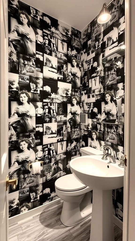
Some spaces need personality without relying on color. Black and white photography wallpaper introduces detail through contrast and imagery rather than pattern alone.
In a small bathroom with warm lighting, a collage-style layout with varied image sizes softens the contrast while keeping the design interesting.
Clean fixtures help maintain clarity. The result feels bold but still controlled.
One thing that becomes noticeable is how too many dense images can feel cluttered up close. Spacing between visuals helps the wall feel curated instead of overwhelming.
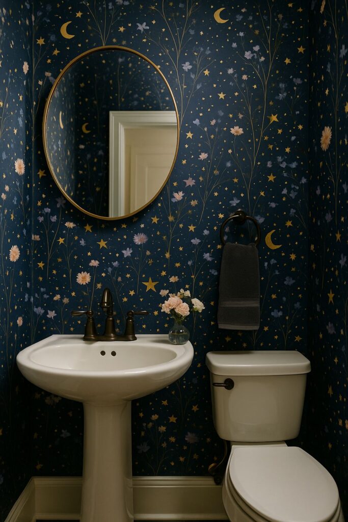
Whimsical Stars for a Dreamy Atmosphere
Bathrooms used for quick routines can still feel calm. Star-patterned wallpaper on a light base adds a gentle visual rhythm without making the room busy.
In a small hallway bathroom with limited space, a soft scattered star design with fine detailing works well alongside simple fixtures and warm lighting. This keeps the room feeling open while adding a subtle layer of interest. The space feels softer and more relaxed.
A small observation is how larger star patterns can dominate tight walls quickly. Smaller, spaced designs maintain that quiet effect without crowding the space.
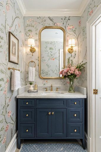
Glamorous Floral Overlays for a Luxurious Feel
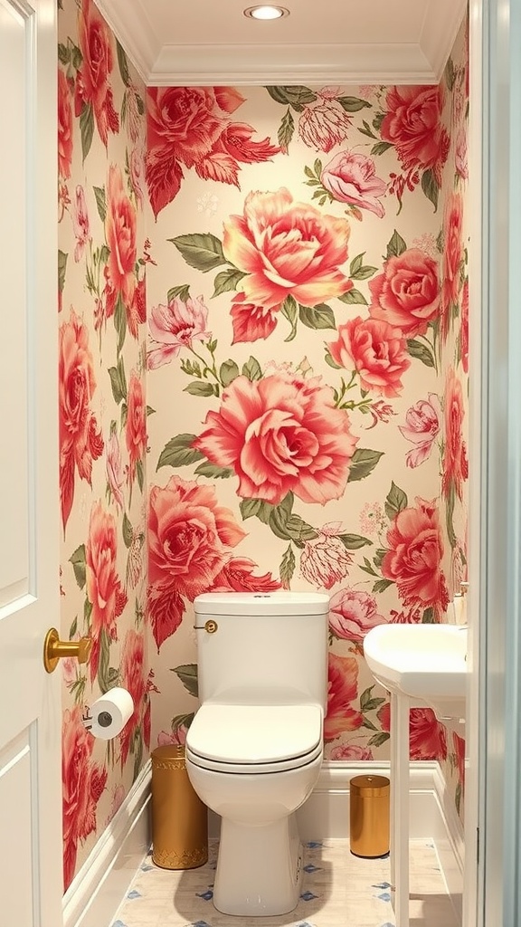
Some bathrooms benefit from a strong focal point. Oversized floral wallpaper introduces scale that changes how the walls are perceived.
In a small powder room, a large rose pattern with soft pink and green tones on a smooth finish creates depth without relying on darker colors.
Pairing it with clean fixtures and a single metallic accent keeps the look balanced. The room feels more styled and intentional.
A detail worth noting is how too many competing decor elements can clash with large-scale florals. Keeping accessories minimal allows the pattern to stay clear and impactful.
Craft Paper Look for a Unique Texture
Plain walls can feel flat, especially in smaller layouts. Craft paper style wallpaper with text details adds texture through pattern rather than color, giving the space a warm, layered feel.
In a small high traffic bathroom, a neutral toned print with subtle typography on a matte surface works well with simple fixtures and a round mirror. This keeps the design calm while still interesting. The room feels more styled without adding clutter.
A detail that stands out over time is how busy text patterns can feel overwhelming at eye level. Choosing softer, faded prints keeps the texture noticeable without making the space feel crowded.
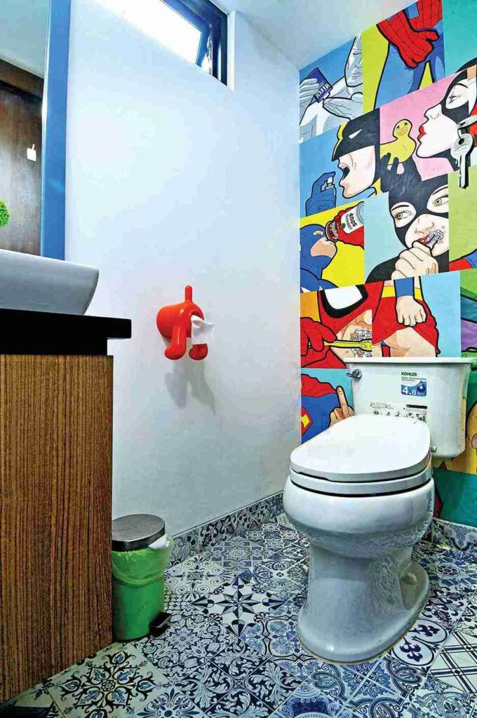
Retro Pop Art for a Bold and Bright Look
Some bathrooms feel dull when everything stays neutral. Pop art wallpaper with large graphic shapes introduces energy that shifts the mood instantly.
In a small bathroom with no natural light, a bright floral pattern with clear color blocks helps bring life into the space while keeping the layout simple. Pairing it with plain fixtures prevents visual overload. The result feels bold and lively.
One thing that becomes clear is how trying to match too many colors can make the space feel chaotic. Pulling one tone into accessories keeps everything aligned without effort.
Artistic Murals to Create a Focal Point
Tight spaces can feel smaller when walls lack depth. Mural wallpaper with scenic elements draws the eye across the surface, creating a sense of expansion.
In a small bathroom with one main wall, a nature-inspired mural with balanced color tones and soft transitions works best alongside minimal decor. This keeps the focus clear. The space feels deeper and more immersive.
A useful observation is how overly dark murals can reduce brightness in compact areas. Choosing designs with lighter sections helps maintain balance.
Contemporary Line Art for a Minimalist Approach

Some designs need detail without adding weight. Line art wallpaper in black and white introduces movement while keeping the overall look clean.
In a small bathroom with limited space, a thin line pattern on a white base with a smooth finish pairs well with modern fixtures and a round mirror. This keeps the space visually open. The room feels light but still intentional.
One small detail is how thicker lines can start to dominate tight walls. Finer lines maintain the minimalist feel without crowding the design.
Seasonal Themes for Dynamic Refresh
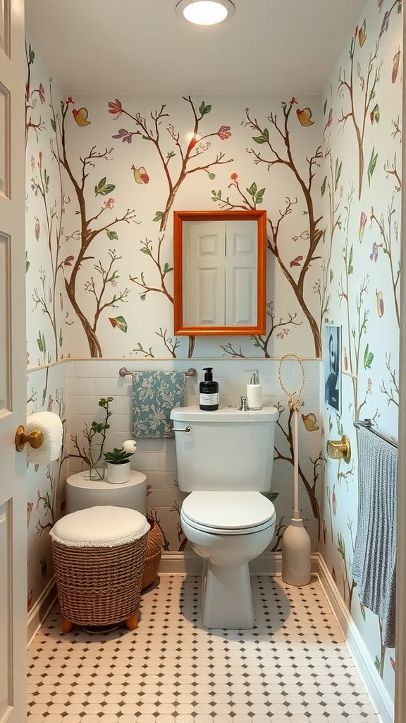
Bathrooms can feel repetitive over time. Wallpaper with seasonal elements like trees or birds brings subtle variation that keeps the space feeling fresh.
In a small bathroom with consistent lighting, a light background with soft nature motifs spaced evenly works well with simple accessories that can be rotated. This keeps the design flexible. The room feels updated without needing major changes.
A detail worth noting is how overly detailed seasonal prints can limit styling options later. Simpler patterns allow small decor changes to stand out more.
Chalkboard Style for a Fun and Functional Space
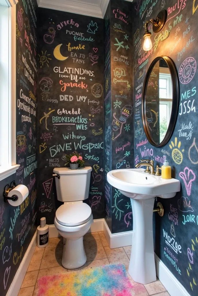
Dark walls can make small bathrooms feel enclosed if not handled carefully. Chalkboard wallpaper adds function while introducing a bold visual layer.
In a small bathroom with limited light, a deep matte black surface paired with bright white fixtures and strong lighting helps maintain contrast and clarity. The result feels interactive without becoming too heavy.
One practical insight is how chalk dust can build up quickly in humid spaces. Keeping a cloth nearby makes it easier to maintain a clean look without effort.
FAQ
How Do You Choose The Right Wallpaper For A Small Bathroom?
Start by looking at your lighting and wall space. Small bathrooms often have limited natural light, so lighter backgrounds or balanced patterns help prevent the room from feeling closed in. Scale matters too.
Large prints can work, but only when there is enough breathing space. If the layout is tight, go for softer or more spaced designs. Always consider how the wallpaper looks both up close and from a distance.
Can Wallpaper Really Work In Humid Bathrooms?
Yes, but material and placement make a big difference. Use moisture-resistant wallpaper or vinyl options, especially near sinks or high splash zones. Proper ventilation also plays a role.
In bathrooms with poor airflow, avoid placing wallpaper directly behind water sources. When installed correctly, wallpaper can hold up well and maintain its look over time without peeling or fading.
Should You Use Wallpaper On All Walls Or Just One?
It depends on how much visual weight the pattern carries. In very small bathrooms, using wallpaper on one feature wall often feels more balanced. It creates interest without overwhelming the space. For lighter or more subtle patterns, covering all walls can still work. The key is to match the intensity of the design with the size of the room so it feels intentional, not crowded.
What Colors Make A Small Bathroom Feel Bigger?
Lighter tones generally help reflect more light, which can make a space feel more open. Soft whites, pastels, and muted neutrals are reliable choices.
That said, darker shades can still work when paired with good lighting and reflective surfaces. The goal is not just brightness but balance. A well-chosen pattern can shift perception more effectively than color alone.
Is Wallpaper Better Than Paint For Small Bathrooms?
Wallpaper offers more visual depth compared to flat paint, especially in compact spaces. Patterns can guide the eye, add texture, and change how dimensions are perceived. Paint is easier to maintain and update, but it does not provide the same layered effect.
If you want a noticeable transformation without structural changes, wallpaper tends to create a stronger impact.
Conclusion
Small bathrooms often feel limiting, but the right wallpaper can completely shift how the space looks and functions. Thoughtful choices in pattern, scale, and placement make a noticeable difference without requiring major changes.
Each idea in this list shows how small adjustments can improve both visual balance and everyday usability. It is less about decoration and more about using the walls with intention.
If you found a style that fits your space, share this with friends and family who are also planning a bathroom update.