The “Where Do the Colors Go?” Breakdown for Eclectic Maximalist Decor (So You Don’t Guess Forever)
I swear eclectic maximalist decor is 80 percent joy and 20 percent, why is this room suddenly yelling at me?
Last month, I had one of those evenings where the house was technically clean, but the living room felt loud. Not loud like music. Loud like, too many opinions at once. I was standing there with a half-cold drink, staring at a pillow I used to love, and thinking… why does this look chaotic now?
If you’re trying to mix colors in eclectic maximalist decor, you already know the pain point. You want bold, layered, collected, and alive. You do not want “I panic bought everything in the clearance aisle and now the lamp is fighting the rug.”
So this is my real-world guide for where the colors go, how to give them jobs, how to layer patterns without turning your couch into a visual group chat, and how to fix the room without buying a single new thing.
No perfection required. Just a plan that works in an actual house where someone will spill something, your lighting will change at night, and your brain will decide to hate one shade of blue for no reason.
Quick Start Box: Do This First So You Don’t Spiral
The 10-minute version (aka: I have guests in 20 minutes and regret everything)
- Pick your bossy color. The one you would defend in court. The one you still like even when you’re tired.
Example: emerald, navy, terracotta, mustard. - Find two tiny repeats of it.
A book spine. A candle. A stripe in your rug. A little shape in art. Two is the magic number that makes it look intentional. - Remove one random color that is not helping.
If a color appears only once and it feels like it wandered in, it’s the problem. Yes, even if it’s cute. - Corral the small stuff into one spot.
A tray. A bowl. A stack of books. Anything that turns scattered little things into one “scene.” - Turn on only the lamps for a minute.
If your room looks weirdly icy, muddy, or greenish, it’s probably not the decor. It’s the bulb color messing with your palette.
That’s it. Do not start rearranging furniture like you’re auditioning for a home makeover show.
The 1-hour version (aka: I’m in my feelings, and I need the room to match)
- Pick 1 bossy color + 1 supporting color + 1 neutral.
Write it down like a tiny contract. Not in your head. On paper. - Do a quick color map.
Big color goes on big things. Small color goes on small things. Neutral is your breathing room. - Move accents into zones.
One main scene, two small echo zones. If every corner has its own rainbow moment, your eyes never rest. - Check your patterns for scale.
One big, one medium, one small, plus at least one solid to breathe. - Do a repetition pass.
If a color shows up once, repeat it twice or remove it. One is random. Three looks intentional.
I know this sounds slightly bossy, but it’s honestly how you keep maximalism from turning into visual stress.
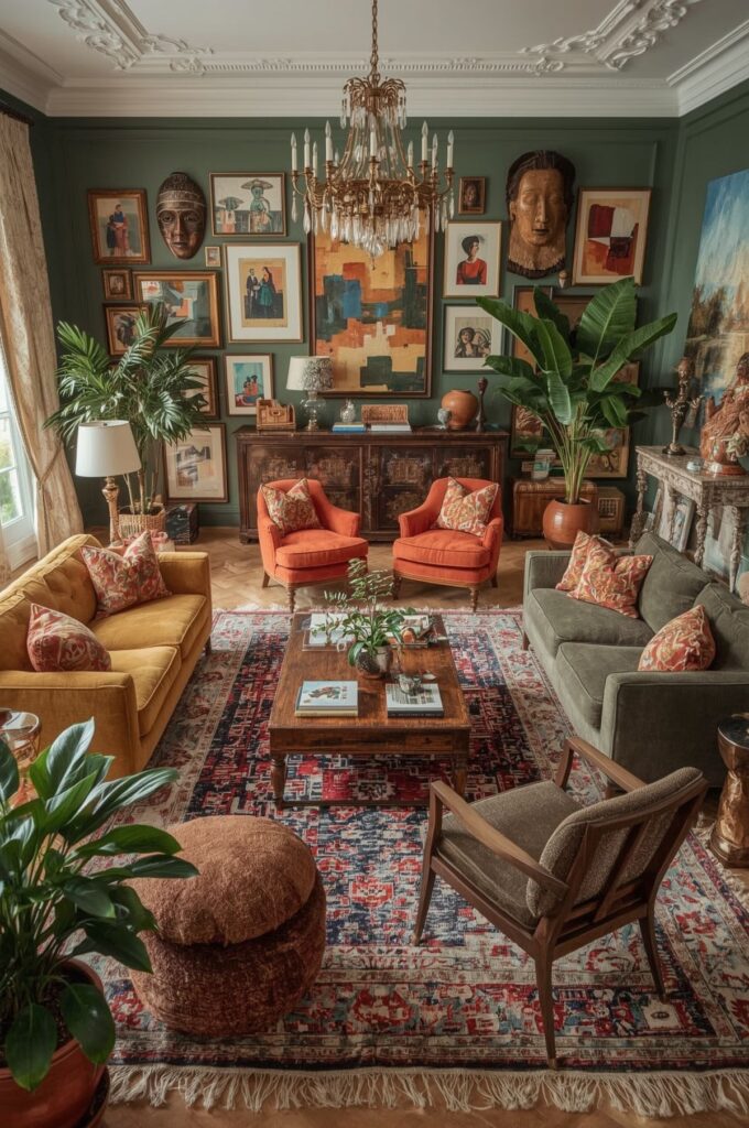
Building a Bold Palette Without Spiraling
Here’s the thing about eclectic maximalist decor. The goal is not to use every color you’ve ever loved. The goal is to make the colors feel like they belong to the same household.
The secret that helped me most was this:
Pick a palette you can describe in one breath
If you can’t say it simply, you’ll keep adding “just one more” color until nothing feels anchored.
A real example from my living room right now:
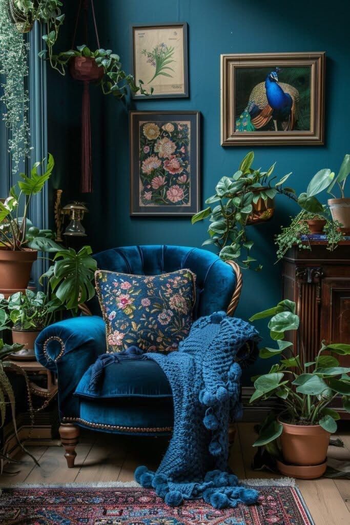
- Bossy color: deep teal
- Supporting color: warm rust
- Neutral peacekeeper: creamy off white
- Bonus mood: brass and warm wood
When I stick to that, I can still mix patterns, weird art, vintage pieces, and bold accessories. But the room feels collected, not accidental.
The “colors have jobs” rule
Rooms that feel loud but not stressful usually have color roles. Like they’re clocking in.
- Bossy color: shows up in one or two large pieces
- Supporting color: appears in medium pieces and repeats in small hits
- Neutral: holds the whole thing together and gives your eyes a break
- Tiny spice color: optional, but only if you repeat it at least twice
And yes, lighting changes everything. I’ve had palettes that looked amazing in daylight and then felt kind of swampy at night because my bulbs were too warm and everything turned yellowish. If your room feels “off” after sunset, try swapping one bulb first before blaming your entire personality.
Palette Recipes I Actually See Working (With Where Each Color Goes)
I’m going to give you a few palette recipes that work because they assign jobs. Use these exactly, or steal the logic and swap colors to match your taste.
Recipe 1: Emerald + Rust + Warm Cream + Brass
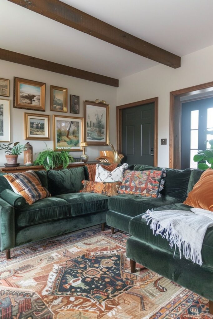
This is cozy, vintage, and slightly dramatic in a good way.
Where the colors go:
- Walls: warm cream or soft off-white
- Sofa: rust, camel, warm brown, or warm neutral linen
- Rug: vintage style with emerald threaded through it
- Art: one larger piece with green plus a little warm red or ochre
- Metals: brass, aged gold, warm bronze
Common mistake: making the emerald both the walls and the sofa. It can go full swamp fast under warm bulbs.
My real-life tip: if emerald feels too heavy, do it in curtains or a big chair instead. It still reads bold, but you’re not living inside the color.
Recipe 2: Cobalt + Caramel + Soft Gray Green + Black
This one feels modern eclectic. A little crisp, still warm, still bold.
Where the colors go:
- Walls: soft gray green, or neutral walls with gray green on trim if you’re brave
- Sofa: cobalt, or cobalt in a big rug if you refuse to commit to upholstery
- Rug: caramel, tan, warm neutral to calm the blue down
- Frames: black frames make the whole palette feel grounded
- Wood: warm wood helps keep cobalt from feeling too cold
Common mistake: adding more cool colors because they “match.” Then the room feels chilly at night.
My real-life tip: cobalt needs warmth nearby. Caramel leather, warm wood, or brass lamps. Give it a cozy friend.
Recipe 3: Plum + Blush + Walnut + Cream
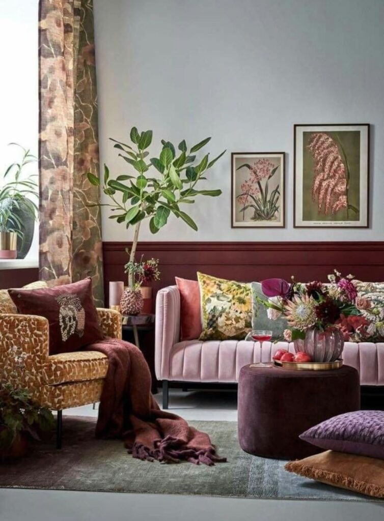
This one can feel dreamy and a little romantic without going full baby shower.
Where the colors go:
- Walls: cream, unless your room gets great light and you want plum walls
- Sofa: walnut leather, deep brown velvet, warm neutral linen
- Rug: blush and cream, but make it dusty and slightly muted
- Art: one large piece with plum, plus smaller prints with blush tucked in
Common mistake: choosing blush that’s too sweet. Go dusty, not candy.
My real life tip: add one grounding dark note. Black frame. dark wood side table. deep brown throw. Plum and blush love a little seriousness.
Recipe 4: Teal + Mustard + Ivory + A Little Red
This is playful but still grown up if you keep the red tiny.
Where the colors go:
- Walls: ivory
- Sofa: teal, or teal chair if you’re easing in
- Rug: patterned rug with teal plus warm tones
- Art: something with a tiny red note
- Accent: red shows up like a spice sprinkle, not a whole meal
Common mistake: using mustard on huge surfaces when the room is already warm. It can get heavy fast.
My real-life tip: mustard works best as a chair, pillow, or art detail. It pops without taking over.
Recipe 5: Terracotta + Olive + Cream + Mixed Metals
This one is earthy maximalism, and it feels calm even when it’s layered.
Where the colors go:
- Walls: cream
- Sofa: warm neutral, or olive if you want drama without neon energy
- Rug: terracotta heavy vintage rug, or natural fiber rug with terracotta layered on top
- Art: earthy tones plus one crisp modern shape
- Metals: mix brass and black, or brass and bronze
Common mistake: going too muddy with olive + brown + beige. You need one crisp contrast moment.
My real-life tip: add one clean note. A white vase. a black frame. a bright cream pillow. Just one thing that feels clear.
The Bossy Color Rule (Because This Is Where It Usually Goes Wrong)
The bossy color is the one you want to feel in your bones. Jewel tones work really well because they feel rich, not neon.
But the bossy color needs boundaries.
Here’s my rule:
Put the bossy color on one big thing you can’t ignore
Pick one:
- sofa
- rug
- curtains
- painted wall
- big chair
- large piece of art
Then echo it in two or three smaller places:
- a vase
- a candle
- one pillow
- a little detail in art
- a book spine moment
If your bossy color shows up once, it looks random. If it shows up three times, it looks planned.
Also, repeating the bossy color in different textures is what makes maximalism feel elevated. Velvet, ceramic, painted wood, woven textile. Same color story, different materials.
Pattern on Pattern Without the “Messy Room” Vibe
Patterns are what make eclectic maximalist decor feel layered and lived in. Patterns are also what make you stare at your couch and whisper, why does this feel like a circus.
So let’s do it the sane way.
The pattern rule that saves everything
If every pattern is loud, your eyes don’t know where to land.
You need one pattern to be the main character and at least one pattern to act calm.
Pattern Cheat Sheet
- 1 large pattern: scene stealer (rug, curtains, big chair)
- 1 medium pattern: sidekick (throw, second pillow, ottoman)
- 1 small pattern: detail (tiny pillow, lampshade, small print)
- 1 solid: the exhale (blanket, big pillow, sofa, simple curtain)
What “quiet pattern” actually means
A quiet pattern is a pattern that reads almost solid from across the room. It’s usually:
- small scale
- low contrast
- tone on tone
- faded or subtle
Examples that behave:
- tiny stripes
- soft checks
- speckles
- micro florals
- faded botanicals
In real life, a quiet pattern is what lets you keep your wild rug and still feel calm when you sit down at night.
My quick “pattern pairing” trick
Pick one hero pattern. Usually the rug.
Then, when you choose pillows or throws, don’t ask “do these match?”
Ask:
- do they share one color with the rug
- are they a different scale than the rug
- do I have at least one solid to breathe
That’s it.
Also, texture matters. If all your patterns are printed cotton, everything looks flat. Add something nubby and tactile:
- chunky knit
- boucle
- washed linen
- velvet
- woven wool
It makes the room feel expensive even if half your pieces are thrifted.
And yes, if you have kids, pick at least one pattern that hides real life. I learned this after buying a pale cream pillow that somehow attracted every sticky fingerprint in the household like a magnet.
Creating Harmony Through Repetition
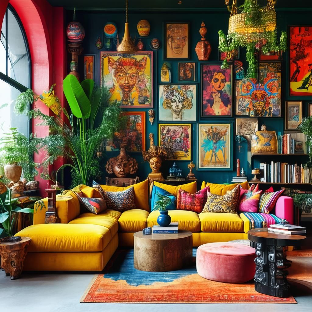
This is the part nobody talks about enough. Repetition is how maximalism stays cozy instead of chaotic.
Repeat ideas, not exact objects
You don’t need matching decor. You need repeating threads.
Examples:
- warm wood in three spots
- black accents in frames, lamp base, and one little bowl
- one shade of green repeated in a rug detail, a vase, and a pillow
- curved shapes repeated in a mirror, a lamp, and a chair
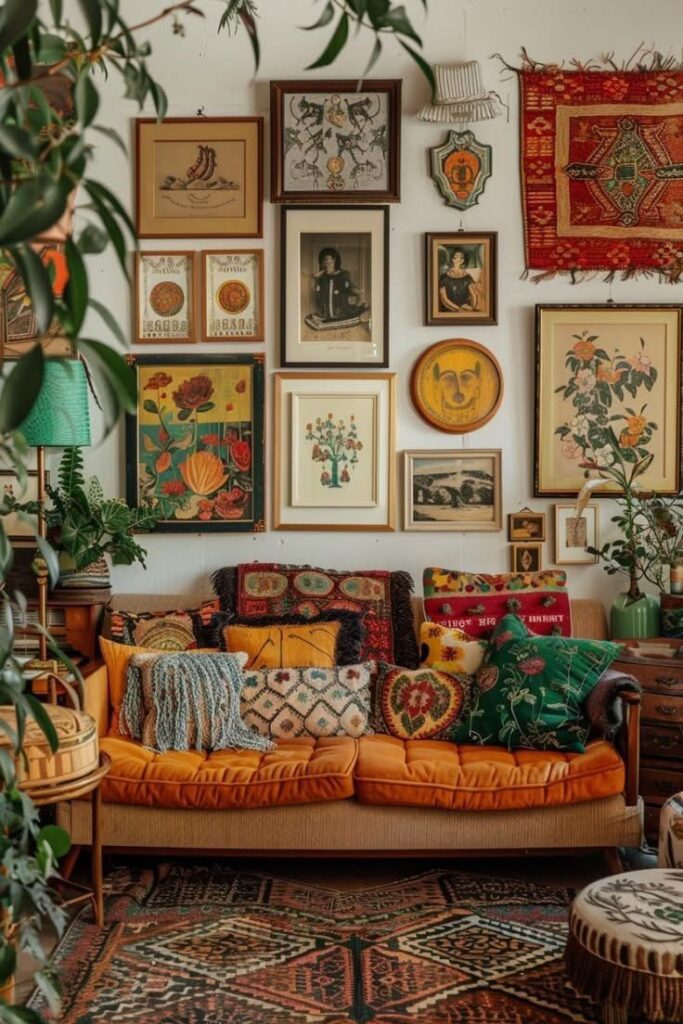
One of my favorite tricks is using a gallery wall where frames are mixed, but mats are the same creamy white. That one repeat makes it look curated, not random.
Another repeat thread that always works is material. Pick one material and echo it:
- rattan
- marble
- brass
- dark wood
- ceramic
It ties the room together without feeling matchy.
Accent Placement for Cohesion (Stop Sprinkling It Like Confetti)
If you scatter bold accents evenly across the whole room, nothing feels special and everything feels busy.
So I decorate in zones.
Think: one main scene, two echo zones
- Main scene: sofa, wall, bed, wall, dining area
- Echo zones: reading corner, console table, shelf moment
The main scene gets the boldest mix. Echo zones get smaller repeats.
This is also where lamps are a cheat code. Colored glass lamp. pleated shade. sculptural base. Lighting can carry color without adding another pillow, and honestly, I respect that.
My “accent containers” trick
If your room feels cluttered, you probably have too many tiny items floating around.
Contain them:
- tray
- bowl
- stack of books
- basket
- one shelf
Contained color feels intentional. Loose color feels messy.
Fix It Flow for “Why Does This Room Feel Messy” (No Shopping, Promise)
This is what I do when the room feels off and I’m tempted to buy something new to “solve” it.
Step 1: Do a 3-minute reset
Take every small loose item off:
- coffee table
- console
- dining table
Put it in a basket temporarily. This is not failure. This is clearing the visual noise.
Step 2: Ask one question
Is the problem mostly:
- stuff mess, or
- visual mess
If it’s a mess, skip straight to Step 5.
Step 3: Kill one random color
Find the color that appears once and only once.
Remove it for now. Close it. Move it to another room. Put it in time out.
If you miss it later, bring it back with a buddy color so it has support.
Step 4: Add one “exhale” solid
Pick one:
- Plain threw on the sofa
- Solid pillow
- Simple blanket on a chair
This is the fastest way to calm a maximalist room without changing the whole vibe.
Step 5: Make two zones on purpose
- Display zone: the things you actually love looking at
- Contain zone: tray or basket for the “real life stuff.”
Contained mess feels calmer. That counts.
Step 6: Repetition check
If a color shows up once, do one of these:
- Repeat it twice using what you already own, or
- Remove it
One is random. Three is intentional.
Step 7: Pattern sanity check
If you have three loud patterns fighting, swap one pillow or throw for a solid.
Not forever. Just to give your eyes a break.
Conclusion
Eclectic maximalist decor can be bold and cozy at the same time. The secret is not adding more. It’s connecting what you already have.
Pick a palette with a bossy color, a supporting color, and a neutral that keeps the peace. Let colors have jobs. Layer patterns with a clear hierarchy. Repeat your favorite threads in different textures. Place accents in zones instead of sprinkling them everywhere.
Then give it a week. Seriously. Your brain needs time to adjust, and lighting changes everything.
If the room feels good at night with lamps on and you can actually relax on the couch, you’ve nailed it. That’s the real test.
FAQ
What is eclectic maximalism?
It’s mixing styles, colors, patterns, and objects in a way that feels layered and personal, but still intentional. It’s collected, not random.
What are eclectic colors?
They’re usually a mix of warm and cool tones, plus a neutral thread that keeps the room grounded. The key is choosing a small set of main colors and repeating them.
Is there a difference between messy and eclectic?
Yes. Messy feels accidental and unedited. Eclectic feels intentional, even if it’s playful and imperfect.
What does an eclectic room look like?
A mix of eras, art, patterns, and textures, with a few repeated elements that tie everything together. It should feel like someone lives there, not like a showroom.
If you want, tell me one thing you already own that you want to keep as the “bossy color anchor” (sofa, rug, curtains, or art), and I’ll suggest 2 supporting colors and a simple pattern plan that fits it.