What Colors Go With Caramel Couch? The Ultimate Guide for Cozy Spaces
A caramel couch has a way of warming up a room instantly.
It is rich without being dark. It is neutral but never boring. And unlike gray or stark white sofas, it carries depth and personality all on its own.
The challenge is not whether caramel works. It absolutely does. The real question is how to build a color palette around it that feels balanced instead of too heavy, too orange, or overly matchy.
Caramel sits in the warm brown family with subtle orange undertones. That means the colors you choose need to either cool it down slightly, echo its warmth intentionally, or provide clean contrast so the space feels layered and cohesive.
Below is a detailed breakdown of the best color pairings, how to use them properly, and what to avoid.
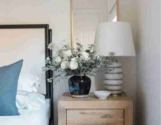
Navy Blue: The Most Reliable Contrast
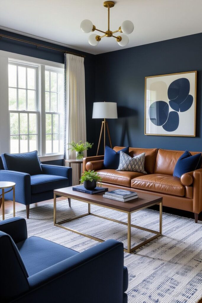
If you are unsure where to start, navy is one of the safest and most timeless choices.
Caramel’s warmth pairs beautifully with navy’s cool depth. The contrast feels grounded and classic rather than dramatic.
Why it works:
- Navy tones down caramel’s orange undertones
- The contrast feels sophisticated
- It works in modern, farmhouse, traditional, and transitional spaces
How to use it:
- Navy throw pillows layered with cream
- A navy and ivory-patterned rug
- A deep blue accent wall behind the couch
- Navy curtains with warm wood furniture
To keep the room balanced, use cream or warm white elsewhere so the space stays bright and inviting.
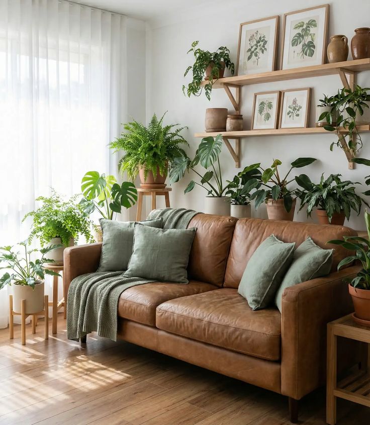
Sage Green: Soft and Organic
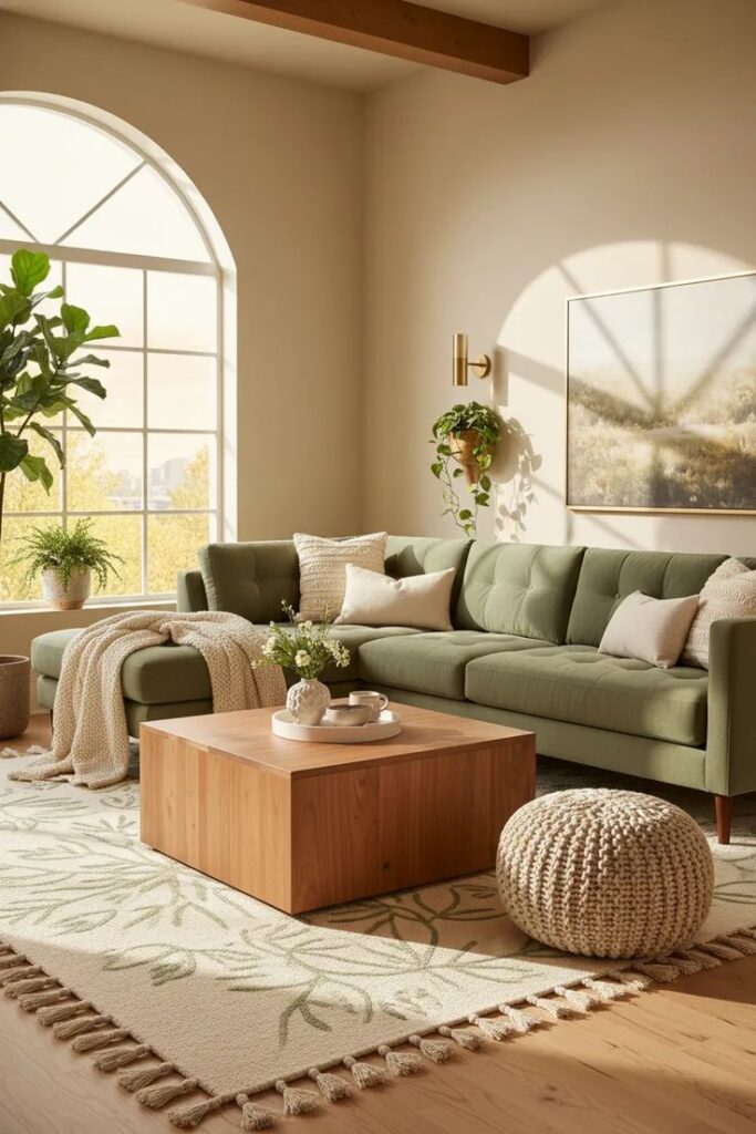
Sage green creates a calm, natural look that feels relaxed and lived in.
Because sage is muted and slightly gray-based, it complements caramel without competing with it.
Best ways to use Sage:
- Accent walls
- Linen curtains
- Velvet or cotton accent chairs
- Botanical artwork
- Area rugs with subtle green tones
Pair sage with natural materials like jute rugs, oak coffee tables, or woven baskets for an earthy, layered look.
This combination works especially well in cozy, nature-inspired interiors.
Emerald Green: Rich and Luxurious
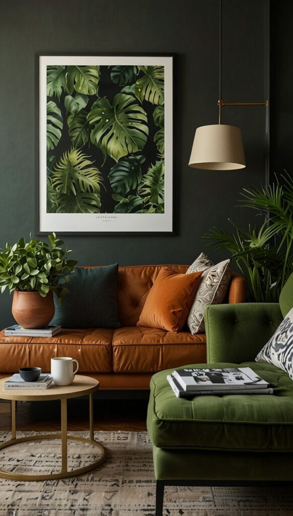
If you want depth and drama without going too dark, emerald is a stunning option.
Emerald green has richness that elevates caramel into a more upscale palette.
Where it shines:
- Velvet armchairs
- Floor-length curtains
- Bold artwork
- Statement pillows
Keep surrounding elements neutral so emerald and caramel remain the focal points. Too many competing colors can overwhelm the space.
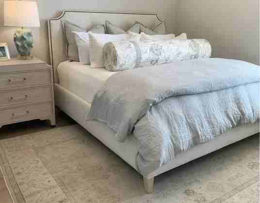
Cream and Warm White: Soft and Timeless
Cream is the most versatile backdrop for a caramel couch.
Unlike cool white, cream carries subtle warmth that enhances caramel’s tone rather than clashing with it.
Use cream in:
- Walls
- Curtains
- Large area rugs
- Throw blankets
- Layered bedding if your sofa is in a multi-purpose space
Avoid bright, blue-toned whites. They can make caramel appear overly orange and sharp instead of cozy.
Warm white and ivory create softness and balance.
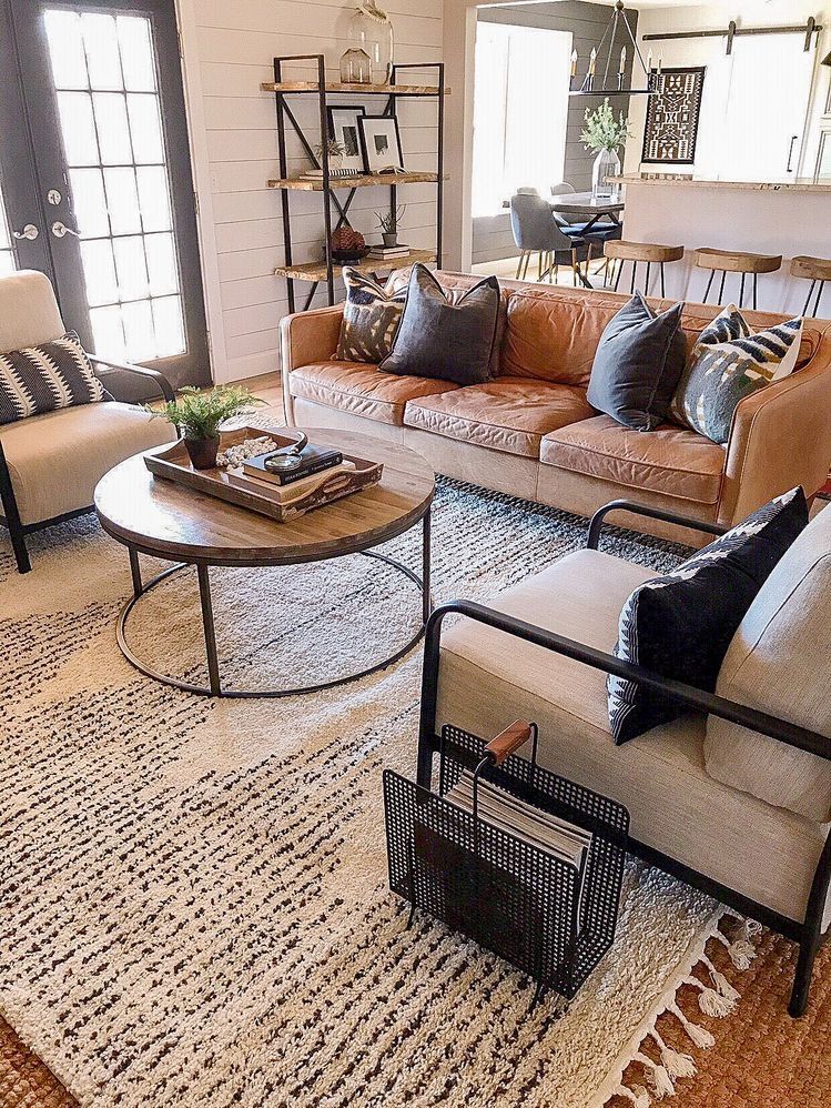
Charcoal Gray: Modern and Grounded
Charcoal gray introduces contrast without the starkness of black.
It adds depth and modern structure while allowing caramel to remain the warm anchor.
Great uses for charcoal:
- Geometric rugs
- Framed artwork
- Accent chairs
- Side tables
- Matte black or charcoal lighting fixtures
If you use charcoal, balance it with warm wood or brass accents so the room does not feel cold.
Mustard Yellow: Energetic and Retro
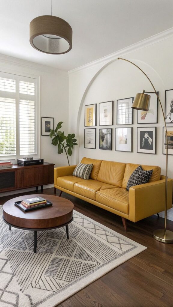
Mustard enhances caramel’s warmth in a playful but controlled way.
Because mustard has brown undertones, it feels harmonious rather than overwhelming.
Use mustard as:
- Accent pillows
- Decorative ceramics
- Artwork details
- A patterned rug with mustard accents
Keep mustard limited to smaller touches so the room remains balanced.
Teal: Fresh and Vibrant
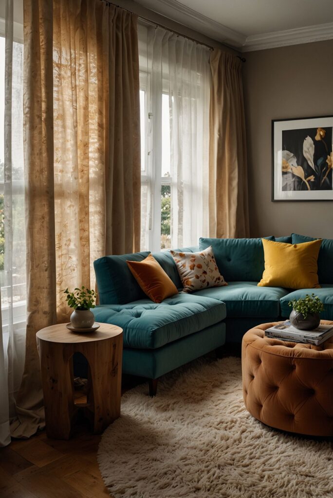
Teal sits opposite orange on the color wheel, making it a natural complementary shade.
The coolness of teal offsets caramel’s warmth beautifully.
Use teal in:
- Accent chairs
- Pillows
- Abstract artwork
- Decorative vases
Pair teal with cream or soft beige to maintain harmony and prevent visual overload.
Chocolate Brown: Deep and Layered
Many people hesitate to mix browns, but darker chocolate tones can create a sophisticated layered look.
The key is contrast.
Your darker brown elements should clearly be deeper than your caramel couch.
Use in:
- Coffee tables
- Wood shelving
- Throw blankets
- Leather accessories
Mix textures like wool, smooth leather, and polished wood to keep the look dimensional.
Terracotta and Rust: Warm and Earthy
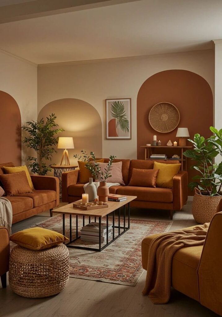
If you love warm palettes, terracotta and rust create a cohesive, sunset-inspired atmosphere.
These tones enhance caramel’s richness rather than fighting it.
Ideal for:
- Boho interiors
- Southwestern-inspired spaces
- Rustic settings
Balance with cream or beige to keep the palette from feeling overly saturated.
Black and White: Clean and Graphic
Black adds structure. White adds brightness.
Together, they sharpen caramel’s warmth and create a more contemporary look.
Use black in:
- Coffee tables
- Lamp bases
- Picture frames
- Curtain rods
Use white in:
- Pillows
- Walls
- Rugs
- Curtains
Keep black control and intentionality so it grounds the space rather than overpowering it.
Choosing the Right Rug
Rugs set the foundation for your color palette.
Excellent rug options for caramel couches include:
- Navy and cream vintage rugs
- Sage green distressed rugs
- Charcoal geometric rugs
- Natural jute rugs
- Teal patterned rugs
Avoid rugs that match your couch too closely. Slight contrast creates depth and prevents the room from looking flat.
Coffee Tables and Accent Pieces
Dark wood coffee tables, like walnut or espresso, anchor caramel beautifully.
Light oak tables create an airy and relaxed atmosphere.
Black metal frames modernize the space.
Warm metals such as brass and copper enhance caramel’s golden undertones.
Avoid chrome and cool silver finishes, which can clash with caramel’s warmth.
Lighting Tips for Caramel Furniture
Lighting dramatically affects how caramel looks.
Choose warm light bulbs around 2700K for the most flattering effect.
Layer lighting with:
- Fabric-shaded table lamps
- Floor lamps
- Soft wall sconces
- Ambient lighting instead of harsh overhead fixtures
Cool-toned bulbs can make caramel appear overly orange or artificial.
Quick Color Pairing Ideas
If you want a calm, neutral look
Caramel + cream + sage + natural wood
If you want bold and dramatic
Caramel + emerald + charcoal + brass
If you want modern contrast
Caramel + black + white + light oak
If you want earthy warmth
Caramel + rust + olive + beige
If you want fresh and coastal
Caramel + navy + white + woven textures
Frequently Asked Questions
What Is the Best Wall Color for a Caramel Couch?
Warm white, cream, sage green, soft greige, and muted blue tones work beautifully with a caramel couch. These colors support the warmth of the leather without competing with it. Avoid cool or icy whites, which can make caramel look flat or overly orange.
Can Gray Go With a Caramel Sofa?
Yes, gray can work well, but undertone matters. Choose warm gray or charcoal gray shades. Cool, blue-based grays tend to clash with caramel’s warmth and can make the room feel unbalanced.
What Throw Pillow Colors Work Best?
Navy, emerald, sage, mustard, cream, teal, and patterned neutrals are all strong choices. Mixing solid pillows with subtle patterns adds depth while keeping the look cohesive and intentional.
Should I Match My Rug to My Couch?
No. Matching exactly can make the room feel flat. Instead, choose a rug that complements the caramel tone while offering slight contrast. This creates dimension and visual interest.
A caramel couch is one of the most versatile foundation pieces you can own. The key is balance. Pair warmth with cooler tones, layer in texture, use thoughtful lighting, and introduce contrast intentionally.
When proportions and colors work together, your caramel sofa does not just sit in the room. It defines the space with depth, warmth, and style.