
Should Your Curtains Match Your Bedspread? Easy Tips for a Cozy Bedroom Look
I get this question a lot when styling bedrooms: do the curtains and bedspread need to match exactly?

Short answer? No. They absolutely do not need to be twins.
That said, they should feel like they belong in the same story. When curtains and bedding work together, the whole room feels intentional. When they clash without a plan, the space can feel unfinished or chaotic. The goal is cohesion, not duplication.
Here’s how I think about it when designing a cozy, balanced bedroom.
Should Curtains and Bedspreads Match Exactly?
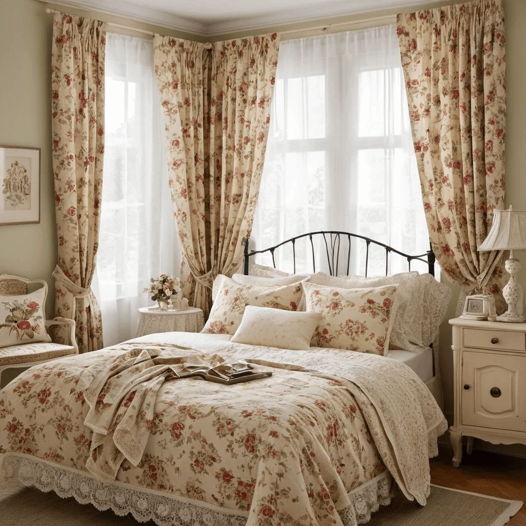
Matching sets can look clean and organized. If you use the same fabric or color for both curtains and bedding, the room instantly feels coordinated. This works especially well in smaller bedrooms where too many competing patterns might feel overwhelming.
But exact matching is not required for a beautiful result. In fact, too much matching can sometimes make a space feel flat or overly staged. Bedrooms should feel layered and personal, not like a showroom display.
Instead of asking, “Should they match?” I prefer asking, “Do they complement each other?”
That shift makes all the difference.
When Matching Works Best
There are certain situations where matching or closely coordinating curtains and bedspread makes sense.
If your bedroom is small, sticking to a consistent palette can make the space feel calmer and more open. For example, soft blue curtains paired with a similar blue duvet creates a seamless look that feels restful.
Matching is also helpful if your bedding has a strong pattern. Repeating one of the smaller colors from that pattern in your curtains keeps things balanced.
If you want a serene, hotel inspired bedroom, matching or closely coordinated tones create that peaceful, put together feel.
When Mixing Looks Better

Mixing curtains and bedding often creates more depth and personality.
If your bedspread is solid, patterned curtains can add visual interest. Geometric prints, subtle florals, or textured fabrics introduce contrast without overwhelming the room.
On the other hand, if your bedding is bold or heavily patterned, keeping curtains more neutral helps the room breathe.
The key is balance. One element can be the statement. The other should support it.
Choosing the Right Curtain Color
When picking curtain color, I always look at three things: wall color, bedding, and overall mood.
If your room leans neutral with beige or white walls, curtains are a great place to add color. A deep green, muted terracotta, or soft navy can create warmth and contrast.
If your bedding is already colorful, I pull a tone from it and repeat that shade in the curtains. This makes the room feel cohesive without being overly matched.
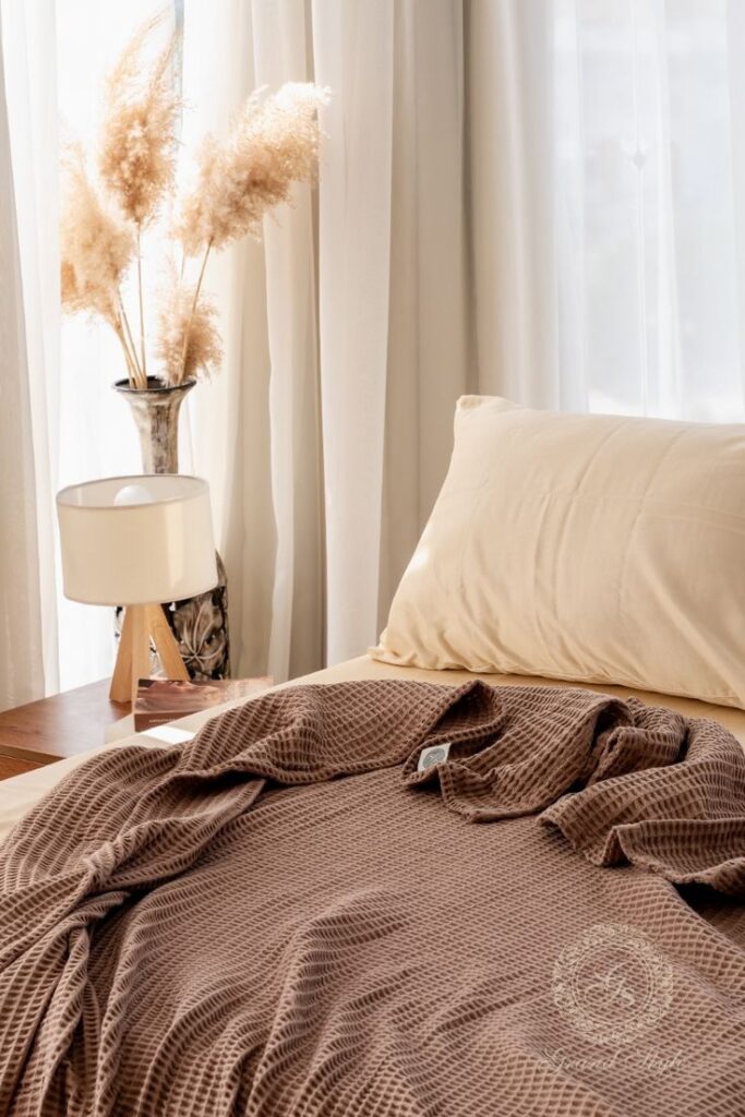
Neutral curtains like white, cream, gray, or taupe are always safe choices. They allow bedding and decorative accents to stand out.
Fabric texture matters too. Linen feels airy and relaxed. Velvet feels dramatic and luxurious. Cotton is classic and easy. Texture can change the mood even if the color stays neutral.
Creating Harmony Without Being Boring
Harmony does not mean everything looks identical. It means nothing feels out of place.
For example, imagine a room with soft gray bedding, light wood furniture, and cream walls. Instead of matching gray curtains exactly, you could use textured ivory curtains with subtle woven detail. The tones relate, but the textures add dimension.
Or picture a white bedspread with navy throw pillows. Navy curtains would tie in beautifully, even though the bed itself is white.
Repeating colors in small ways throughout the room makes everything feel intentional.
Playing With Texture
Texture is often more important than color.
You can keep curtains and bedding in the same color family but use different materials. For example:
- Crisp cotton duvet with soft velvet curtains
- Linen bedspread with lightweight gauzy curtains
- Quilted bedding paired with structured woven drapes
This creates contrast while maintaining cohesion.
Mixing textures keeps the bedroom from feeling flat. It also makes the space feel layered and comfortable, which is exactly what a bedroom should be.
Using Patterns the Smart Way
Patterns can elevate a bedroom, but they require balance.
If your bedspread is patterned, look for curtains in a solid color pulled from that design. This keeps the room visually grounded.
If your bedding is simple and solid, patterned curtains can become the focal point. Florals, stripes, or abstract prints can introduce personality without overwhelming the space.
One simple rule I follow: do not compete. If both bedding and curtains are bold patterns, they should share at least one common color to tie them together.
Otherwise, the room can feel chaotic.
Matching Sets: Pros and Cons
Pros:
- Instant coordination
- Easy decision making
- Calming and seamless look
- Ideal for minimalist or traditional styles
Cons:
- Can feel overly staged
- May lack depth
- Less opportunity for personality
If you love a clean, symmetrical space, matching might work perfectly. If you prefer a layered and collected look, mixing will likely feel more natural.
Incorporating Throw Pillows and Layers
Throw pillows are where you can bridge the gap between curtains and bedding.
If your curtains are a deep shade and your bedding is neutral, add pillows in that curtain color to connect the two visually.
Layering blankets at the foot of the bed in a coordinating shade also ties everything together.
These small accents make the room feel curated rather than accidental.
What About a Bed Skirt?
A bed skirt can quietly influence the overall look.
If your bedding is bold, a neutral bed skirt keeps things grounded. If your bedding and curtains are simple, a textured or subtly patterned bed skirt can add dimension.
Make sure the length just grazes the floor for a finished appearance. Fabric choice matters here too. Lightweight cotton feels relaxed, while velvet or heavier fabrics create warmth and structure.
Curtain Colors for Popular Bedding Shades
Choosing curtain colors gets much easier when you treat bedding as your anchor. The goal is to support the bedding, not compete with it. These combinations are practical, flexible, and easy to live with.
Blue Bedding

Blue bedding pairs best with curtains that either soften it or give it depth. White or cream creates a calm, airy feel. Beige adds warmth and keeps the room from feeling cold. Navy works when you want more contrast and a slightly moodier look. Soft gold tones add warmth and subtle contrast without overpowering the blue.
Green Bedding
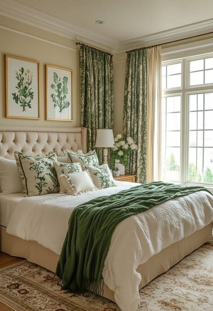
Green bedding leans naturally earthy, so grounded neutrals work beautifully. Taupe or tan enhances that organic feel. Warm white keeps the room light and fresh. Muted blush adds softness and a gentle contrast that still feels relaxed.
Gray Bedding

Gray is one of the most flexible bedding colors. Pastels create a soothing, soft atmosphere. Charcoal adds a clean, modern edge. Deep jewel tones bring drama and richness without clashing, as long as the gray has a warm or neutral undertone.
White Bedding
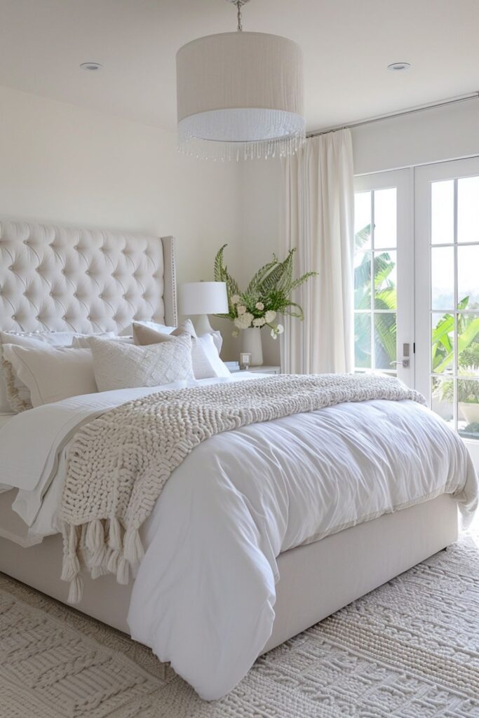
White bedding gives you the most freedom. It acts as a blank canvas for almost any curtain color. Deep jewel tones add bold contrast. Soft pastels create a romantic, airy mood. Textured neutrals keep things calm and layered. Patterned curtains are an easy way to introduce personality without overwhelming the room.
When in doubt, let bedding lead and use curtains to either soften, warm, or lightly contrast the space. White bedding is the most forgiving, but every bedding color works best when curtains support the overall mood you want to create.
How to Decide What’s Right for Your Bedroom
Start by asking yourself what kind of atmosphere you want.
Do you want:
- Calm and serene?
- Bold and dramatic?
- Light and airy?
- Cozy and layered?
Once you know the mood, your curtain and bedding choices become clearer.
If you want calm, stick to similar tones.
If you want energy, introduce contrast.
If you want coziness, focus on texture.
There is no single rule that fits every bedroom. The best choice is the one that makes the space feel comfortable and reflective of your style.
Final Thoughts
Your curtains do not need to match your bedspread exactly. They simply need to work together.
Matching creates simplicity and peace. Mixing creates depth and personality. Both can look beautiful when done intentionally.
Pay attention to color harmony, texture, pattern balance, and the mood you want to create. When those elements align, your bedroom will feel cohesive, cozy, and thoughtfully designed.