Moody Blue Bathroom Ideas That Somehow Feel Bold and Relaxing
Bathrooms often feel plain or outdated, even after small updates.
Many people struggle to create a space that feels calm and stylish without making it look too dark or overwhelming. Choosing deeper colors like blue can feel tricky, especially when you are not sure how to balance them with light and texture.
The truth is, you do not need a full renovation to make a moody blue bathroom work. A few thoughtful choices in color, materials, and layout can completely change how the space feels.
In this article, I will walk you through simple ways to use moody blue and bring everything together in a clean, balanced way.
Let’s jump into it!
Why Moody Blue Works So Well in Bathrooms
Bathrooms are naturally intimate spaces. They’re smaller, quieter, more contained. That’s actually why deeper shades can feel so grounding here.
Instead of trying to brighten everything, moody blue leans into warmth and softness. Pair it with warm lighting and natural wood, and it feels inviting. Add marble or white tile, and you get balance. Mix in brushed brass or matte black hardware, and the whole space feels layered and considered.
It’s also practical. Darker tones tend to hide minor wear, watermarks, and everyday scuffs better than lighter shades.
What If Your Bathroom Is Small?
Small bathrooms can absolutely handle darker colors — sometimes even better than large ones.
If you’re unsure about going all in, try:
- A deep blue vanity instead of full walls
- Moody blue tile inside the shower only
- An accent wall behind the mirror
- Blue cabinetry paired with crisp white walls
Even one bold element can shift the mood of the room without making it feel enclosed.
29 Moody Blue Bathroom Ideas to Inspire Your Next Refresh
Below, you’ll find ideas that balance boldness with softness from inky walls and navy vanities to slate-blue tiles paired with warm wood and glowing metal accents.
If you’ve been craving something deeper than basic white but still want your bathroom to feel like a place you can unwind, these ideas will show you how to make moody blue feel rich, calm, and completely livable.
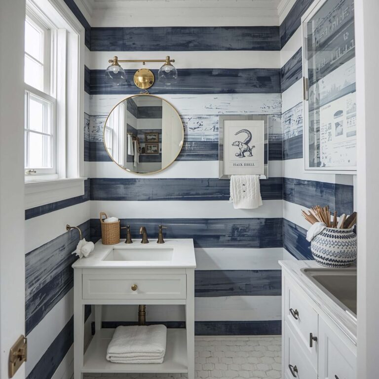
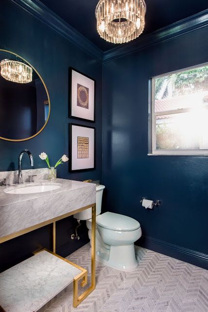
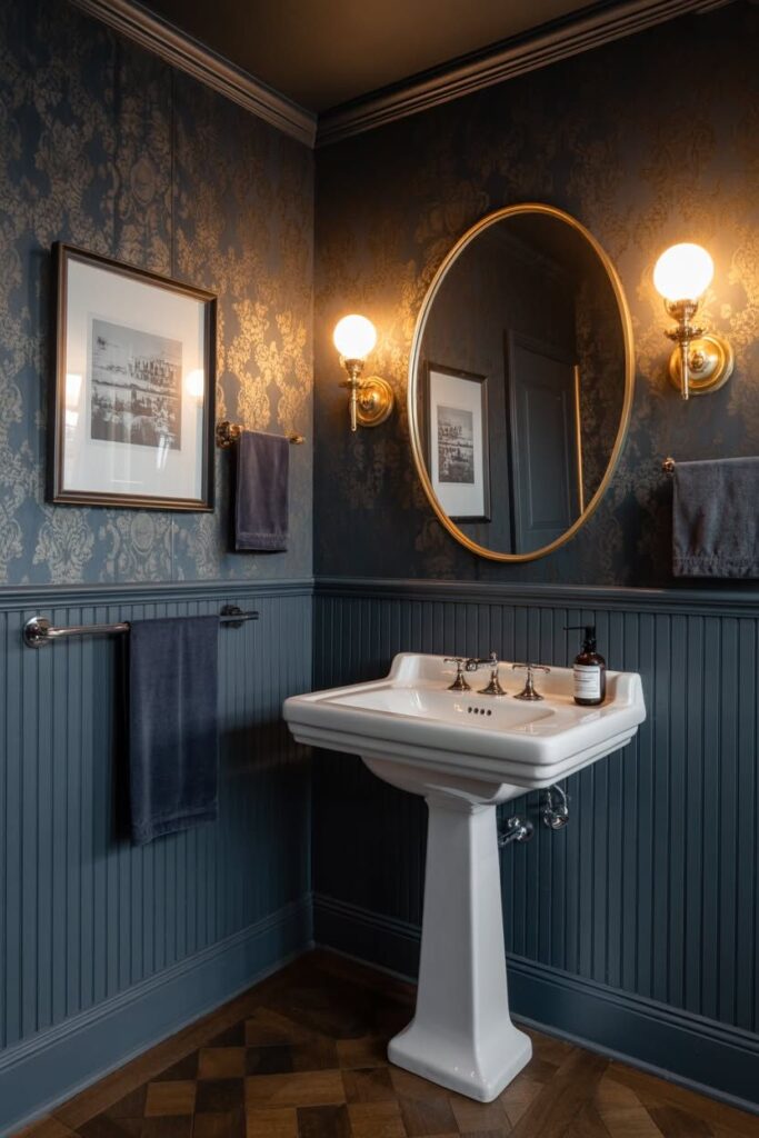
1. Dark Blue Walls with Soft White Accents
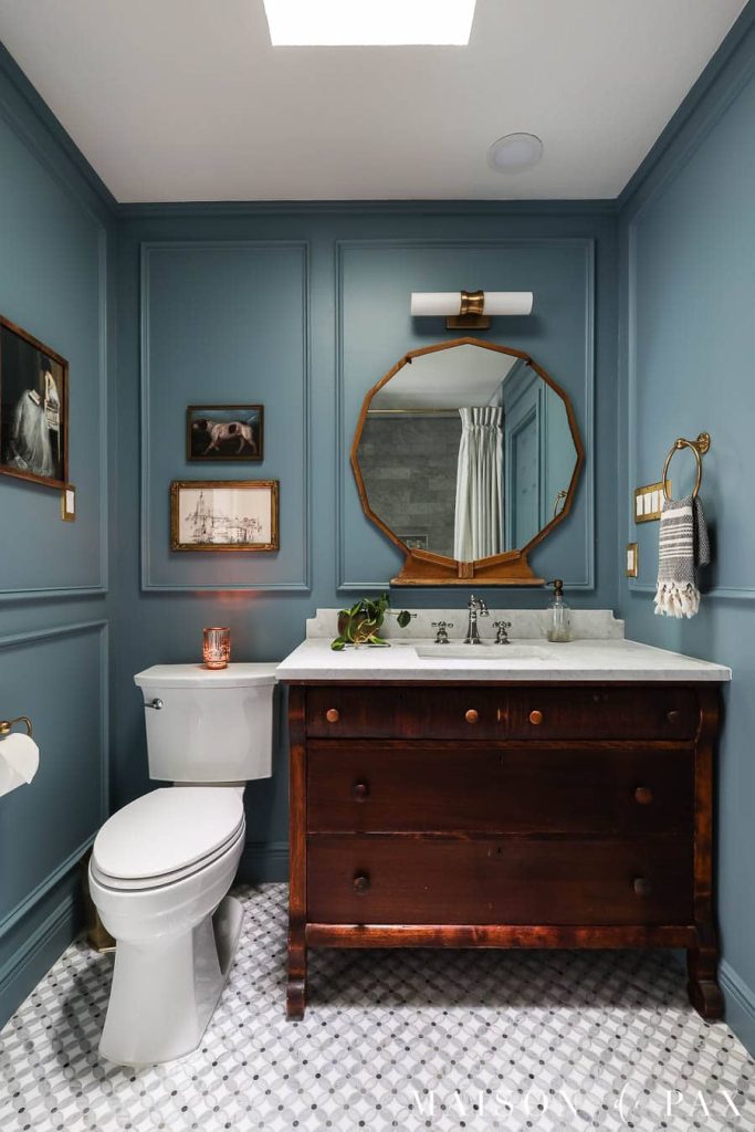
Deep blue walls instantly shift a bathroom’s mood, especially when balanced with soft white fixtures and surfaces. Navy or indigo against sinks, cabinets, and tiles creates a clean contrast that feels structured without being harsh.
In bathrooms with limited natural light, darker shades can feel heavier, so layering in white towels, rugs, and mirror frames helps reflect light into the space. This keeps the room from closing in while still holding that deeper tone.
A small detail that makes a noticeable difference is finish contrast. Matte blue walls paired with glossy white elements reduce glare and sharpen edges, which often looks more refined in everyday lighting than using the same finish across everything.
2. Navy Blue Tiles for a Coastal Vibe
Navy blue tiles bring a quieter coastal feel, leaning more grounded than brighter beach tones. The deeper shade adds structure and calm without making the space feel overly themed.
In smaller bathrooms or areas with limited airflow, covering large surfaces like floors or shower walls can feel dense. Mixing in light wood or woven textures helps soften the depth and keeps the room visually balanced.
One detail that often gets overlooked is how light interacts with tile surfaces. Glossy navy tiles reflect more light but show water spots faster, while matte finishes feel calmer but can dull the space if the lighting is weak.
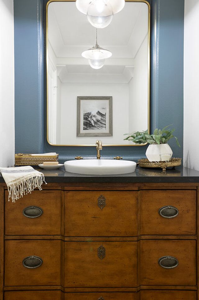
3. Moody Blue Statement Mirror
A deep blue framed mirror adds a strong focal point without changing the entire room. It works especially well when the rest of the space stays neutral but needs one defined visual anchor.
In narrow layouts or bathrooms with low ceilings, shape plays a bigger role than most expect. Round or oval mirrors draw the eye upward, making the space feel less compressed than sharp rectangular designs.
Pairing the mirror with warm metal finishes like brass or gold creates a cleaner contrast, but placement matters. If the lighting sits too high or too cool, the blue frame can lose depth and appear flat instead of standing out.
4. Moody Blue with Brass Fixtures for Luxury
Moody blue paired with brass brings a layered contrast that feels warm and grounded. The depth of blue tones helps soften the shine of brass, so the space looks balanced instead of overly reflective.
In bathrooms with strong artificial lighting, brass can appear too bright if overused. Focusing on key areas like faucets, handles, or wall lights keeps the look controlled while still adding that warm accent.
A small adjustment that improves the result is finish selection. Brushed or satin brass tends to age better visually than high polish, especially against dark walls where fingerprints and glare become more noticeable over time.
5. Matte Blue Bathroom with Wooden Elements
Matte blue walls paired with wood create a grounded, softer atmosphere that feels easy to live with. The texture of wood naturally reduces the sharpness of darker tones, making the space feel calmer.
In bathrooms with limited ventilation, darker matte finishes can hold moisture marks longer. Adding wood through shelves, vanities, or frames helps break up surfaces and keeps the space from feeling flat.
A small choice that changes the outcome is tone selection. Lighter wood balances the weight of navy walls better, while very dark wood can make the room feel heavier than expected.
6. Moody Blue with Marble Accents for Classic Elegance
Moody blue and marble create a structured contrast that feels steady and clean. The brightness of marble surfaces helps lift darker walls without competing for attention.
In smaller bathrooms, too much marble can feel cold if lighting is not warm enough. Using it on countertops, backsplashes, or floors keeps the balance while still adding variation.
One detail that improves cohesion is veining. Softer marble patterns blend more naturally with deep blue, while bold veining can pull focus away from the overall design.
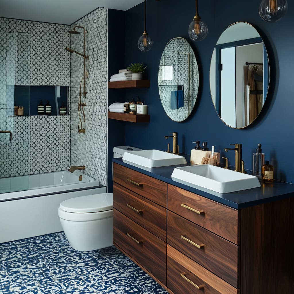
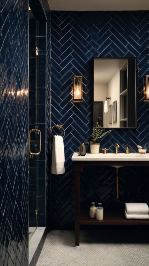
7. Blue-Tiled Shower Nook for an Inviting Retreat
A blue tiled shower nook defines a separate zone while keeping the design connected. The deeper tone creates a calm, enclosed feel without fully closing off the space.
In narrow bathrooms, solid tile walls can feel tighter if not handled carefully. Using a glass panel instead of a full partition keeps the area open and lets light pass through.
Grout choice plays a bigger role than most expect. Lighter grout highlights tile patterns and adds contrast, but it can also require more frequent cleaning to maintain the look.
8. Navy Blue and Gold Color Combo
Navy blue paired with gold creates a balanced contrast that feels rich but controlled. The depth of the navy helps gold accents stand out without overwhelming the space.
In smaller bathrooms, too many reflective finishes can feel busy under direct lighting. Using gold in lighting, mirrors, or towel holders keeps the look clean while still adding warmth.
A small but important detail is the finish choice. Brushed or matte gold reduces glare and looks more stable over time, especially compared to high shine finishes that can feel too decorative.
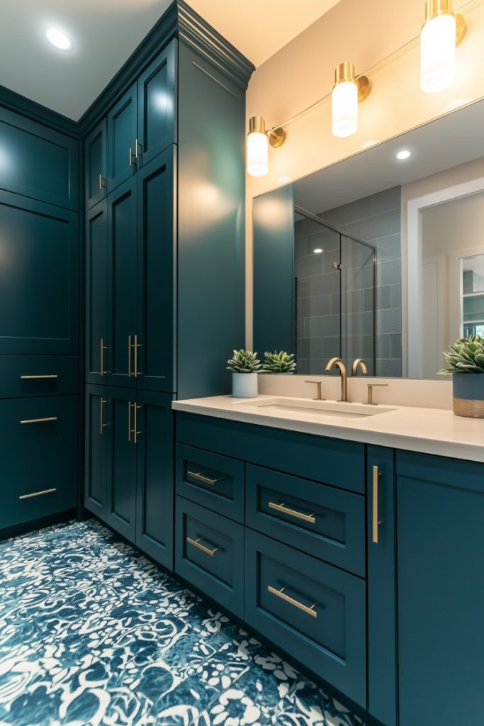
9. Moody Blue Vanity for a Bold Statement
A moody blue vanity draws attention without needing large changes elsewhere. It introduces color in a focused way, creating a clear visual anchor within the room.
In compact layouts, darker vanities can feel heavier if the surrounding area is also dark. Keeping walls and flooring light allows the vanity to stand out without closing in the space.
One detail that improves balance is the countertop. Lighter surfaces reflect more light and reduce visual weight, which makes the vanity feel sharper rather than bulky.
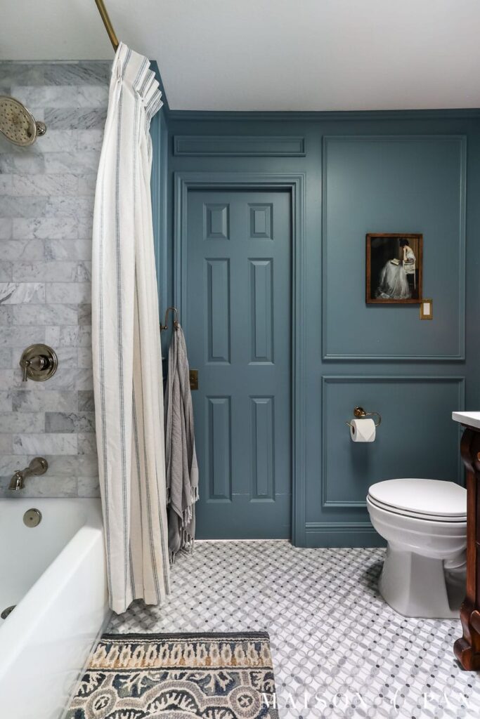
10. Soft Blue with Deep Accent Walls
Using a deep blue accent wall adds contrast without committing the entire room to darker tones. A softer blue across the rest of the space keeps the overall feel lighter and more open.
In bathrooms with uneven lighting, placing the accent wall behind a vanity or tub helps control where attention goes. This creates a defined focal point without spreading darkness across the room.
Paint finish plays a subtle role here. A slight sheen reflects light better than flat paint, helping the deeper shade stand out instead of blending into shadows.
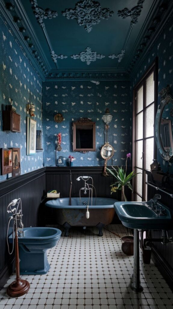
11. Blue Wallpaper with Floral Patterns
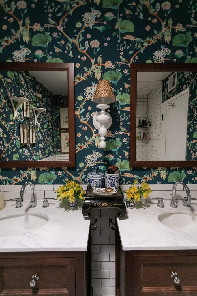
Blue floral wallpaper adds depth while softening the overall look through pattern and detail. The darker base gives contrast, while floral elements keep the space from feeling too rigid.
In humid bathrooms, standard wallpaper can peel or lose texture over time. Choosing moisture-resistant options helps maintain both color and pattern clarity.
Pattern scale often gets overlooked. Smaller floral prints feel more controlled in tight spaces, while larger patterns can quickly dominate if the room is limited in size.
12. Moody Blue with Black Accents for a Modern Edge
Moody blue paired with black details creates a sharper, more structured look that leans modern. The contrast keeps the design clean and defined without adding visual clutter.
In bathrooms with low lighting, too much black can flatten depth and make edges blend. Adding small lighter elements like towels or trim helps break that effect and keeps the space readable.
Finish consistency matters more than expected here. Matte black surfaces reduce reflections and keep the look cohesive, while mixed finishes can make the design feel slightly disjointed.
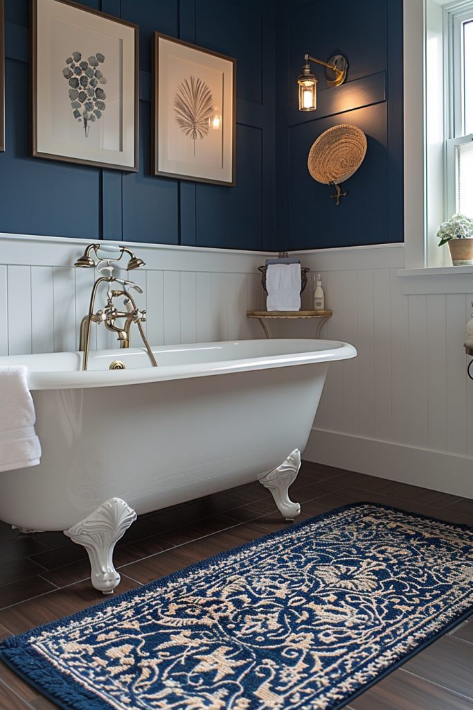
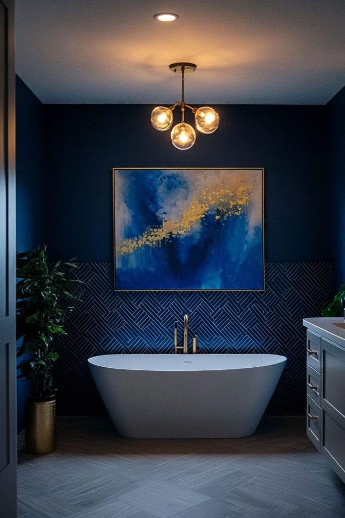
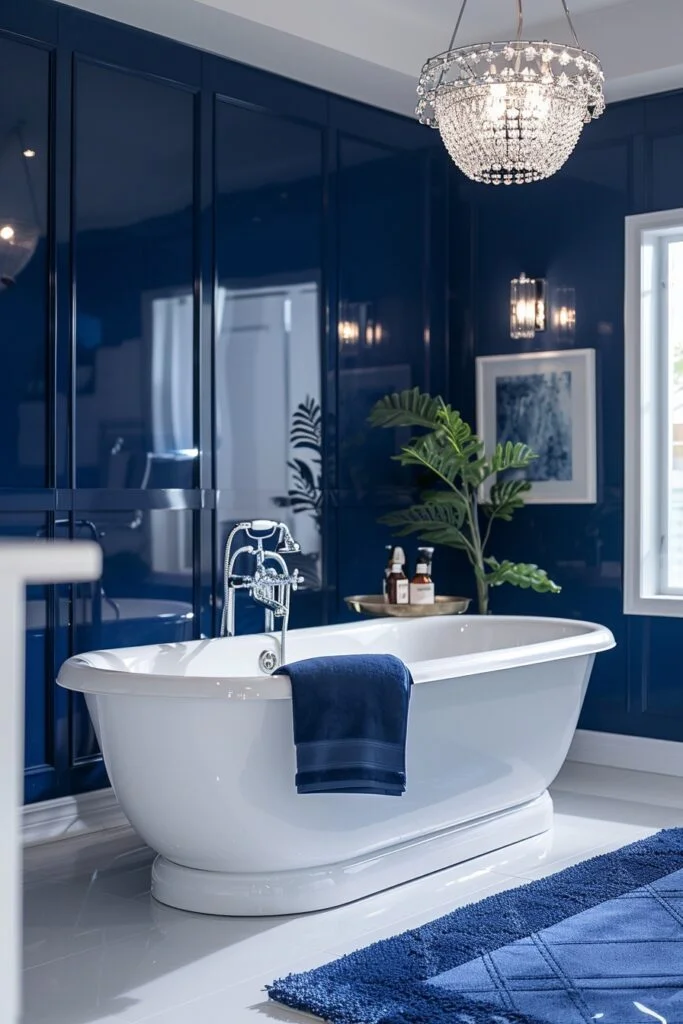
13. Navy Blue Bathtub for a Luxe Feel
A navy blue bathtub naturally becomes the focal point without needing extra decoration. The deeper tone adds presence while still blending smoothly with neutral surroundings.
In tighter layouts, darker tubs can feel heavier if the floor and walls are also dark. Keeping surrounding surfaces lighter helps the shape stand out and keeps the room open.
One detail that improves the overall result is form. Simple, clean tub shapes highlight the color better, while overly detailed designs can distract from the finish.
14. Blue and White Striped Shower Curtains
A blue and white striped curtain introduces movement while keeping the palette consistent. The pattern adds contrast in a way that feels light and easy to adjust over time.
In shared bathrooms, fabric choice affects daily use more than expected. Thinner materials can cling or lose shape, especially with frequent moisture exposure.
A practical upgrade is fabric weight. Thicker curtains hold structure better and resist wear, which keeps the stripes looking clean instead of uneven over time.
15. Moody Blue with Glass Shelving for Open Storage
Glass shelving against moody blue walls keeps storage functional without adding visual weight. The transparency allows the wall color to remain visible, which helps the space feel open.
In small bathrooms, bulky storage can quickly close in the layout. Using glass shelves instead of solid units maintains accessibility while reducing visual density.
Lighting placement makes a subtle difference here. Soft lighting near shelves highlights items without casting harsh shadows, which keeps the overall look balanced rather than cluttered.
16. Blue and Gold-Accented Tiling
Blue tiles with gold detailing add depth while keeping the design controlled and refined. The contrast works best when gold is used in small trims or inlays, allowing the blue to stay dominant.
In bathrooms with strong overhead lighting, gold accents can reflect too much if spread across large areas. Keeping surrounding walls neutral helps the tile work stand out without creating visual noise.
A subtle adjustment that improves the result is placement. Using gold only along edges or borders keeps the pattern sharp, while full coverage can make the design feel busy faster than expected.
17. Moody Blue with Velvet Touches
Velvet introduces a soft texture that balances the depth of moody blue. Even small additions can make the space feel warmer and more layered without changing the layout.
In humid bathrooms, fabric choice needs attention since moisture can affect how materials hold up. Using velvet in low splash areas like curtains or framed accents keeps the texture intact over time.
One detail often missed is contrast. Pairing velvet with lighter finishes prevents the space from feeling too dense, especially when the walls already carry darker tones.
18. Blue Accent Wall with White Tiles
A blue accent wall paired with white tiles creates a clean contrast that defines the space. The darker tone adds depth, while white tiles reflect light and keep the room visually open.
In smaller bathrooms, placement becomes important to avoid uneven balance. Positioning the accent wall behind a vanity or shower area helps guide focus without spreading darker tones across the room.
Grout choice has a visible impact on the final look. Lighter grout keeps the tile pattern crisp, though it may require more upkeep to maintain that fresh appearance.
19. Moody Blue with Light Wood Accents
Light wood tones soften the depth of moody blue walls and make the space feel more balanced. The natural warmth of wood helps reduce the cool intensity of darker shades.
In bathrooms with limited natural light, darker walls can feel heavier if not balanced correctly. Adding light wood through vanities, shelves, or frames introduces contrast without adding clutter.
A small but useful detail is the finish choice. Natural or lightly sealed wood keeps the space feeling open, while darker stains can shift the room back toward a heavier look.
20. Navy Blue with Floral Wall Art
Floral artwork against navy walls adds variation without disrupting the color scheme. The patterns bring detail while still blending into the background in a controlled way.
In compact bathrooms, too many bold frames can make walls feel crowded. Placing one or two framed pieces near mirrors or vanities keeps the focus intentional.
Color selection within the artwork matters more than expected. Softer palettes break up the dark wall gently, while overly bright tones can feel disconnected from the rest of the space.
21. Navy Blue and White Chevron Pattern
A navy and white chevron pattern introduces movement through strong, repeating lines. The contrast keeps the design structured while adding visual energy.
In smaller layouts, bold patterns can feel overwhelming if used across large areas. Applying chevron on floors or a backsplash only keeps the effect focused and easier to manage.
One detail that changes the outcome is scale. Smaller patterns feel more controlled, while larger chevron designs can dominate the space faster than expected.
22. Moody Blue Freestanding Sink
A moody blue freestanding sink creates a clear focal point without adding bulk. Its standalone form keeps the layout open while adding depth through color.
In tighter bathrooms, placement is important since freestanding pieces need breathing space. Surrounding it with lighter surfaces helps define the shape without closing in the area.
A subtle improvement comes from contrast. Pairing it with a lighter countertop or base sharpens the edges, making the color stand out more clearly in everyday lighting.
23. Blue Tile Border Around Mirrors
A blue tile border around a mirror adds detail without taking over the space. It creates a defined frame that subtly introduces color while keeping the layout clean.
In bathrooms with limited light, darker borders can reduce brightness around the mirror. Using a slightly lighter blue or reflective tiles helps maintain clarity while still adding contrast.
Tile size affects the final look more than expected. Smaller tiles create a finer, more refined edge, while larger pieces can feel heavier and less precise.
24. Moody Blue with Dark Wood Furniture
Dark wood furniture paired with moody blue walls creates a deeper, grounded atmosphere. The richness of the wood brings warmth that balances the cooler tones of blue.
In smaller bathrooms, combining two darker elements can make the space feel dense if not balanced. Adding lighter fabrics or accessories helps break that weight and keeps the room usable.
One detail that improves the outcome is spacing. Leaving small gaps around furniture prevents the area from feeling packed, especially when both tones are visually strong.
25. Navy Blue Mosaic Tiles for Texture
Navy mosaic tiles add texture through their layered surface and small scale. They reflect light in varied directions, which helps brighten the space while keeping a deeper tone.
In bathrooms with uneven lighting, too much mosaic can create visual noise. Using them in focused areas like backsplashes or shower sections keeps the effect controlled.
A subtle detail to consider is grout tone. Matching grout keeps the surface smooth and cohesive, while high contrast grout can make the pattern feel more pronounced than intended.
26. Moody Blue with Black Marble
Moody blue paired with black marble creates a deep, layered contrast that feels structured and bold. The natural veining in marble adds movement within darker surfaces, keeping them from looking flat.
In bathrooms with limited lighting, combining two dark materials can reduce depth if not handled carefully. Keeping the layout simple and adding soft, warm lighting helps reveal the texture instead of hiding it.
A small detail that changes the result is veining contrast. Subtle marble veining blends more smoothly with blue, while high contrast patterns can pull attention away from the overall balance.
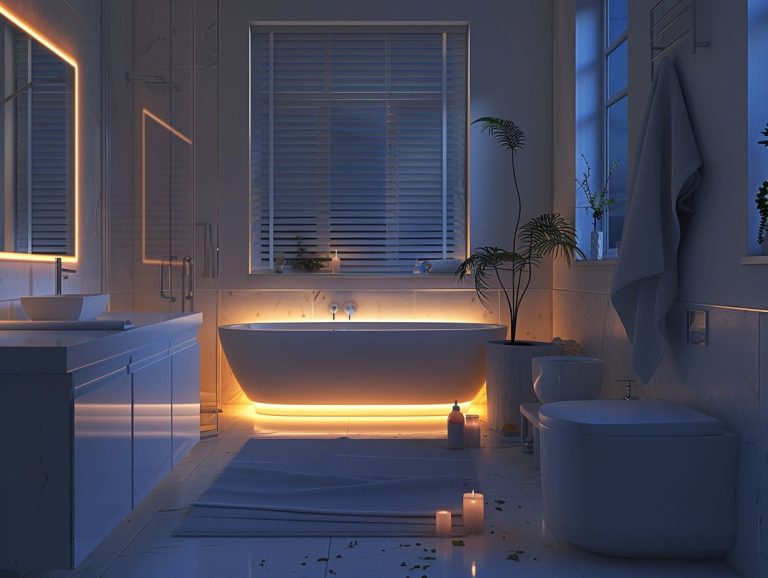
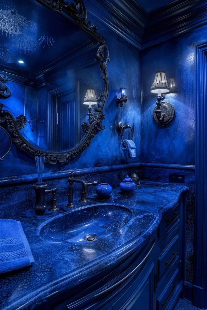
27. Soft Blue Lighting for a Relaxing Atmosphere
Soft blue lighting shifts the mood of a bathroom without adding physical elements. It works with deeper tones to create a calmer and more defined atmosphere.
In smaller spaces, too much colored lighting can reduce visibility if used alone. Pairing it with neutral or warm white light sources keeps the room functional while maintaining the mood.
Placement makes a noticeable difference. Positioning blue light near tubs or lower wall areas softens the effect, while overhead use can feel too cold or harsh over time.
28. Moody Blue Shower Doors
Blue toned shower doors introduce color in a subtle, functional way. The finish adds depth while keeping the overall structure clean and minimal.
In compact bathrooms, darker glass can make the shower area feel more enclosed if lighting is limited. Using clear or lightly tinted finishes helps maintain openness while still adding tone.
One detail that improves consistency is framing. Simple or frameless designs keep attention on the color, while heavy frames can compete with the overall look.
29. Blue and White Tiled Floor
A blue and white tiled floor creates a strong base through contrast and pattern. It adds visual interest while keeping walls and fixtures free for simpler finishes.
In smaller bathrooms, large or complex patterns can feel overwhelming if spread across the entire floor. Choosing more controlled layouts or smaller repeats helps maintain balance.
Grout and spacing influence the final effect more than expected. Consistent grout lines keep the pattern clean, while uneven spacing can make the design feel less structured over time.
Frequently Asked Questions
How do I keep a moody blue bathroom from feeling too dark?
Focus on balance instead of brightness. Use light surfaces like white tiles, mirrors, or countertops to reflect light. In spaces with limited natural light, layering warm lighting helps prevent the blue from feeling flat.
What shades of blue work best for bathrooms?
Deeper tones like navy, indigo, and midnight blue tend to feel more stable in bathrooms. Lighter blues can work, but they often lack the same depth and contrast when paired with materials like wood or marble.
Can Moody Blue work in a small bathroom?
Yes, but placement matters. Using blue on one wall, a vanity, or a shower area keeps the space from feeling enclosed. Pairing it with lighter elements helps maintain openness.
What materials pair well with moody blue?
Materials that add contrast or warmth work best. Wood, marble, brass, and glass help balance the depth of blue and keep the design from feeling heavy.
Is matte or glossy finish better for moody blue?
It depends on lighting and maintenance. Matte finishes reduce glare and feel softer, while glossy finishes reflect more light but can show water spots more easily in daily use.
Conclusion
Moody blue works because it brings depth without requiring a full redesign. The key is not just the color, but how it interacts with light, texture, and surrounding materials.
Small choices make the biggest difference. A lighter countertop, a softer finish, or a well-placed mirror can shift how the entire space feels.
When done with balance, moody blue does not make a bathroom feel smaller. It makes it feel more intentional, more structured, and easier to live with over time.