Simple Ways to Decorate Using Just Three Colors
I used to think decorating meant layering in color after color until a room felt “finished.”
What does it actually feel like? Overwhelming.
At one point, my living room had beige walls, a grey sofa, blue pillows, green plants, black frames, brown wood, brass lamps, and a random dusty pink throw I panic-bought because it was trendy. Nothing was technically wrong. It just felt… busy.
The shift happened when I forced myself to stick to just three colors.
And honestly? It changed everything.
Here’s exactly how I use the three-color rule now and how you can apply it without making your space feel flat or boring.
What Is the Three-Color Rule?
The three-color rule means choosing only three main colors for a space and repeating them intentionally.
When I first tried this, I followed the 60-30-10 formula:
| Role | Percentage | Where It Shows Up |
|---|---|---|
| Dominant | 60% | Walls, largest furniture, rugs |
| Secondary | 30% | Curtains, chairs, bedding, cabinets |
| Accent | 10% | Pillows, art, decor, small details |
- The dominant color sets the tone.
- The secondary supports it.
- The accent adds personality.
Once I followed this structure, my room stopped feeling random and started feeling designed.
Why Limiting to Three Colors Actually Feels Better
When I had too many colors, my eye didn’t know where to rest.
With just three, everything suddenly felt calmer.
Here’s what I personally noticed:
- My space looked more expensive
- Shopping decisions became easier
- Mixing old and new furniture worked better
- Seasonal swaps felt effortless
- The room felt cohesive without trying too hard
Three colors create visual clarity. Your brain relaxes because it understands the space instantly.
How I Pick My Three Colors
When I redid my bedroom, I followed this exact method.
Step 1: Choose One Color You Genuinely Love
For me, it was warm beige. I realized I always gravitate toward it.
That became my dominant color.
Step 2: Add a Supportive Secondary Shade
I added soft grey. It balanced the warmth of beige without clashing.
Step 3: Pick One Accent
I chose matte black for contrast. Lamps, handles, frames, and curtain rods.
That was it. No fourth color allowed.
Combinations I’ve Personally Tried
Here are palettes I’ve used or helped friends implement that actually work in real homes:
| Palette | Feeling | Where It Works Best |
|---|---|---|
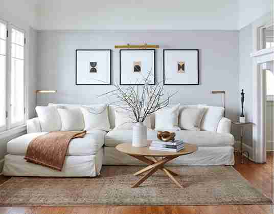
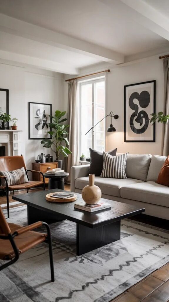
| Beige, White, Black | Calm and modern | Living rooms, apartments |
| Grey, White, Navy | Clean and classic | Bedrooms |
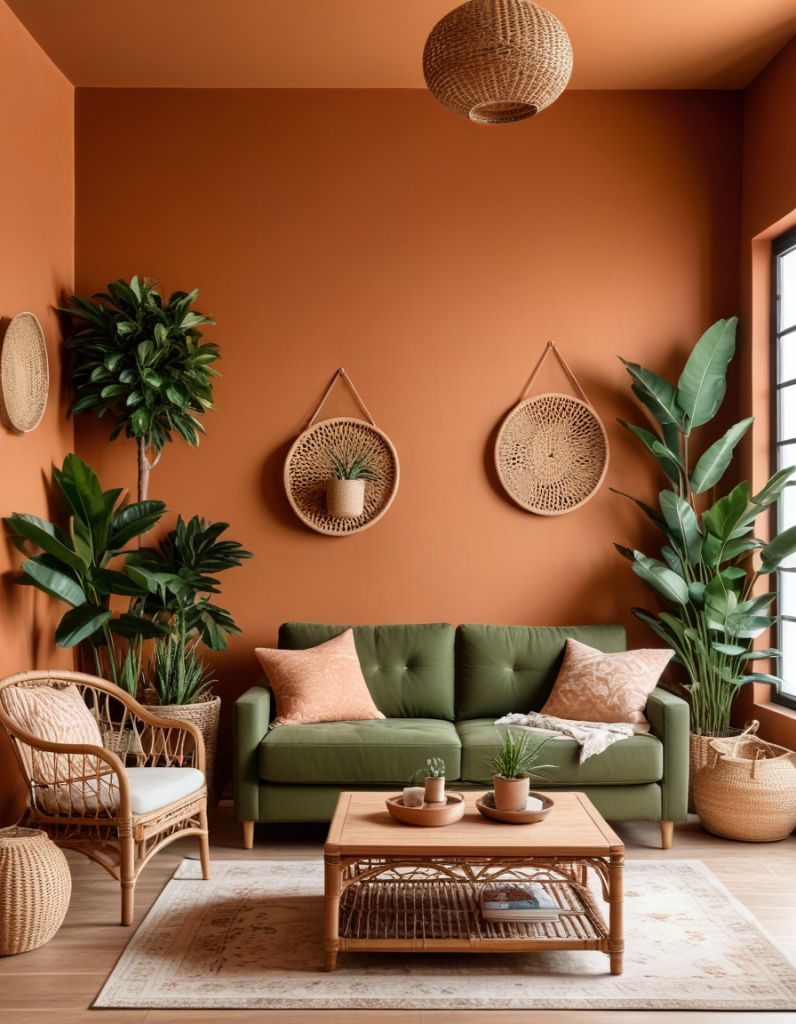
| Rust, Camel, Ivory | Cozy and warm | Open concept spaces |
| Black, White, Emerald | Bold and dramatic | Dining areas |
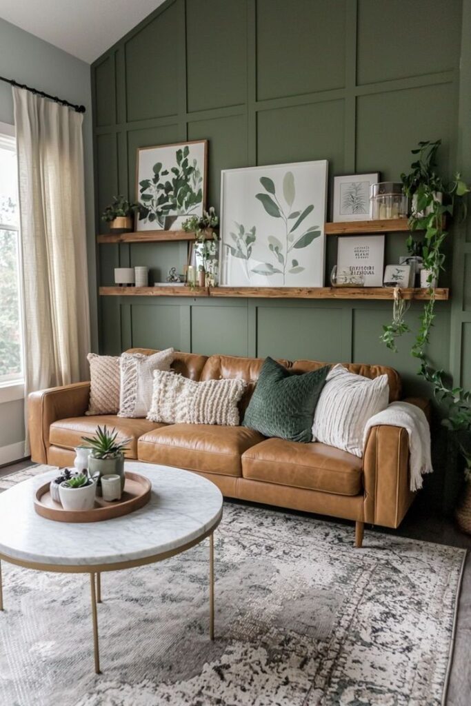
| Brown, Cream, Charcoal | Relaxed and grounded | Family rooms |
When I stick to one of these frameworks, everything else falls into place.
Neutrals Make Life Easier
Neutrals make the three-color rule almost effortless.
White, beige, gray, and black act as visual anchors that keep a room grounded. They allow you to play with proportion without the space feeling busy or chaotic.
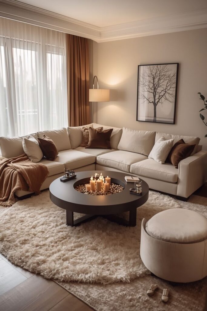
In my living room, beige walls cover about sixty percent of the room. A gray sofa and curtains take up roughly thirty percent. Black accents handle the remaining ten percent. The result feels layered and intentional, but never loud.
The real secret is texture.
- Linen curtains add softness.
- Velvet cushions bring depth.
- Wood side tables introduce warmth.
- Woven baskets keep things relaxed and lived in.
Even with just three colors, texture creates interest and prevents the room from feeling flat.
How I Use the 60-30-10 Rule in Real Rooms
Here’s a real example from my living room:
| Item | Color | Category |
|---|---|---|
| Walls | Beige | 60% |
| Sofa | Grey | 30% |
| Curtains | Grey | 30% |
| Rug | Beige | 60% |
| Coffee Table | Wood (neutral) | Supports |
| Lamps + Frames | Black | 10% |
| Throw Pillows | Black + Beige | Accent |
Nothing feels chaotic because each item fits into one of the three buckets.
What I Learned About Accent Colors
This is where I used to get it wrong.
I would fall in love with a trendy color and let it quietly take over the room. What was meant to be an accent became the main character.
Now I treat accent colors like seasoning. A little goes a long way.
If black is my accent, I use it in small, repeatable places like lamp bases, curtain rods, picture frames, a single vase, or cabinet handles. These touches create rhythm without dominating the space.
I avoid using accent colors in large areas like the rug, the sofa, or the walls. Once an accent moves into those zones, it stops being an accent.
Keeping accent colors small makes them feel intentional and polished instead of overwhelming.
Muted Colors Work Best
I’ve experimented with bold primaries, but muted tones always feel more livable.
Instead of bright green, I choose sage.
Instead of royal blue, I chose dusty navy.
Instead of neon pink, I choose clay or blush.
Muted colors blend better and feel grown-up.
Testing Paint Was a Game-Changer
I learned this the hard way.
Paint looks completely different in:
- Morning light
- Afternoon sun
- Night with warm bulbs
Now I always test samples on multiple walls.
Here’s what I check:
| What I Look For | Why It Matters |
|---|---|
| Warm vs Cool undertones | Prevents color clashes |
| Coverage quality | Avoids patchy finishes |
| Day vs Night look | Keeps tone consistent |
| Interaction with furniture | Ensures harmony |
Testing saved me from repainting an entire room.
Where Most People Go Wrong
From my own experience, here are the biggest mistakes:
- Adding a fourth “almost neutral” that becomes a new color
- Letting the accent color take up too much space
- Ignoring texture
- Mixing warm and cool tones accidentally
- Forgetting lighting affects everything
Once I tightened my palette and respected the percentages, decorating became easier instead of stressful.
Final Thoughts From Someone Who Tried It Both Ways
When I decorated with too many colors, my rooms felt styled but unsettled.
When I committed to just three colors, everything clicked.
It did not feel limiting.
It felt controlled.
It felt intentional.
If you feel overwhelmed by decorating decisions, start with three colors.
Choose one you love.
Choose one that supports it.
Choose one small pop.
Then repeat them confidently.
You will be surprised how calm and polished your space starts to feel.