The One Layout Shift That Made Bedroom Wall Decor Above Bed Feel Right
There is a very specific kind of design anxiety that only shows up when you stare at the wall above your bed.
It is too big to ignore.
Too important to mess up.
And somehow it feels way more dramatic than hanging art anywhere else in the house.
When that wall is empty, the room feels unfinished.
When the layout is off, even slightly, the whole bedroom feels chaotic.
The shift that finally fixed it for me was not buying better art.
It was changing the layout logic.
Once I stopped thinking “what should I hang?” and started thinking “how should this relate to the bed?” everything clicked.
This guide walks you through the sizing math, spacing rules, layout options, and safe mounting tips that make bedroom wall decor above the bed feel intentional instead of accidental.
The One Layout Shift That Changes Everything
Here is the shift:
Stop centering your art on the wall. Start centering it on the bed.
That sounds obvious, but it changes everything.
Your bed is the anchor. The wall decor should visually “belong” to it, not float randomly in the middle of a large wall.
When the art spans the right width and sits at the right height relative to the headboard or mattress, the room suddenly feels calm.
This is where the sizing math comes in.
The Simple Formula For Bedroom Wall Decor Above The Bed
Getting the wall above the bed right is less about taste and more about proportion. These three rules solve most layout problems without guesswork.
Width rule: sixty to eighty percent of the bed width
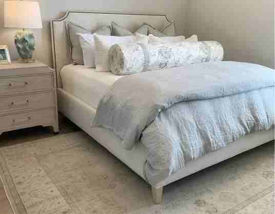
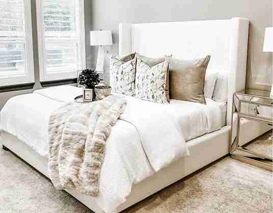
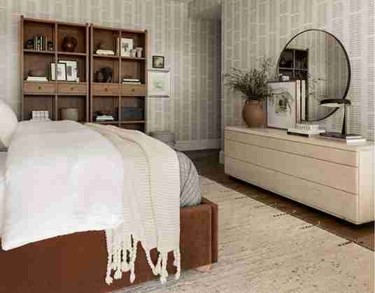
Your full art arrangement should span roughly sixty to eighty percent of the bed’s width. A twin bed usually looks best with a smaller grouping, a queen bed can handle a medium statement or grouped layout, and a king bed needs a larger statement or extended gallery to feel balanced.
When art is too narrow, it looks lost and accidental. When it stretches wider than the bed, it feels disconnected from the furniture below it.
Height rule
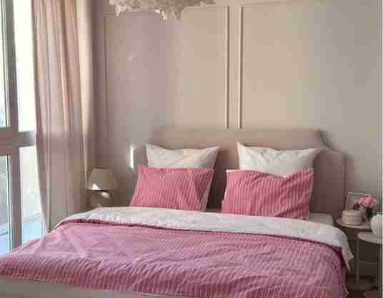
If you have a headboard, the bottom of the art should sit about six to ten inches above it. If you do not have a headboard, aim for fourteen to sixteen inches above the mattress.
Hung too high, the art starts to feel like hallway decor. Hung too low; it feels cramped and uncomfortable.
Spacing rule
For gallery walls, keep about two to three inches between frames. This spacing allows multiple pieces to read as one cohesive arrangement rather than a cluttered collection.
When these three rules are respected, the wall above the bed almost always feels intentional and calm.
Choosing The Right Art For The Mood You Want
Before you think about sizes, frames, or layouts, decide how you want your bedroom to feel when you walk in. Mood should lead the decision, not trends.
If you want a calm and restful space, lean toward soft landscapes, muted abstract art, or neutral photography. These pieces create visual quiet and help the room feel relaxed rather than stimulating.
For a clean and modern look, graphic shapes with plenty of negative space work well. Simple compositions and high contrast designs feel intentional without overwhelming the room.
If you want the space to feel personal and cozy, choose family photos, travel memories, or collected pieces that have meaning. The key is keeping the color palette controlled so the room still feels restful.
Avoid art that feels loud or overly busy unless you genuinely enjoy high-energy spaces. Bedrooms usually work best when the visual tone supports rest rather than demanding attention.
A balanced arrangement often includes:
- One larger anchor piece to ground the layout
- Two to four supporting pieces to build visual interest
- One subtle textural element if desired
Printable art, canvas sets, framed photographs, or even small textile pieces can work together beautifully when the layout is strong.
Layout Options That Actually Work
When wall decor above the bed feels wrong, it is almost always a layout issue, not an art issue. These layouts work because they respect balance, proportion, and the bed as the visual anchor.
Symmetrical layout
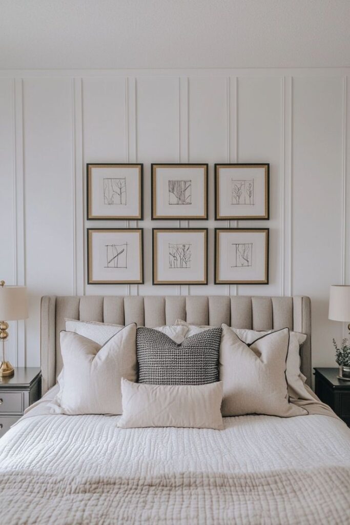
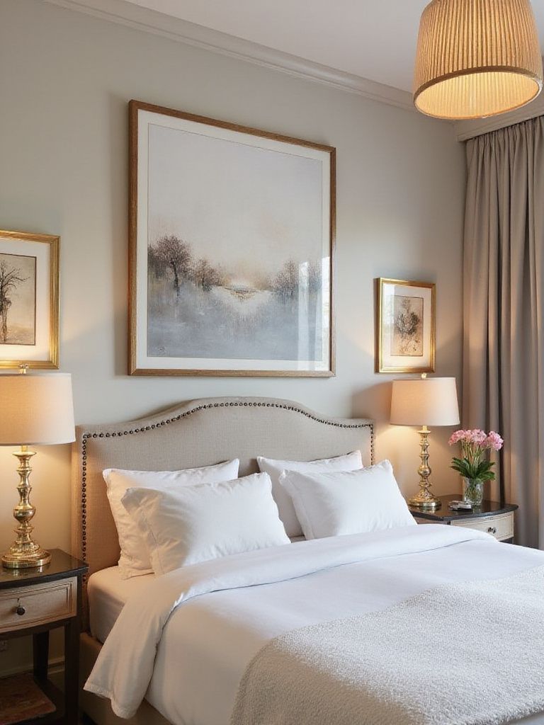
This uses two or three pieces evenly centered above the bed. It works especially well in calm, traditional, or structured bedrooms where visual order matters. Symmetry instantly grounds the space and makes the room feel settled.
Asymmetrical layout with an anchor
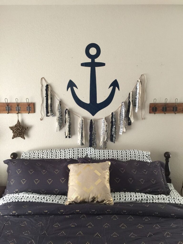
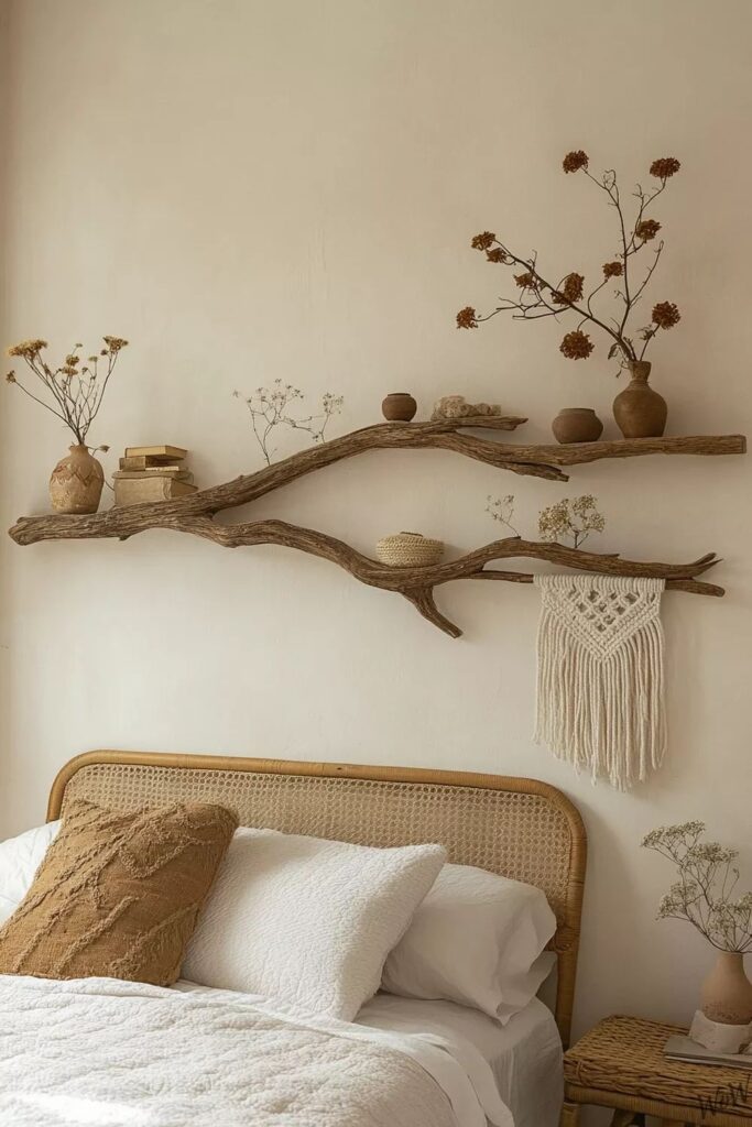
Start with one larger central piece and build outward with smaller pieces, keeping the visual weight balanced. This approach works beautifully for relaxed or collected styles and personal gallery walls. The goal is balance, not randomness, so everything still feels connected.
Panoramic statement
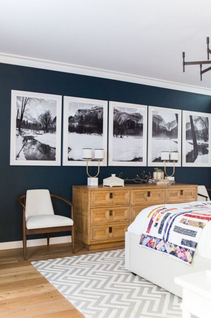
One wide horizontal piece that spans most of the bed’s width. This is ideal for minimal bedrooms, upholstered headboards, or large walls that need presence without clutter. It delivers impact while keeping the room visually calm.
Scale And Proportion: Why Small Art Fails
Beds, especially queen and king sizes, are visually heavy. When a small piece of art is hung above them, it almost always looks undersized and disconnected.
For larger beds, a single statement piece should be at least eighteen by twenty-four inches. Panoramic prints usually look better when they are wider rather than taller. For gallery layouts, think of the entire grouping as one large shape rather than individual frames.
The overall silhouette matters far more than the size of each piece. When the arrangement reads as one cohesive form, the wall above the bed finally feels resolved.
Frame Choices That Keep It Cohesive
You do not need identical frames across the entire wall, but you do need consistency in at least one place. That single through line is what makes the arrangement feel intentional instead of random.
The easiest way to do this is to choose one unifying element and repeat it. That might be the same frame color, the same mat style, or a shared tonal palette across all the artwork. You only need one. More than that can start to feel overcontrolled.
Warm wood frames work especially well with warm bedding, natural textures, and softer color palettes. They add quiet warmth without pulling attention away from the art itself.
Black frames create clean contrast on light walls and are great for modern or graphic spaces. They help define the arrangement clearly and give the wall a strong outline.
White mats are useful when prints feel busy or varied. They create breathing room and help different pieces sit together more calmly.
Too much variation in frames makes the wall feel chaotic and unsettled. Too much matching can make it feel staged and impersonal. The sweet spot is balance, where the frames support the art and the bed rather than competing with them.
Safe Mounting Above a Bed
This is not just about how it looks. It is about safety and peace of mind.
When hanging anything above a bed, lighter is always better. Avoid heavy glass frames whenever possible, especially large pieces that could cause injury if they fall. Lightweight frames, canvas, or acrylic fronts are safer choices for this zone.
Use proper anchors rated for drywall if you are not hitting a stud. If the piece has real weight, take the extra step to mount directly into studs. This matters more here than anywhere else in the house.
If you are using adhesive strips, follow the weight limits exactly and be honest about the frame weight. Decorative frames often weigh more than expected.
Once everything is mounted, do a gentle tug test. If it shifts or feels unstable, fix it now rather than hoping it holds.
Bedrooms are for sleeping, not surprise gravity experiments.
Bonus Styling Moves That Elevate the Look
Once your layout is correct, a few additions can make it feel finished:
- Slim picture light above art
- Small textile piece mixed into a gallery
- Narrow floating shelf with one lightweight object
- Soft wall color behind the bed for subtle framing
These additions should support the layout, not overpower it.
The Emotional Reality
After you hang your wall decor, give it a little time.
Your brain needs a few days to recalibrate. What feels off on day one often feels completely normal by day five once your eyes adjust to the new balance.
If something still nags at you after that, the issue is usually small and specific. The art might be hung slightly too high. The scale might be a bit too small for the bed. Or the lighting may be too cool, making everything feel sharper than intended.
These are easy fixes. Lowering the piece by an inch or two, swapping to a larger frame, or warming up the light temperature often solves the problem immediately.
Bedroom wall decor above the bed should feel like a calm backdrop to your life, not a design experiment that keeps you awake at night.
Frequently Asked Questions
What is the two-thirds rule for wall art?
It means your full art arrangement should span about sixty to eighty percent of your bed’s width. This keeps the scale proportional and prevents the art from feeling lost or disconnected.
Should you hang art above your bed?
Yes, as long as it is lightweight and securely mounted. When done correctly, it anchors the bed visually and makes the room feel finished.
What kind of wall art works best in bedrooms?
Calmer pieces tend to work best, such as soft landscapes, muted abstracts, and personal photographs. These support rest instead of overstimulating the space.
How high should art be above a headboard?
Typically six to ten inches above the headboard. If you do not have a headboard, aim for fourteen to sixteen inches above the mattress.
When you respect proportion, anchor the art to the bed, and choose pieces that match how you want the room to feel, the wall above your bed stops being stressful.
It becomes the calmest part of the room.
I prefer this response