Kitchen Backsplash Ideas That Completely Changed My Mind About Tile
A backsplash can completely change how your kitchen or bathroom looks, but choosing the right one is not always easy. The wrong design can feel outdated, too busy, or out of place with the rest of the space.
Many people struggle with balancing style and function. Some materials look great but are hard to maintain, while others are practical but lack visual impact.
The good news is you don’t need a full renovation to upgrade your space. The right backsplash can instantly add character, depth, and a clean finished look.
This article brings you 17 backsplash ideas to help you refresh your space. Practical inspiration that works for real homes and everyday use.
Let’s jump in!
Why the Backsplash Has So Much Impact
The backsplash acts as a visual bridge in your kitchen. It ties together colors, finishes, and lighting.
Because it covers a concentrated area, it is one of the easiest places to introduce contrast or texture without committing to large-scale changes. A new backsplash can completely refresh cabinetry that might otherwise feel dated.
It also plays a practical role. It protects walls from moisture, heat, and cooking splatter. When beauty and function meet, the result feels intentional rather than decorative.
Can You Update a Backsplash Without a Full Remodel?
Yes. Peel-and-stick tiles, painted tile refreshes, or even installing a slab backsplash over existing surfaces can transform the look without extensive demolition.
Choosing a design that complements your current finishes is key. Look at the undertones in your countertops and cabinets before selecting tile color and grout.
17 Backsplash Ideas to Inspire Your Next Kitchen Upgrade
Below, you will find a curated collection of backsplash styles that range from clean and modern to textured and statement-making.
Whether you are planning a complete kitchen renovation or simply refining the details, these backsplash ideas highlight how one focused update can elevate your entire kitchen design.
Shimmering Glass Tiles
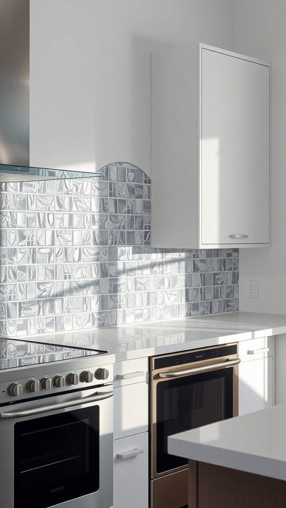
Glass tiles are often chosen to brighten a kitchen, but they behave differently depending on light. In a space with low natural light or heavy overhead LEDs, the reflective surface can either lift the room or create sharp glare.
The finish matters more than most expect. Glossy glass tiles in silver or blue tones reflect under-cabinet lighting strongly, which can make the backsplash look brighter at night but slightly harsh during the day.
When placed well, the effect is noticeable. It opens up the space visually and feels cleaner, especially in compact kitchens. One small thing to watch, fingerprints and smudges show quickly, so a quick wipe routine keeps that polished look intact.
Vintage Tin Panels
Vintage tin panels shift the mood of a kitchen, especially in spaces with warm lighting or darker corners where texture becomes more visible. In very bright kitchens, the detail can fade, but in softer light, the patterns stand out beautifully.
The surface detail does most of the work here. Embossed tin with slightly aged or brushed finishes pairs well with wood shelves and open storage, adding depth without needing extra decor.
Over time, the kitchen feels more layered and lived in. It softens modern elements and adds character instantly. One thing to note, if not sealed properly, moisture near the stove area can dull the finish faster than expected.
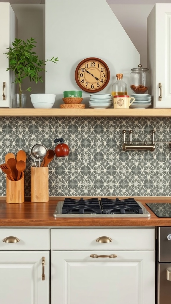
Bold Geometric Patterns

Geometric backsplashes can feel overwhelming in small kitchens or narrow layouts where patterns sit close to eye level. In tighter spaces, large or high-contrast shapes can dominate quickly.
The scale of the design changes everything. Medium-sized tiles with balanced contrast work better than overly sharp black and white combinations, especially under bright lighting.
Used carefully, the result is strong but controlled. It adds energy without making the space feel busy. A small adjustment that helps align patterns with cabinet lines so the layout feels intentional rather than random.
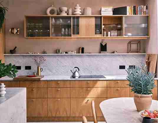
Marble Slab Sophistication
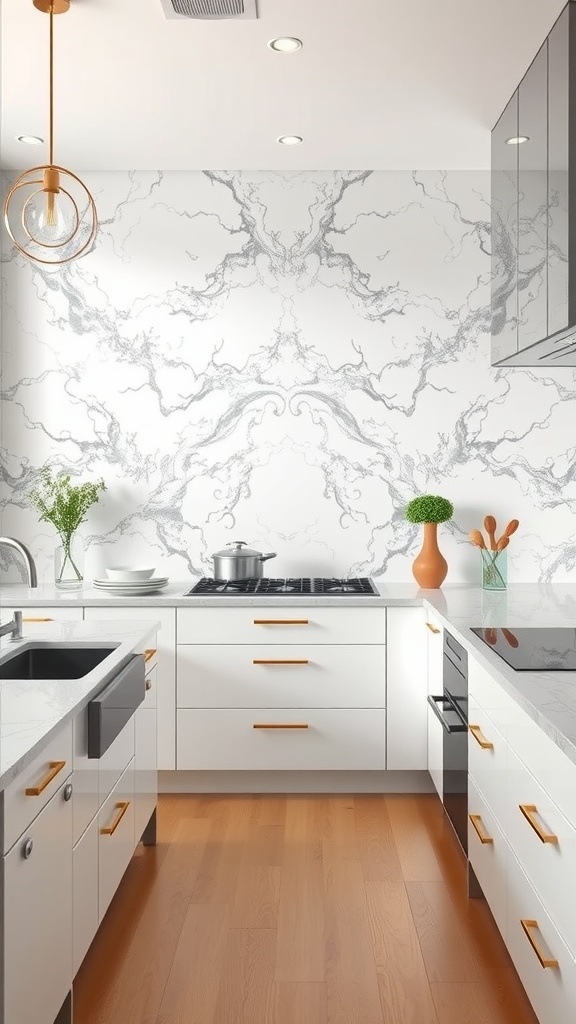
Marble slabs react strongly to lighting conditions, especially in kitchens with mixed lighting sources. Under warm lights, the veining looks softer, while cool lighting can make it appear more dramatic.
The material choice plays a key role. Polished marble with subtle veining keeps things calm, while bold veining can shift the entire focus of the kitchen, even with minimal decor.
The overall effect is clean and steady. It creates a seamless, high-end surface that feels quiet but impactful. One detail people miss, sealing regularly is important since stains near cooking areas can settle in faster than expected.
Stylish Painted Mason Jar Backsplash
This style behaves differently depending on the space size. In a compact kitchen or busy cooking zone, too many colors or patterns can feel cluttered rather than playful.
The execution makes the difference. Soft pastel tones or limited color palettes with jar outlines keep the look controlled while still feeling creative.
When balanced well, it changes the atmosphere. It makes the kitchen feel warmer and more personal without heavy design work. A small tip: keeping surrounding surfaces neutral helps the design stand out without overwhelming the space.
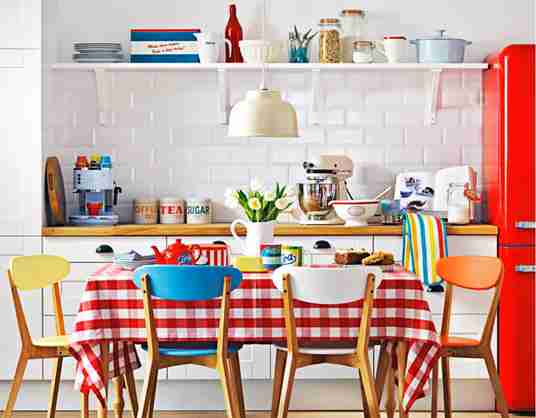
Classic Subway Tile Elegance
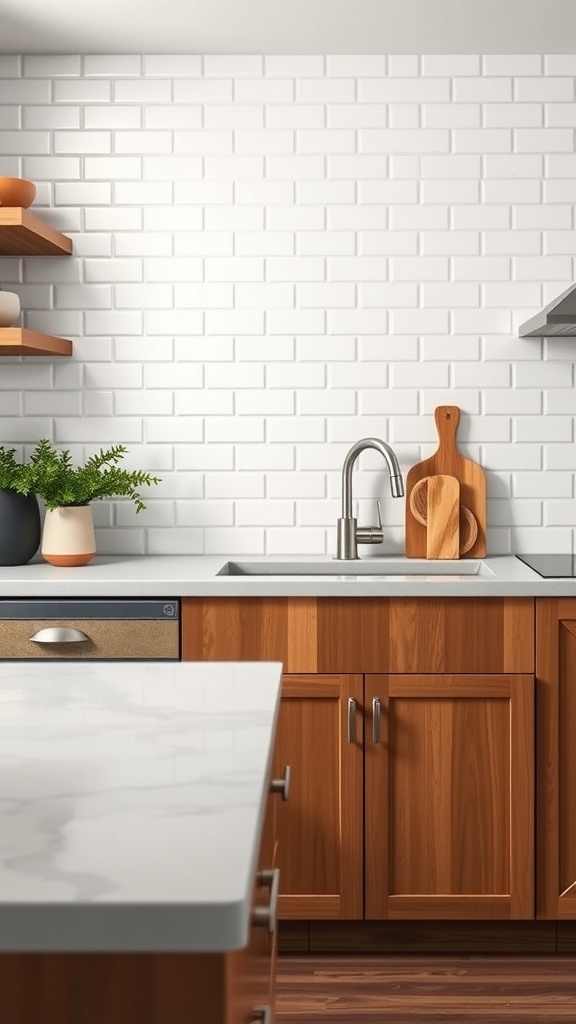
Subway tile adapts well, but in small kitchens with limited light, bright white tiles can sometimes feel flat instead of fresh. The surrounding materials decide how it reads.
Small changes make a noticeable shift. Off white tiles with contrasting grout or a vertical stack layout add depth without losing that clean base look.
Once installed, the kitchen feels more flexible. It stays bright while letting cabinets and decor stand out over time. A small detail that helps, darker grout hides everyday splashes better than white.
Colorful Mosaic Design
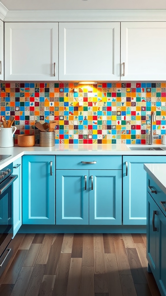
Mosaic backsplashes can quickly take over in compact kitchens or areas with busy countertops. Too many colors in a tight space can feel overwhelming.
Control comes from the palette. A mix of 2 to 3 tones or a soft gradient pattern keeps the movement without making the wall feel chaotic.
Used thoughtfully, it changes the mood instantly. It adds energy and personality while still feeling balanced. One thing to keep in mind, irregular grout lines can collect residue, so spacing and sealing matter more than expected.
Rustic Wood Plank Charm

Wood behaves differently in kitchens, especially in high-moisture areas near stoves or sinks. Without proper sealing, it can absorb splashes over time.
Material choice is key here. Sealed wood planks with a matte finish and visible grain bring warmth without looking overly polished.
The effect is noticeable right away. It softens hard surfaces and makes the kitchen feel more inviting. A quiet adjustment that helps, slightly spacing planks allows airflow and reduces long-term wear.
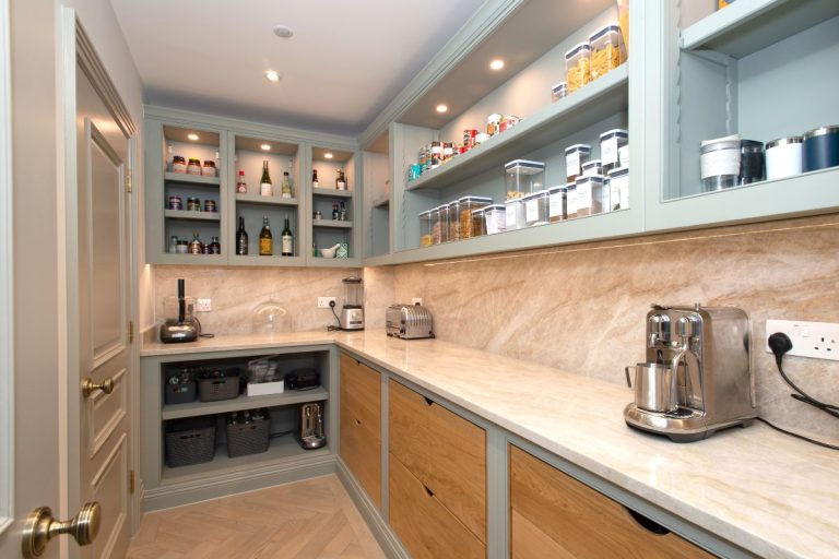
Natural Stone Texture
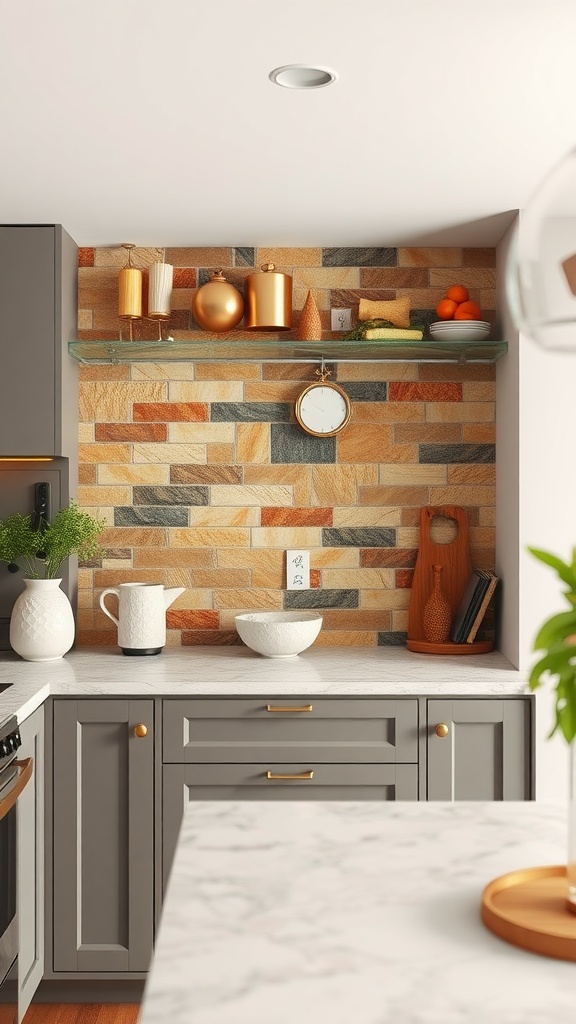
Stone backsplashes can feel heavy in low-ceiling kitchens or tight layouts, where too much texture closes in the space visually.
Choosing the right variation matters. Light-toned stone with subtle texture and uneven edges adds depth without making the wall feel dense.
Over time, it creates a steady backdrop. It adds warmth and dimension while staying calm and grounded. One small note, uneven surfaces may need extra cleaning near cooking zones where grease settles into the texture.
Eco-Friendly Recycled Materials
Recycled materials react differently depending on lighting, especially in kitchens with mixed artificial and natural light, where color variation becomes more visible.
The finish defines the look. Recycled glass with slight tonal variation or matte reclaimed tiles gives a more natural, less uniform appearance.
In daily use, the kitchen feels more intentional. It adds texture and uniqueness without looking mass-produced. A subtle point: check batch consistency before installation, since variation can shift more than expected.
Luxurious Metallic Accents
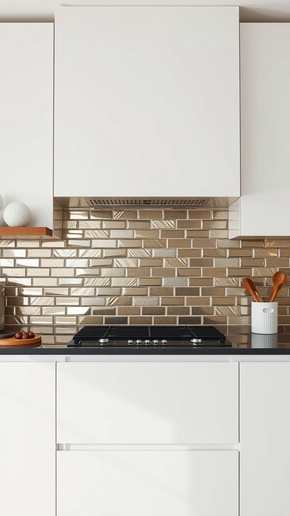
Metallic backsplashes can feel intense in bright kitchens with direct lighting, where reflection becomes stronger and sometimes distracting.
The finish changes the experience. Brushed gold or soft bronze instead of high gloss metal keeps the shine controlled while still adding depth.
When balanced well, it stands out without overwhelming. It adds contrast and makes the space feel sharper, especially at night under warm lights. One small adjustment, limit metallic surfaces nearby to avoid too much reflection competing in one area.
Chalkboard Paint for Flexibility

Chalkboard paint works differently depending on placement, especially in busy cooking zones near the stove where grease and heat can affect the surface over time.
The finish impacts usability more than expected. Matte chalkboard paint with a smooth base layer writes cleaner and wipes off without leaving heavy ghost marks.
In daily use, it becomes part of the routine. It keeps notes visible while reducing paper clutter on counters. One small thing to watch, frequent wiping in the same spot can create uneven patches if the base is not sealed properly.
Farmhouse Style Shiplap

Shiplap can feel very light, but in tight kitchens with limited ventilation, moisture buildup can affect painted surfaces if not treated correctly.
Material choice makes a difference. Primed and sealed shiplap boards with a soft white finish hold up better while keeping that airy look intact.
Once installed, the kitchen feels more relaxed. It adds texture without making the space feel busy or heavy. A practical adjustment, using semi-gloss paint instead of flat, makes cleaning splashes much easier over time.
Contemporary Graphic Print

Graphic prints can shift quickly depending on scale, especially in small kitchens where bold patterns sit close to eye level and become visually dominant.
The pattern selection controls the balance. Black and white designs with moderate spacing and clean edges feel sharp without overwhelming the layout.
The result feels intentional and styled. It creates a strong focal point that defines the kitchen’s personality. One detail that helps is aligning the pattern with cabinet lines, which keeps the overall look structured instead of chaotic.
Textured 3D Paneling

3D paneling reacts strongly to lighting, particularly in kitchens with uneven or directional lighting, where shadows can either enhance or distort the texture.
The material finish is key here. Subtle matte panels with soft geometric depth create movement without harsh shadow lines.
When done right, it changes how the wall reads. It adds dimension and makes neutral colors feel more layered and interesting. A small insight, deeper patterns can trap dust near cooking areas, so shallow textures are easier to maintain.
FAQ
What Is the Easiest Kitchen Backsplash to Clean?
Glass tile, glazed ceramic tile, and metal finishes are usually the easiest because they have smooth, nonporous surfaces. For textured options like natural stone or wood, sealing and regular wiping make maintenance much simpler.
How Do I Choose a Backsplash That Matches My Countertops?
Start by pulling one or two colors from the countertop pattern and use that as your guide. If the counter is busy, choose a simpler backsplash. If the counter is plain, you can go bolder with pattern, texture, or contrast.
Is Peel and Stick Backsplash a Good Idea?
It can be great for renters, quick makeovers, or testing a style before committing. Just choose a product rated for kitchens and avoid placing it too close to high-heat zones unless the material specifically supports it.
What Backsplash Makes a Small Kitchen Look Bigger?
Light colored tile, glossy finishes, and larger format pieces can help reflect light and reduce visual breaks. Keeping grout lines minimal and using a simple pattern also helps the wall feel more open.
Do I Need to Seal My Backsplash?
It depends on the material. Natural stone typically needs sealing, and wood needs protection in kitchen zones. Most glazed tile and glass tile do not need sealing, but grout often benefits from a sealer to reduce staining.