I Didn’t Expect Green Tile Bathrooms to Look This Stylish
Have you ever tried adding green tiles to your bathroom and ended up unsure if it actually looks right? It is one of those ideas that sounds fresh, but can quickly feel too bold or mismatched once installed.
Bathrooms already have fixed elements like lighting, fixtures, and layout, so introducing color without disrupting the balance can be harder than expected. Even small changes in shade or tile finish can shift the entire feel of the space.
That is where most people hesitate. Too light can feel plain, too dark can feel heavy, and the wrong tone can clash with everything else.
In this guide, you will explore 29 Green Tile Bathroom Ideas that show how to use green in a way that feels clean, balanced, and easy to live with.
Let’s jump in!
How Do You Use Green Tiles Without Overpowering the Bathroom?
Green tiles work best when they are balanced with light, texture, and surrounding materials. In smaller bathrooms, strong shades can feel more intense than expected.
Lighter greens or controlled placement, like a shower wall or backsplash, can add color without making the space feel crowded. Pairing green with neutral tones helps maintain a clean look.
You do not need to cover every surface. Using green in key areas allows it to stand out while keeping the overall design simple.
With the right approach, green tiles can make your bathroom feel fresh, calm, and more visually interesting.
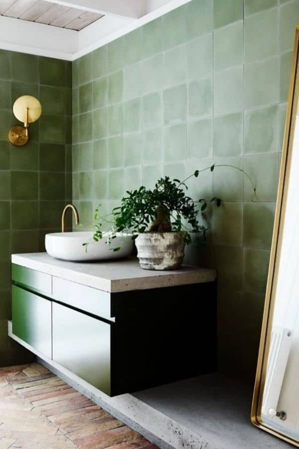
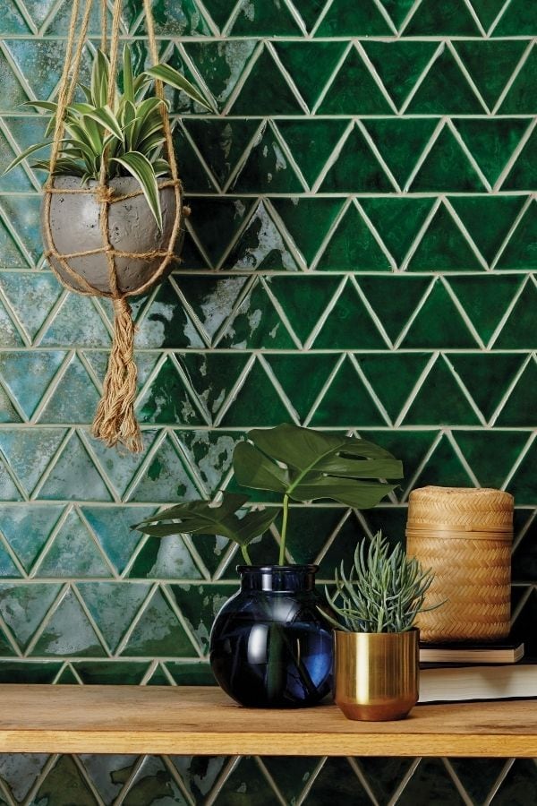
1. Glossy Green Triangle Tiles with Natural Accents
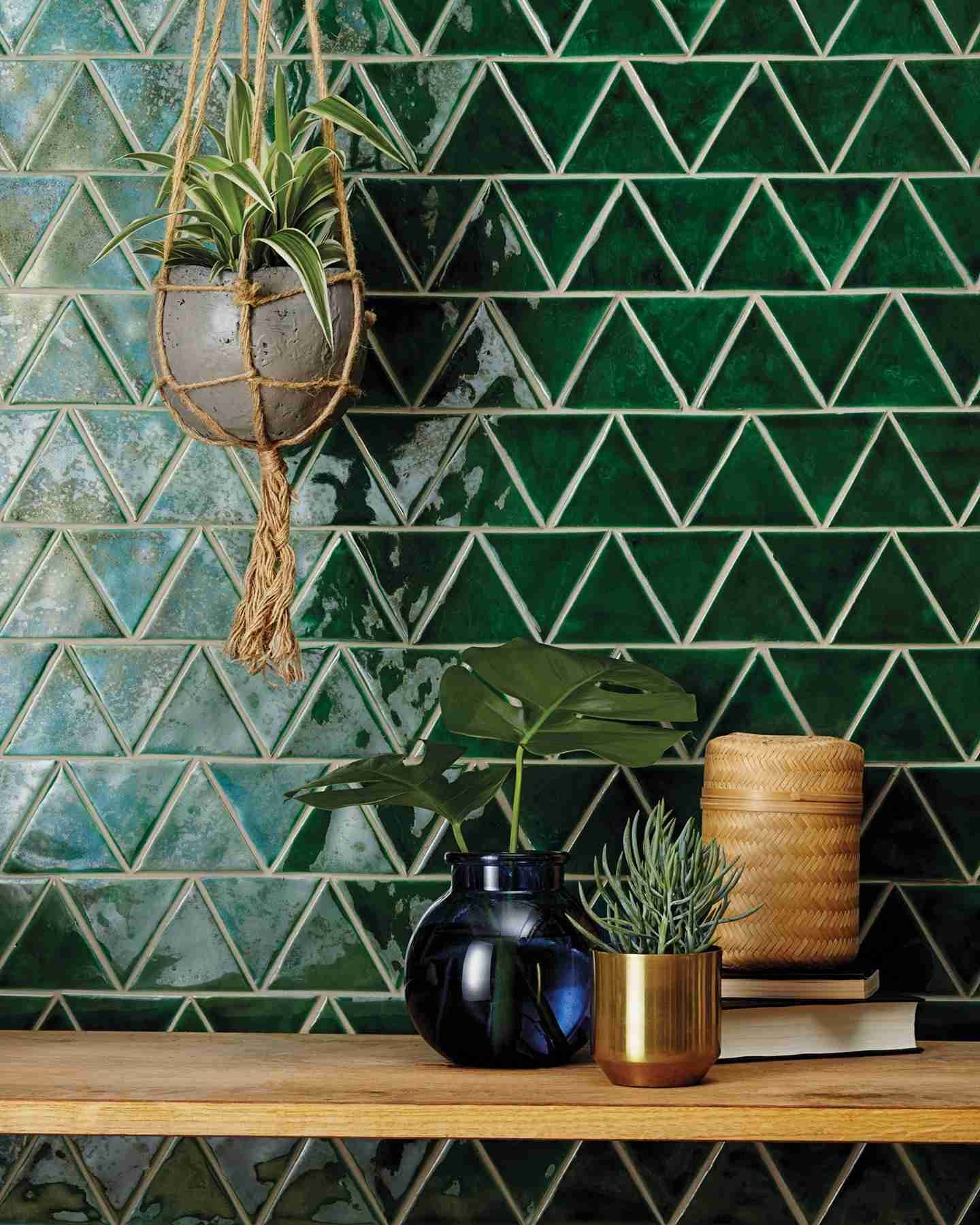
Glossy triangle tiles add movement and reflect light, which helps brighten deeper green shades in smaller bathrooms. The pattern feels more open instead of heavy.
In low-light spaces, pairing with warm wood and small plants softens the sharp geometry and adds balance. It keeps the look from feeling too structured.
A small detail that matters is grout color. Lighter grout makes the pattern stand out, while darker grout tones it down and feels easier to live with daily.
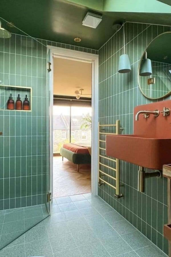
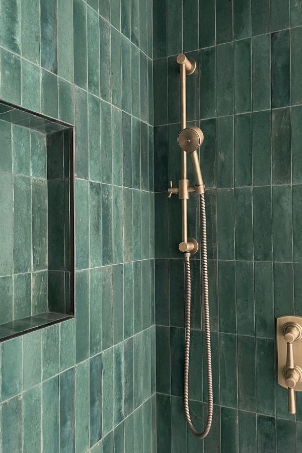
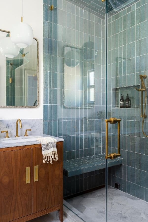
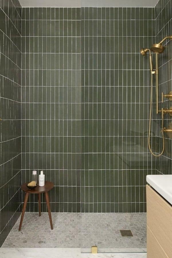
2. Deep Green Vertical Tiles with Brass Accents
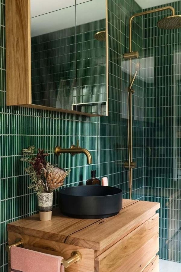
Deep green vertical tiles create strong lines that help stretch the height of the room, especially in tighter spaces. The glossy surface reflects light and keeps the color from feeling too dense.
In bathrooms with limited width, combining these tiles with brass fixtures and a wood vanity adds warmth and breaks up the intensity. It keeps the space from feeling too enclosed.
A detail that matters here is reflection. Glossy vertical tiles can show watermarks easily, so regular wiping keeps the finish looking clean.
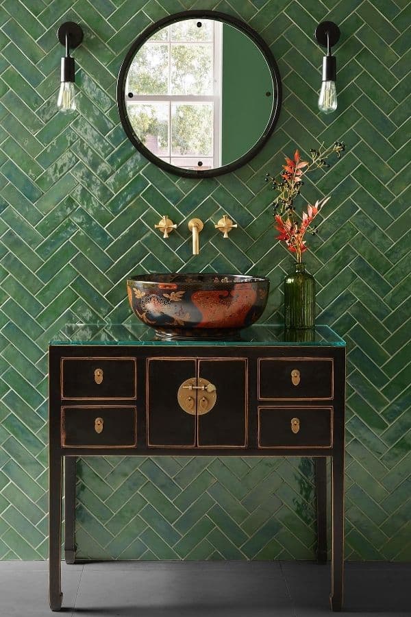
3. Mixed Green Tile Styles with Brass and Wood Balance
Using different green tile styles in one space adds depth, but it needs control. In smaller bathrooms, mixing square tiles with herringbone patterns can still feel balanced if the tones stay close.
When lighting changes across the room, pairing tiles with brass fixtures and a wood vanity helps connect everything visually. It keeps each section from feeling disconnected.
One detail that often gets missed is finish contrast. Combining matte and glossy tiles works well, but too much shine in one area can pull attention away from the rest of the space.
4. Green Herringbone Tiles for Shower Focus
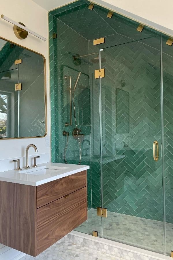
Herringbone tiles add movement and naturally draw attention, making them effective for defining the shower area without extra elements. The pattern feels structured but not overwhelming.
In bathrooms with clear glass partitions, pairing with brass hardware and a wood vanity keeps the space cohesive. It balances the pattern with warmer materials.
A small detail that affects the result is tile direction. Slight misalignment in herringbone patterns becomes noticeable quickly, so precision makes a big difference.
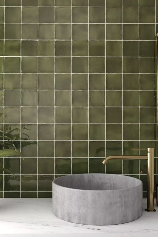
5. Glossy Green Square Tiles with Soft Lighting
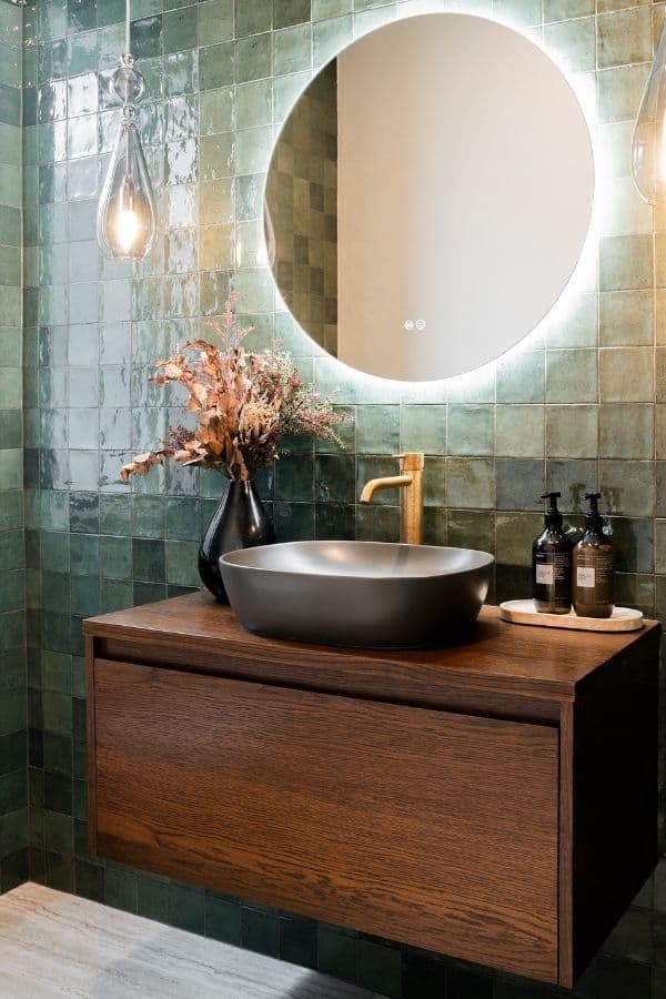
Glossy square tiles reflect light in a softer way when paired with warm ambient lighting, which helps reduce sharp glare. This creates a more relaxed surface overall.
In spaces with mixed lighting sources, combining with a round mirror and wood vanity smooths out reflections and keeps the look balanced.
One detail often missed is light placement. Direct lighting on glossy tiles can create harsh spots, so angled or diffused lighting gives a cleaner finish.
6. Dark Green Herringbone Tiles with Brass Highlights
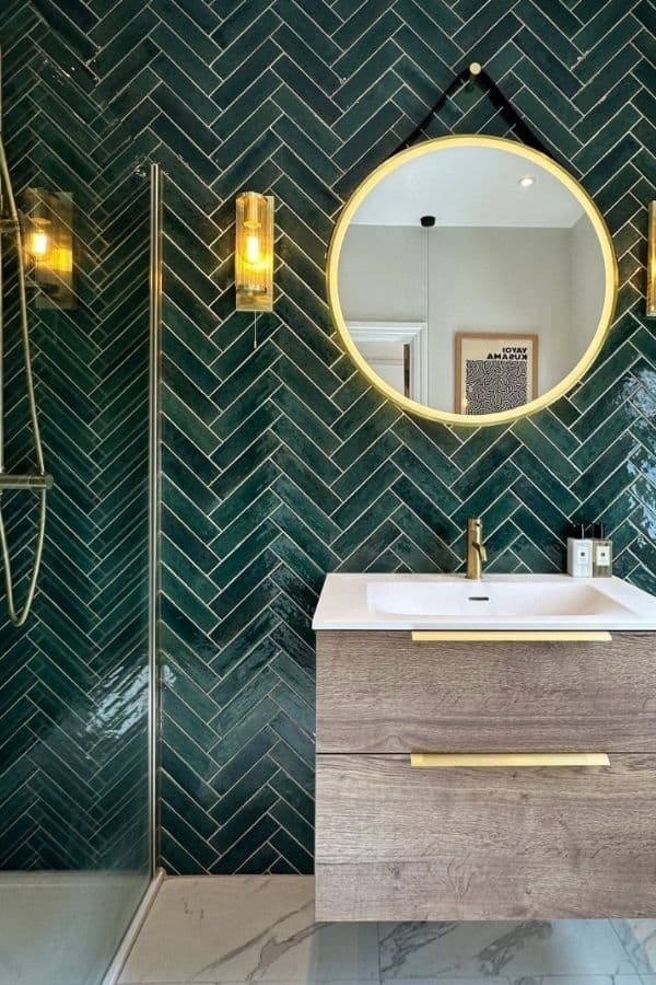
Dark green herringbone tiles create a strong visual texture, which works well for feature walls in medium-sized bathrooms. The pattern adds depth without needing extra decor.
In spaces with softer lighting, pairing with a round mirror and brass fixtures helps reflect light and keeps the wall from feeling too heavy.
A small detail to watch is grout contrast. Too light can make the pattern feel busy, while a closer tone keeps it more refined.
7. Muted Green Tiles with Vertical Layout
Muted green tiles in a vertical layout help stretch the perception of height, especially in narrow bathrooms. The softer tone keeps the look relaxed.
When natural light enters from one side, using simple fixtures and minimal contrast prevents uneven shadows across the wall.
One subtle issue is ceiling color. A darker ceiling can shorten the visual height even when tiles run vertically.
8. Glossy Green Triangle Tiles with Natural Decor
Triangle tiles introduce a geometric feel that adds movement, especially on smaller feature areas like backsplashes. The glossy finish enhances depth.
In spaces with mixed textures, combining with wood shelves and small plants softens the pattern and keeps it grounded.
A small detail is spacing consistency. Uneven gaps can disrupt the pattern more than expected with geometric tiles.
9. Full Green Tile Bathroom with Patterned Flooring
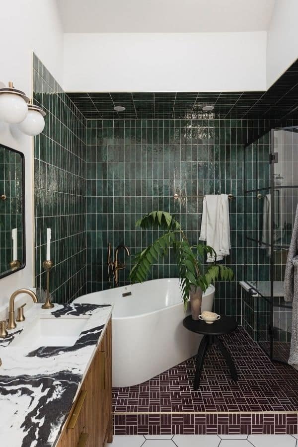
Covering walls in green tiles creates a bold look, but it works best in larger bathrooms where space can handle depth. It gives a cohesive feel.
Pairing with a patterned floor and lighter fixtures helps break the monotony and keeps the room visually balanced.
A common mistake is matching everything too closely. Slight contrast in floor or fixtures keeps the space from feeling flat.
10. Light Green Tiles with Classic Vanity Details
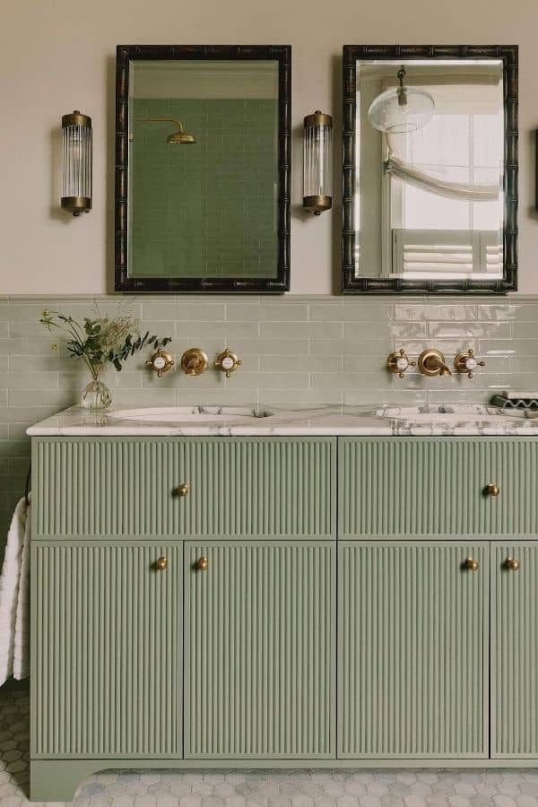
Light green tiles bring a softer tone that works well in shared bathrooms with mixed lighting conditions. The color feels easy on the eyes.
When paired with a classic vanity and brass fixtures, the space feels balanced between modern and traditional elements.
A small detail is the finish choice. Slightly glossy tiles reflect light better, while fully matte can look dull in low light areas.
11. Half Wall Green Tiles with Open Upper Space
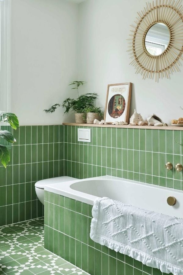
Half-wall green tiles keep the lower area protected while leaving the top open, which helps make smaller bathrooms feel less enclosed. The contrast adds visual breathing room.
In spaces with good natural light, pairing with light upper walls and simple decor keeps the look clean and balanced.
A small detail that matters is tile height. Stopping at the wrong level can look awkward, so aligning with fixtures or windows creates a cleaner finish.
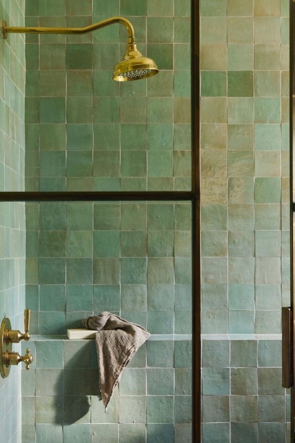
12. Textured Green Tiles with Subtle Variation
Textured green tiles add depth without strong patterns, which works well in enclosed shower areas. The variation keeps the surface from feeling flat.
In spaces with limited light, combining with brass fixtures and built-in niches adds warmth and breaks up the wall visually.
One subtle issue is uneven tone distribution. Tiles with too much variation can look patchy instead of naturally blended.
13. Green Marble Effect Tiles for a Statement Look
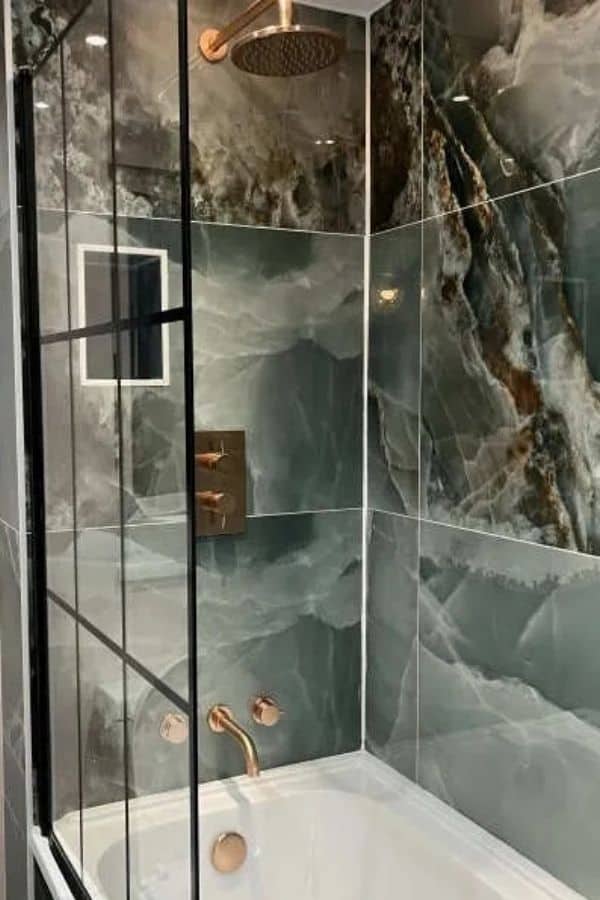
Marble effect tiles bring a bold, layered look that works best in larger shower areas where the pattern can spread naturally. It creates a strong visual impact.
In bathrooms with glass enclosures, pairing with minimal hardware and soft lighting lets the natural pattern stand out without distraction.
A small detail is tile alignment. Misplaced veins can break the flow and make the wall feel less cohesive.
14. Dark Green Subway Tiles with Clean Lines
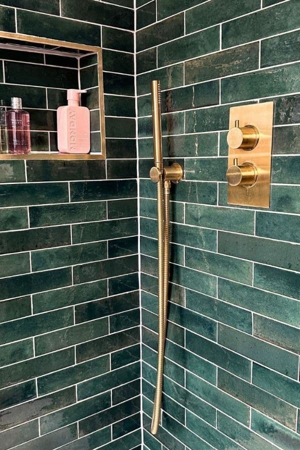
Dark green subway tiles create a structured look that works well in compact shower corners. The horizontal layout adds a sense of width.
In tighter spaces, pairing with brass fixtures and recessed storage niches keeps the design practical without adding clutter.
One thing often missed is grout thickness. Thicker lines can make the wall feel busier than expected.
15. Olive Green Square Tiles with Soft Finish
Olive green tiles offer a muted tone that works well in bathrooms with mixed lighting conditions. The color stays consistent without shifting too much.
In minimal setups, pairing with a stone sink and simple brass faucet keeps the focus on the tile without adding visual noise.
A subtle detail is the finish choice. Slightly glossy surfaces reflect just enough light, while fully matte surfaces can feel flat in darker areas.
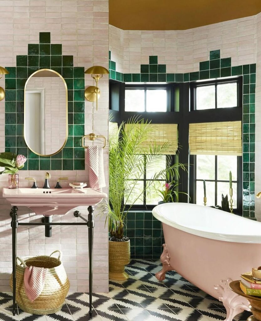
16. Green Tile and Wallpaper Combination for Contrast
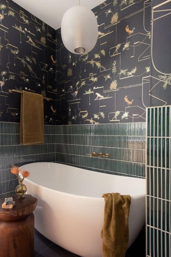
Combining green tiles with wallpaper adds contrast, especially in mid-sized bathrooms where walls need variation. The mix keeps the space from feeling too uniform.
In rooms with softer lighting, pairing dark wallpaper above and vertical tiles below creates balance without overwhelming the layout.
A small detail is the pattern scale. Busy wallpaper with strong tiles can clash, so keeping one element subtle improves the result.
17. Soft Green Square Tiles with Natural Variation
Square tiles with slight variation bring a natural feel that works well in enclosed shower spaces. The uneven tones add depth without needing patterns.
In areas with limited airflow, pairing with brass fixtures and simple shelving keeps the design clean and practical.
A subtle issue is tone distribution. Too much variation in one spot can look unbalanced instead of organic.
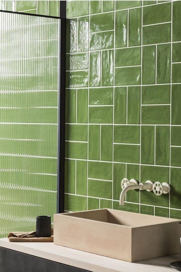
18. Green Geometric Tiles for a Modern Edge
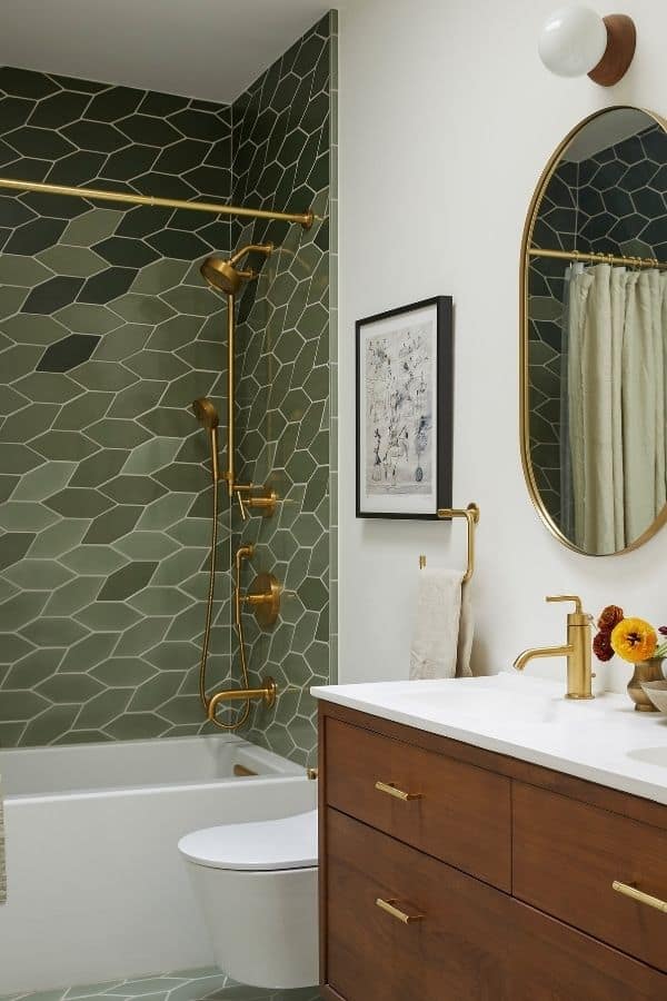
Geometric green tiles introduce structure, which works well in smaller bathrooms needing a focal point. The pattern adds interest without extra decor.
In compact layouts, pairing with clean lines and simple fixtures keeps the space from feeling too busy.
One detail to watch is tile size. Smaller shapes can make walls feel crowded if overused across the entire room.
19. Green Herringbone Tiles with Bold Vanity Contrast
Herringbone tiles create movement that stands out more when paired with strong vanity designs. The contrast helps define each element clearly.
In bathrooms with balanced lighting, combining a dark vanity and a round mirror adds depth without making the space feel heavy.
A small detail is the pattern direction. Changing direction mid-wall can break the flow and feel unintentional.
20. Muted Green Brick Tiles with Classic Touch
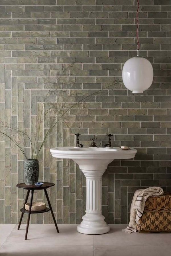
Muted green brick tiles bring a classic look that fits well in bathrooms with traditional layouts. The simple pattern keeps the design grounded.
In spaces with softer lighting, pairing with a pedestal sink and minimal decor keeps the focus on the tile texture.
A subtle detail is the grout tone. Matching grout creates a smoother look, while contrast grout highlights the pattern more.
21. Dark Green Subway Tiles with Classic Contrast
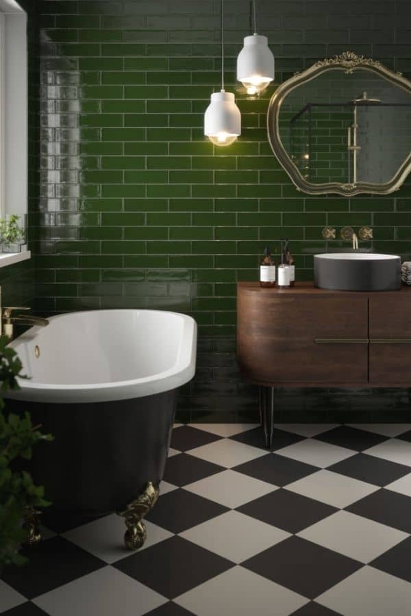
Dark green subway tiles create a strong backdrop that works well in bathrooms with bold flooring patterns. The contrast keeps each element clearly defined.
In spaces with mixed finishes, pairing with a clawfoot tub and warm lighting softens the darker tone and adds balance.
A small detail is the gloss level. High shine tiles reflect more light but can highlight water spots quickly.
22. Glossy Green Mixed Layout Tiles for Texture
Using mixed tile layouts adds texture, which works well in feature walls where detail matters. The variation keeps the surface visually active.
In areas with strong lighting, combining a stone sink and simple fixtures prevents the wall from feeling too busy.
A subtle issue is spacing consistency. Uneven layout lines can disrupt the overall pattern more than expected.
23. Soft Blue Green Tiles for a Light Feel
Blue-green tiles create a lighter feel that works well in bathrooms with limited natural light. The cooler tone keeps the space open.
In compact layouts, pairing with glass enclosures and brass fixtures maintains clarity without adding visual weight.
A small detail is the lighting temperature. Cooler lights can make the color feel flat, while warmer tones add depth.
24. Green Scallop Tiles for Soft Pattern
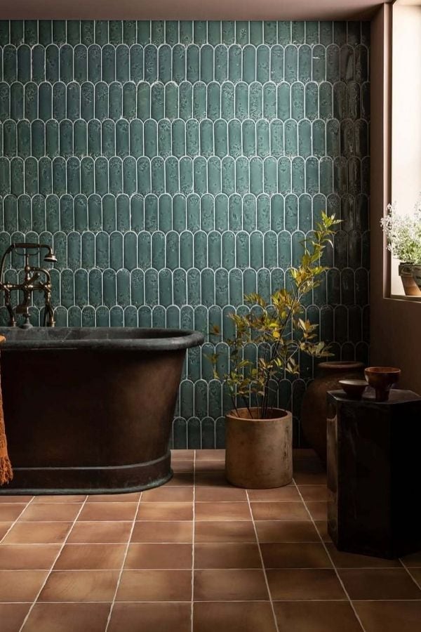
Scallop tiles introduce a softer pattern, which works well in bathrooms with simple layouts. The curved shapes feel less rigid.
In spaces with natural materials, pairing with wood tones and soft lighting enhances the organic look.
A subtle detail is the grout color. A matching tone keeps the pattern gentle, while contrast makes it more defined.
25. Half Wall Green Tiles with Clean White Contrast
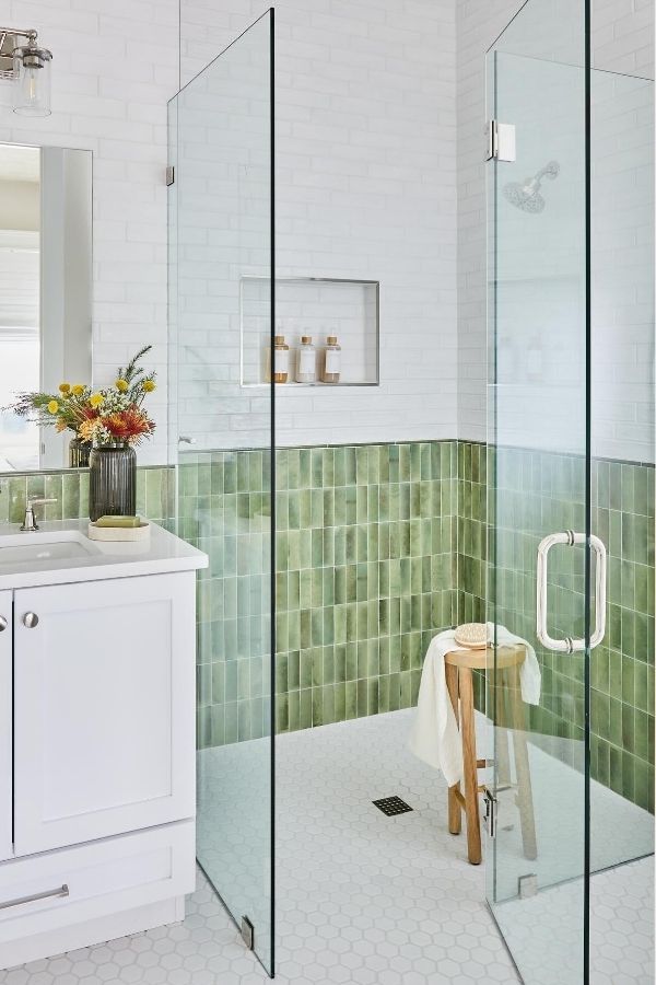
Half-wall green tiles create separation, which works well in smaller bathrooms needing visual clarity. The white upper wall keeps it open.
In bright spaces, pairing with glass panels and light fixtures maintains a clean and simple look.
One detail to watch is transition lines. A clean edge between tile and wall makes the design feel more intentional.
26. Vertical Green Tiles with Minimal Layout
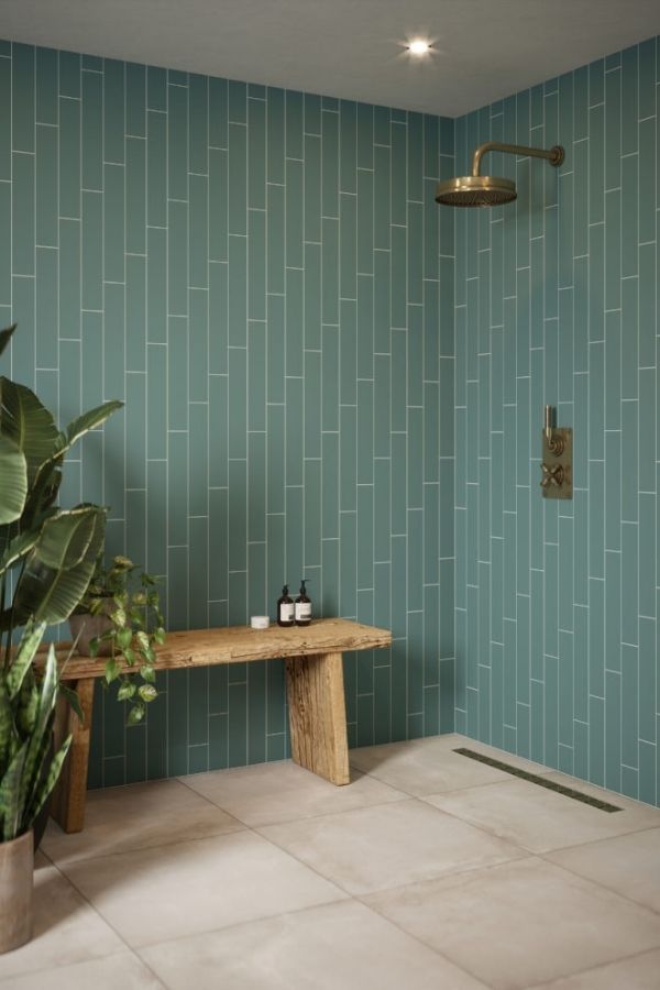
Vertical green tiles create a clean rhythm that works well in open shower layouts with fewer visual breaks. The lines help guide the eye upward.
In spaces with neutral flooring, pairing with a simple wood bench and brass fixtures adds warmth without interrupting the pattern.
A small detail is the grout spacing. Thin lines keep the look refined, while thicker joints can make the wall feel busier.
27. Deep Green Vertical Tiles for Enclosed Showers
Deep green vertical tiles create a more enclosed feel, which works best in dedicated shower zones with defined boundaries. The color adds depth.
In smaller showers, pairing with light flooring and minimal decor keeps the space from feeling too tight.
One subtle issue is light absorption. Dark tones can reduce brightness, so overhead lighting becomes more important.
28. Soft Green Tiles with Curved Tub Design
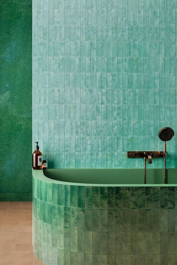
Soft green tiles paired with curved forms create a smoother look, especially in bathrooms with rounded layouts or custom tubs. The flow feels more natural.
In spaces with mixed textures, combining with matte finishes and simple fixtures keeps the focus on the shape instead of the details.
A small detail is the tile placement on curves. Poor alignment can break the flow and make the surface look uneven.
29. Green Tile Accent Pattern with Light Contrast Walls
Using green tiles as an accent pattern keeps the design focused while letting lighter surrounding walls open up the space. This works well in bathrooms with strong natural light.
In layouts with multiple elements, pairing with a classic sink, brass fixtures, and patterned flooring keeps everything visually connected without feeling overwhelming.
A small detail to watch is pattern placement. Centering the tile design around mirrors or fixtures makes the layout feel intentional instead of random.