My Best Upgrade Was Learning How To Decorate A Long Wall In Living Room (And Yes, Lighting Matters)
There’s a very specific kind of stress that comes with a long wall in a living room.
Not a cute little 6-foot situation. I mean the kind that stretches on forever. The kind where you stand there holding a tape measure, convinced you need seventeen frames, two shelves, a mirror, maybe a plant wall, and somehow it still won’t look finished.
That was me.
I used to treat long walls like a blank page I needed to fill. And every time I tried to “add more,” it looked worse. Smaller. Busier. Slightly desperate.
The real shift happened when I stopped filling and started anchoring.
Once I understood that a long wall needs scale, rhythm, one clear anchor, and one functional layer, everything changed. And yes — lighting made it look ten times more intentional.
This is exactly how I approach decorating a long wall now, step by step, from measuring to the final glow at night.
Long Wall Plan (The No-Panic Box)
Before you buy anything, before you scroll Pinterest, before you add 14 frames to your cart, here’s the structure I use:
- Measure the full wall length and ceiling height
- Mark studs, outlets, switches, vents (all of them)
- Identify the wall type (sofa wall, traffic wall, media wall, dining-adjacent wall)
- Pick one lane (gallery, shelves, oversized art, or console/built-in moment)
- Choose a visual center (57 inches from floor to center is my baseline)
- Choose one anchor piece
- Tape the full planned width before hanging anything
- Hang from biggest outward
That order prevents chaos.
Step 1: Identify Your Wall Type
Not all long walls behave the same. Copying the wrong inspiration photo is how most people end up frustrated.
Here’s how I categorize mine:
Sofa Wall
This one is all about comfort and eye level. Cushions already take up visual weight, so the wall decor needs to relate to that.
Traffic Wall
This is the wall people walk past constantly. Backpacks, tote bags, dogs with no spatial awareness. Durable, bump-safe solutions win here.
Media Wall
The TV is here. The router is here. Cords are trying to ruin your mood. This wall needs integration, not denial.
Dining-Adjacent Wall
This wall looks different when you’re sitting down versus standing. Small art can feel chaotic from a seated view.
Knowing the wall type immediately narrows your decisions.
Supplies Quick Checklist
Here’s what I actually use when planning:
- Tape measure
- Painter’s tape
- Pencil and eraser
- Level
- Stud finder
- Paper for templates
- Hooks and anchors
- Command strips for light pieces
- Cord cover kit if needed
- A step stool I trust
Painter’s tape is non-negotiable. I map everything before committing.
Step 2: Measure + Map Before You Shop
I used to shop first and plan later. That was a mistake.
Now I measure the entire wall and mark:
- Studs
- Outlets
- Switches
- Ceiling height
Then I tape a horizontal line at 57 inches from the floor. That becomes my visual center starting point.
It’s not a rigid rule, but it prevents art from creeping upward and floating awkwardly near the ceiling.
Then I choose my anchor zone. The first place your eye should land.
If you skip this step, your wall turns into evenly scattered minis, which reads as clutter no matter how pretty each piece is.
Step 3: Pick a Lane (This Is Where Most People Go Wrong)
“A little of everything” sounds creative.
It’s actually chaos.
A long wall needs one main strategy.
Your options:
- One large gallery rectangle
- Floating shelves
- One oversized statement piece
- Console or built-in moment
Once I pick a lane, I commit.
No adding shelves “just because.” No sneaking in one more frame.
Gallery Layouts and Framed Art
This is what I use most often for a sofa wall.
Instead of scattering frames across the entire length, I build one large rectangular grouping.
Key rules I follow:
- The entire grouping spans about two-thirds of the furniture width
- Bottom of frames sits 8–10 inches above sofa or console
- Spacing stays consistent (2–3 inches between frames)
- No more than two frame finishes
- One repeating element (mat color, tone, or palette)
I always hang from the biggest piece outward.
And I stop adding frames when the shape feels complete.
The mistake I used to make? Adding “one more” at 10:30 p.m. because something felt off. It wasn’t off. I was just tired.
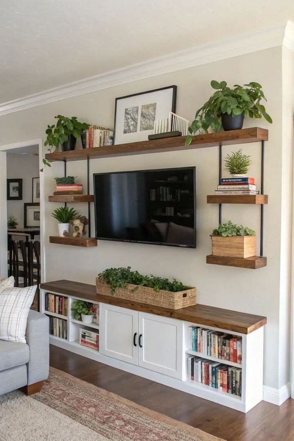
Floating Shelves for Flexible Walls
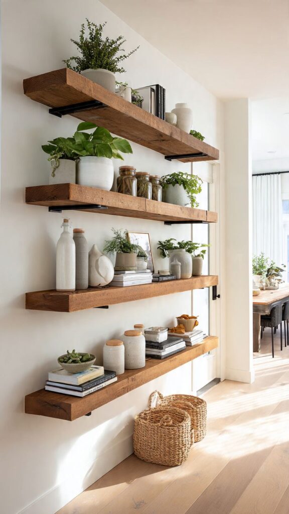
For traffic walls or media walls, shelves are practical.
But long walls need long shelves.
Two extended shelves feel intentional. Tiny staggered shelves look accidental.
I keep the overall shelf composition centered near the 57-inch baseline, then adjust slightly based on what’s below.
Styling formula I use:
- Repeat two frame sizes
- Repeat one material (wood, brass, black)
- Add one tall object every 3–4 feet
- Leave negative space
Shelves try to become storage. I fight this weekly.
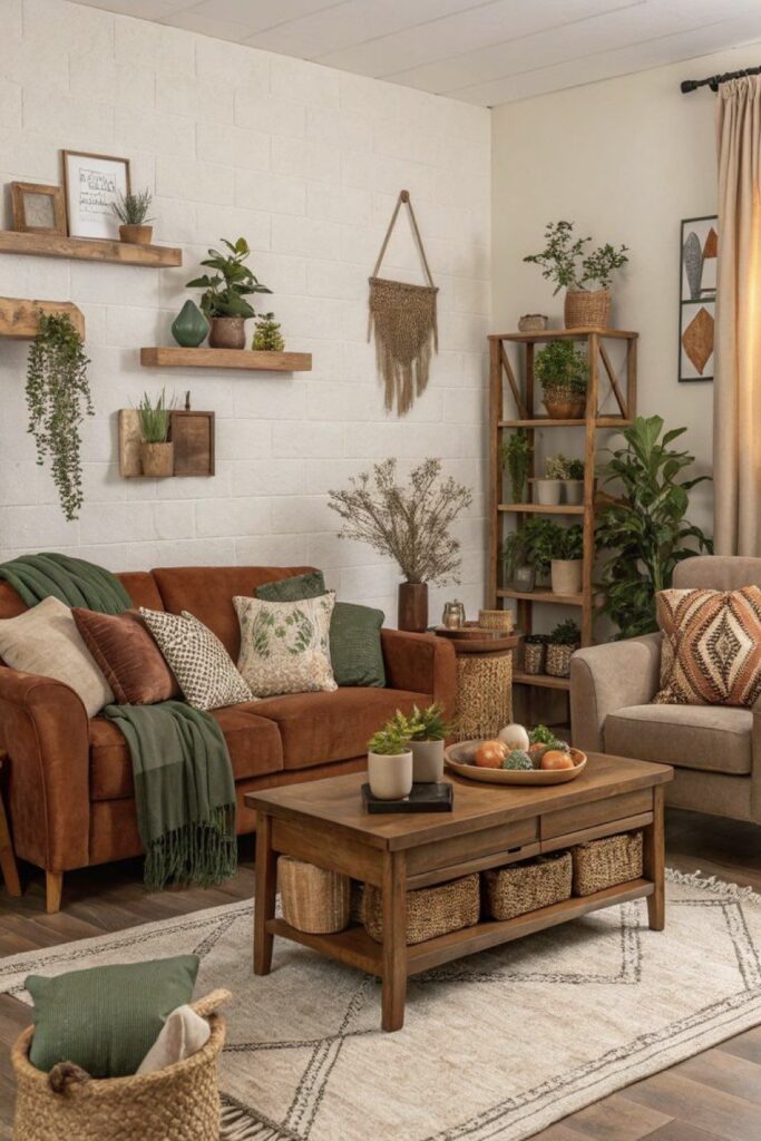
Oversized Statement Pieces
This is my favorite solution when I want simplicity.
One oversized piece instantly anchors the wall.
The art should:
- Span about two-thirds of the furniture width
- Sit 8–10 inches above furniture
- Relate to the 57-inch baseline
If supporting with smaller pieces, I keep them minimal.
Going bigger than feels comfortable is usually the right move.
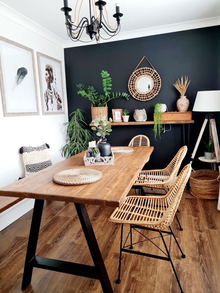
Symmetry vs Asymmetry
This decision quietly controls the vibe.
If the room already has pattern, texture, and movement, I choose symmetry.
Clean grids. Matching frames. Order.
If the room feels stiff or overly structured, I allow balanced asymmetry.
But even then, spacing rules stay consistent.
Indecision creates extra holes in the wall.
Function + Decor Hybrids
Adding a console beneath the decor changed everything for me.
A console:
- Grounds the wall
- Adds storage
- Gives lamps a home
- Connects art to furniture
When I added a console behind my sofa wall and then hung art relative to it, the whole space looked designed.
Without the console, art felt like it was floating in space.
Lighting Is the Credibility Move
This is the part most people skip.
And it’s the part that makes everything look finished.
A long wall in daylight can look fine.
At night? Flat. Cold. Underwhelming.
Adding a picture light or plug-in sconces over the anchor piece made the wall feel intentional.
Sizing tip I use:
The picture light should be roughly half to three-quarters the width of the artwork.
Warm bulbs only. Always.
Lighting turns decoration into design.
Real Walkthrough: Sofa Wall Setup
Let’s say:
- Wall length: 14 feet
- Sofa width: 84 inches
- Console: 72 inches
Here’s what I’d do:
- Center console behind sofa.
- Let extra wall space breathe.
- Create a grouping around 48–54 inches wide (two-thirds of the console).
- Hang the bottom frame 8–10 inches above the console.
- Check alignment with 57-inch center baseline.
- Add two table lamps for warmth.
Done.
No decorating the entire 14 feet.
Breathing room is part of the design.
Real Walkthrough: Traffic Wall Setup
Wall length: 12 feet
Heavy foot traffic
Solution:
- Two long picture ledges.
- Center composition slightly higher than 57 inches.
- Repeat two frame sizes.
- Lean art instead of hanging everything.
- Add one tall mirror at the end.
The mirror breaks the run and reflects light.
Expect the lower ledge to attract mail. Plan for it.
Shopping Reality (Because Budgets Matter)
- Thrift frames: $5–$25
- Oversized prints: $20–$80
- Large reproductions: $150–$600
- Peel-and-stick wallpaper: $40–$120 per roll
- Picture lights: $40–$200+
My favorite sources:
- Etsy downloads
- Facebook Marketplace
- IKEA ledges
- Hardware store for tools
Painter’s tape: buy extra. It disappears.
Quick Diagnostic: When It Looks “Off”
- Too small → Scale problem → Go bigger
- Floaty → Not tied to furniture → Add console or lower grouping
- Scattered minis → No rectangle shape → Cluster
- Too high → Anchored to ceiling → Use baseline
- Too many finishes → Visual noise → Limit to two
- Looks weird at night → Lighting issue → Add warm light
Nine times out of ten, it’s scale or lighting.
FAQ
How Do I Decorate a Very Long Wall in a Living Room?
I measure first, pick one lane, choose an anchor, and build outward. I keep the center near 57 inches, span decor about two-thirds of furniture width, and maintain 2–3 inch spacing between frames. Then I add lighting.
How Do I Break Up a Long Wall?
I create zones instead of decorating evenly across the entire length. One strong anchor area with breathing space around it prevents clutter.
The Last Thing I’ll Say Before You Grab the Tape
Long walls aren’t asking for more decor.
They’re asking for a plan.
If you measure first, choose one strategy, commit to an anchor, repeat elements intentionally, and add lighting at the end, your wall will feel designed instead of filled.
And if you’re still holding a frame at 9 p.m., wondering why it looks crooked, just know I’ve been there too.
Step back.
Check the baseline.
Turn on a lamp.
It probably looks better than you think.