Do Two-Tone Kitchen Cabinets Look Stylish or Outdated in 2026
I’ll be honest. A few years ago, I was convinced two-tone kitchen cabinets were a trend that would burn out fast.
You know the look. Bright white uppers. Dark navy lowers. Everyone on Pinterest doing the exact same thing.
So when I started planning my own kitchen refresh, I paused. Are two-tone cabinets still stylish in 2026? Or are we about to look back at them the way we look at espresso cabinets from 2008?
After researching, touring showrooms, and obsessing over real kitchens instead of staged photos, here’s what I learned.
Two-tone cabinets are absolutely still stylish in 2026.
But only when done thoughtfully.
The difference between timeless and outdated comes down to contrast, tone, and balance.
Two-Tone Cabinets in 2026
The biggest shift I’ve noticed? The contrast is softer now.
In 2020, it was dramatic. Stark white and jet black. High contrast. Bold statements.
In 2026, designers are leaning into subtle depth instead of sharp separation.
Here’s what feels current right now:
| 2026 Direction | What It Looks Like |
|---|---|
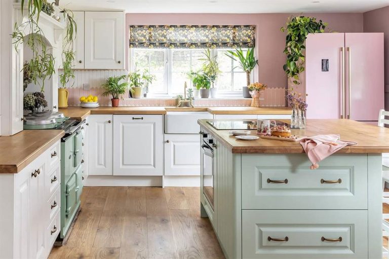
| Soft Contrast | Cream uppers + sage lowers |
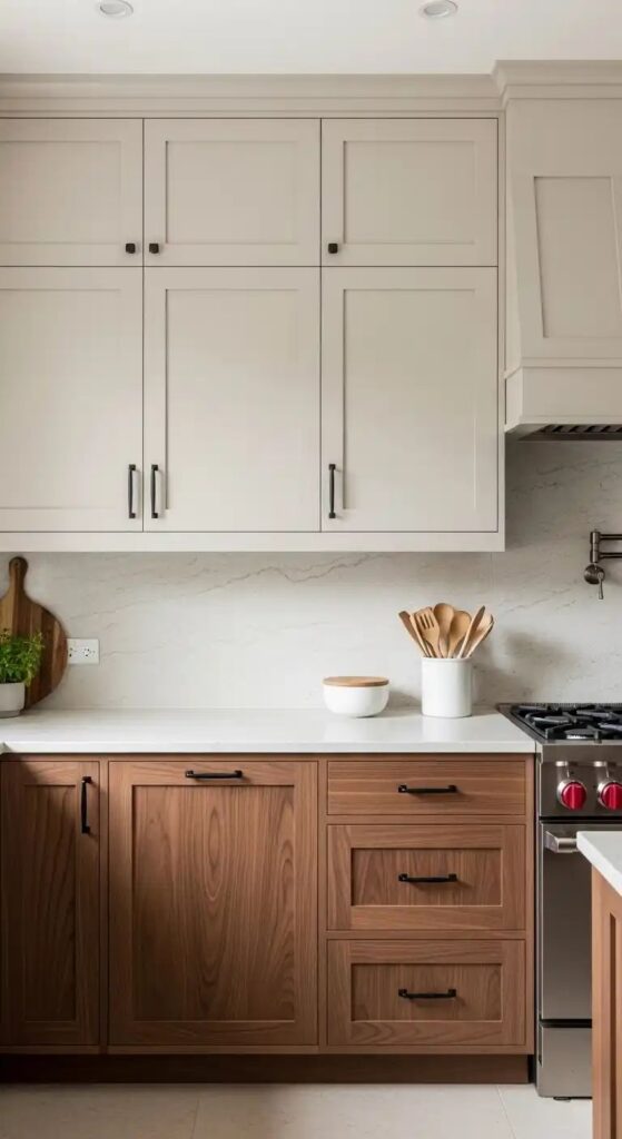
| Wood + Paint | White oak + warm white |
| Muted Color | Dusty blue + greige |
| Organic Pairing | Forest green + cream |
| Textural Mix | Matte paint + natural wood |
It feels layered. Calm. Slightly earthy.
The kitchens that look outdated are usually the ones with super high contrast and cool undertones fighting each other.
Why Two-Tone Still Works
When I walked into a fully one-color kitchen recently, it felt clean but flat.
Two-tone cabinetry breaks up that visual block.
It adds:
- Dimension
- Height illusion
- Depth
- Visual balance
- Personality without chaos
The trick is placement.
Most modern layouts follow this pattern:
| Upper Cabinets | Lower Cabinets |
|---|---|
| Lighter | Darker |
| Airy | Grounded |
| Reflect light | Anchor the space |
This simple structure makes small kitchens feel taller and larger kitchens feel layered.
Color Psychology Actually Matters
I didn’t think about this much until I saw how different tones changed the entire energy of a space.
Warm tones create comfort.
Cool tones create calm.
The best two-tone kitchens mix both strategically.
For example:
| Warm Element | Cool Element |
|---|---|
| Wood lowers | Soft blue island |
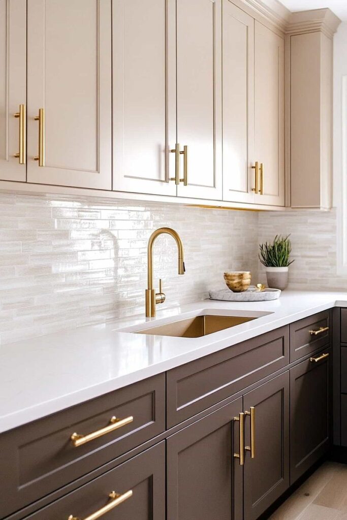
| Cream uppers | Charcoal base |
| Walnut island | Pale gray perimeter |
If your kitchen gets a lot of natural sunlight, you can go deeper with color.
If it faces north and feels dim, warmer tones prevent it from looking dull.
I learned this the hard way after testing a cool gray sample that looked blue and lifeless at night.
The Most Stylish Two-Tone Combinations for 2026
After digging through current design projects, these combinations feel modern but safe:
| Upper Cabinets | Lower Cabinets | Why It Works |
|---|---|---|
| Warm white | Navy | Classic but softened |
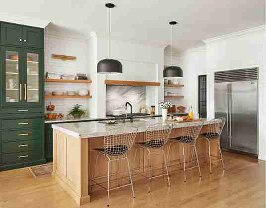
| Cream | Forest green | Organic and grounded |
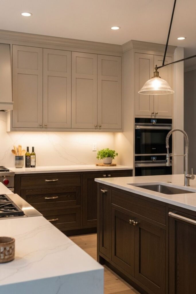
| Greige | Charcoal | Subtle depth |
| White oak | Warm white | Timeless and natural |
| Sage | Soft white | Calm and airy |
Notice a pattern? Nothing icy. Nothing neon. Nothing is screaming for attention.
Wood Tones Are Dominating
If I had to choose one direction that feels strongest in 2026, it’s wood mixed with paint.
White oak is everywhere right now.
It brings warmth without heaviness.
Here’s how different wood tones change the mood:
| Wood Type | Overall Feel |
|---|---|
| White Oak | Scandinavian, light, modern |
| Walnut | Rich, mid-century inspired |
| Cherry | Classic and traditional |
| Maple | Clean and neutral |
Wood keeps two-tone from feeling trendy. It grounds the look in something natural.
Kitchen Islands Are Leading the Two-Tone Trend
One of the easiest ways to do two-tone without committing your whole kitchen is the island.
This layout feels very 2026:
- Perimeter cabinets in soft white
- Island in deep blue, green, or wood
- Hardware ties everything together
The island becomes the statement without overwhelming the room.
It’s lower risk and easier to update later.
Hardware Makes or Breaks It
I underestimated this at first.
But hardware can completely shift the tone.
| Cabinet ColorsBest Hardware Choice | |
|---|---|
| Warm white + wood | Brushed brass |
| Navy + white | Matte black |
| Greige + charcoal | Brushed nickel |
| Cream + green | Aged brass |
Mixed metals are still in, but they need consistency.
If your faucet is warm brass, your handles should echo that warmth.
Lighting Changes Everything
I saw a two-tone kitchen that looked beautiful during the day and harsh at night.
The difference? Lighting.
Warm lighting (around 2700K to 3000K) keeps painted cabinets from looking cold.
Under-cabinet lighting also helps define the layers between upper and lower cabinets.
Pendant lights above islands act like anchors visually.
Without proper lighting, even the best color combo can fall flat.
How to Keep Two-Tone Cabinets Timeless
Here’s what I personally would do if I were renovating today:
- Stick to one neutral
- Add one muted color or wood tone
- Avoid extreme contrast
- Choose classic hardware
- Invest in quality materials
Timeless two-tone kitchens often follow this formula:
| Timeless Pair | Why It Lasts |
|---|---|
| White + Navy | Decades of use in design |
| Wood + Cream | Natural never dates |
| Greige + Charcoal | Soft contrast, modern but subtle |
Trendy colors come and go. Undertones and balance matter more.
Can You Adapt It Later?
This was a big concern for me.
What if I change my mind in five years?
The good news: paint is flexible.
Lower cabinets can be repainted.
Islands can be updated.
Hardware can be swapped.
That’s much easier than replacing everything.
So… Stylish or Outdated?
In 2026, two-tone kitchen cabinets are still stylish.
But the loud, dramatic contrast version is fading.
The current look is softer. Warmer. More organic.
If you choose tones that complement each other instead of compete, your kitchen will feel layered, not trendy.
If you chase high contrast for shock value, it may age faster.
Design is rarely about the trend itself.
It’s about how thoughtfully you apply it.